JNTZN

Tag: frontend

  • Modern CSS Grid: A Practical Layout Tutorial

    CSS Grid changed front-end layout from a pile of hacks into a system. If you have ever fought with floats, nested flex containers, awkward percentage widths, or fragile media queries, Grid is the reset button. It gives you a way to design two-dimensional layouts that are clean, predictable, and much easier to maintain.

    This guide is a practical tutorial on modern CSS Grid layout techniques for developers, freelancers, and site owners who want layouts that look professional without becoming hard to manage. You will learn what Grid is, why it matters in modern responsive design, and how to start using it in real projects with confidence.

    What a Modern CSS Grid Layout Tutorial Really Covers

    A modern CSS Grid layout tutorial is not just a list of properties. It is an explanation of how to think in rows, columns, tracks, gaps, and placement rules instead of relying on old layout workarounds. Grid is a browser-native layout system built specifically for arranging content in two dimensions, which means you can control horizontal and vertical structure at the same time.

    That matters because many page layouts are naturally two-dimensional. A dashboard, pricing section, gallery, magazine-style homepage, or admin panel usually needs both row and column control. Flexbox is excellent for one-dimensional alignment, such as laying items in a single row or column. Grid steps in when the structure itself needs to be more deliberate.

    In practical terms, Grid lets you define a container, create columns and rows, and then place child elements where they belong. You can build complex layouts with surprisingly little CSS. More importantly, you can make those layouts responsive without scattering width calculations throughout your stylesheet.

    Why Grid Feels So Different from Older Layout Methods

    Older CSS layout strategies often forced developers to fight the browser. Floats were intended for wrapping text around images, but they were stretched into page layout tools. Inline-block had spacing quirks. Absolute positioning removed items from normal flow. Even Flexbox, while powerful, can become awkward when you want true row-and-column control.

    Grid feels different because it was designed for layout from the start. You describe the structure first, then let the browser handle placement. That shift makes your CSS more declarative and easier to reason about later.

    A useful analogy is this: Flexbox is like arranging books on one shelf. Grid is like designing the whole bookcase. Both are useful, but they solve different problems.

    When to Use Grid Instead of Flexbox

    One of the most common beginner questions is whether Grid replaces Flexbox. It does not. Modern CSS usually uses both. Grid handles the macro layout of a section or page, while Flexbox often handles alignment inside smaller components.

    If you are building a card grid, a product gallery, or a page with sidebar, content, and footer areas, Grid is usually the stronger choice. If you are centering content inside a button row, aligning a logo with navigation links, or distributing items in a single line, Flexbox is often simpler.

    The best front-end developers do not treat this as a rivalry. They use the right tool for the right layer of the interface.

    Key Aspects of Modern CSS Grid Layout

    To use Grid well, you need to understand a few core concepts. Once these click, the rest becomes much easier.

    The Grid Container and Grid Items

    Every Grid layout starts with a grid container. This is the parent element where you apply display: grid. The direct children of that container become grid items.

    Here is a simple starting example:

    .container {
      display: grid;
      grid-template-columns: 1fr 1fr 1fr;
      gap: 1rem;
    }
    

    In this example, the container creates three equal columns. Each child automatically flows into the grid. The gap property adds consistent spacing between items, which is much cleaner than managing margins on each child.

    This simplicity is one reason Grid is so effective. You define the structure once, and the children fit into it without a lot of manual positioning.

    Understanding Columns, Rows, and Tracks

    In Grid terminology, a track is any column or row. When you write grid-template-columns, you are defining column tracks. When you write grid-template-rows, you are defining row tracks.

    For example:

    ## .layout {
      display: grid;
      grid-template-columns: 250px 1fr;
      grid-template-rows: auto 1fr auto;
      gap: 1.5rem;
    }
    

    This creates a layout with a fixed-width sidebar and a flexible main content column. The rows are set up for a header, main area, and footer. The browser distributes content according to those tracks, making it easier to build traditional page structures.

    The fr unit is especially important in modern Grid. It stands for fractional space. Instead of wrestling with percentages, you can let the browser divide available space proportionally. That makes layouts cleaner and more adaptive.

    The Power of repeat(), minmax(), and auto-fit

    Modern Grid becomes truly impressive when you combine a few advanced but approachable functions. These make responsive design far more elegant.

    The repeat() function reduces repetition:

    ## .grid {
      display: grid;
      grid-template-columns: repeat(4, 1fr);
      gap: 1rem;
    }
    

    Instead of typing 1fr four times, you define a repeat pattern. That is cleaner and easier to update.

    The minmax() function gives a track a minimum and maximum size:

    ## .grid {
      display: grid;
      grid-template-columns: repeat(3, minmax(200px, 1fr));
      gap: 1rem;
    }
    

    This means each column should never be smaller than 200 pixels, but can grow to share remaining space.

    Now add auto-fit or auto-fill, and you get one of the most useful modern responsive patterns in CSS:

    ## .grid {
      display: grid;
      grid-template-columns: repeat(auto-fit, minmax(220px, 1fr));
      gap: 1rem;
    }
    

    This pattern tells the browser to create as many columns as fit, with each column at least 220 pixels wide. As the screen shrinks, the number of columns adjusts automatically. For many layouts, this removes the need for multiple media queries.

    Grid Lines, Placement, and Spanning

    Grid also allows explicit placement. Each track has lines around it, and items can be placed between those lines.

    For example:

    .card-featured {
      grid-column: 1 / 3;
      grid-row: 1 / 2;
    }
    

    This makes the item span from column line 1 to column line 3, which usually means it takes up two columns. Spanning is useful for featured cards, hero blocks, promotional panels, or editorial layouts.

    This is where Grid becomes more than a simple equal-column system. You can create visual hierarchy by making certain elements larger or positioning them strategically, while still keeping the code readable.

    Named Areas Make Layouts Easier to Read

    For page-level structures, grid template areas can make your CSS much more understandable.

    .page {
      display: grid;
      grid-template-columns: 240px 1fr;
      grid-template-areas:
        "sidebar header"
        "sidebar main"
        "sidebar footer";
      gap: 1rem;
    }
    
    .sidebar { grid-area: sidebar; }
    .header  { grid-area: header; }
    .main    { grid-area: main; }
    .footer  { grid-area: footer; }
    

    This approach reads almost like a wireframe. Instead of remembering line numbers, you describe the layout in semantic terms. That is useful in team environments, client projects, and long-term maintenance.

    It also makes responsive redesigns easier. You can redefine the template areas in a media query without changing your HTML structure.

    Responsive Design with Fewer Breakpoints

    One of the biggest benefits of a modern CSS Grid layout approach is discovering how much responsiveness you can get with less code. Grid encourages layouts that adapt naturally because the browser does more of the work.

    For example, many old layouts required separate breakpoints for desktop, tablet, and mobile just to change column counts. With repeat(auto-fit, minmax(...)), the layout often rearranges itself intelligently. You still may need breakpoints for typography or major structural changes, but you use them more strategically.

    That reduces maintenance costs and lowers the risk of layout bugs across devices. For freelancers and small teams, that efficiency matters.

    Grid Versus Flexbox at a Glance

    Feature CSS Grid Flexbox
    Layout direction Two-dimensional One-dimensional
    Best for Page sections, galleries, dashboards, complex layouts Navigation, button groups, inline alignment
    Control over rows and columns Strong Limited
    Item placement Explicit or automatic Mostly flow-based
    Responsive behavior Excellent with minmax() and auto-fit Excellent for component alignment
    Typical use Macro layout Micro layout

    This comparison is not about choosing a winner. It is about understanding how modern CSS works best when both systems are used together.

    How to Get Started with Modern CSS Grid Layout

    The fastest way to learn Grid is to build small, real layouts. Start with a simple card section, then a sidebar layout, then a responsive gallery. Each pattern teaches a different part of the system.

    A Simple Responsive Card Grid

    A card grid is one of the best beginner examples because it is practical and easy to visualize.

    <section class="cards">
      <article class="card">Card 1</article>
      <article class="card">Card 2</article>
      <article class="card">Card 3</article>
      <article class="card">Card 4</article>
    </section>
    
    .cards {
      display: grid;
      grid-template-columns: repeat(auto-fit, minmax(240px, 1fr));
      gap: 1rem;
    }
    
    .card {
      padding: 1.25rem;
      background: #f5f5f5;
      border-radius: 12px;
    }
    

    This is a modern, production-friendly pattern. On a wide screen, several cards appear in a row. On a narrower screen, the cards wrap into fewer columns automatically. You get responsiveness without micromanaging breakpoints.

    For small business sites, portfolios, and service pages, this pattern is useful everywhere. Testimonials, pricing options, blog cards, features, and product listings can all use the same approach.

    Building a Classic Sidebar Layout

    Another useful exercise is a page layout with sidebar and content.

    <div class="dashboard">
      <aside class="sidebar">Sidebar</aside>
      <main class="content">Main content</main>
    </div>
    
    .dashboard {
      display: grid;
      grid-template-columns: 280px 1fr;
      gap: 1.5rem;
    }
    
    @media (max-width: 768px) {
      .dashboard {
        grid-template-columns: 1fr;
      }
    }
    

    This shows a common pattern where Grid handles the page structure and a media query collapses the layout for smaller screens. It is simple, readable, and flexible enough for dashboards, admin pages, documentation layouts, or service directories.

    As your confidence grows, you can refine this with named areas or add a sticky sidebar. Grid does not force complexity. It scales with you.

    Learn Auto-Placement Before Over-Positioning

    A common beginner mistake is trying to place every item manually. Grid can do that, but you often do not need to. Its auto-placement algorithm is powerful enough for many layouts.

    If your items can simply flow left to right and wrap into new rows, let the browser handle it. Use explicit placement only for special elements, such as a featured card or an asymmetrical section.

    This keeps your CSS lighter and makes the layout more resilient when content changes. That matters in real-world sites, where card counts, text length, and image dimensions are rarely perfect.

    Use DevTools to See the Grid

    Browser DevTools make Grid much easier to understand. Chrome, Edge, and Firefox all include Grid overlays that visually show columns, rows, gaps, and line numbers.

    When you inspect a grid container and turn on the overlay, the abstract becomes concrete. You can see how tracks are sized and why items land where they do. If you are serious about learning Grid efficiently, this is one of the best habits to build early.

    Browser DevTools showing CSS Grid overlay

    Common Mistakes Beginners Make

    Most Grid problems come from a few predictable misunderstandings. Developers often forget that only the direct children of the grid container become grid items. They also sometimes define columns but forget to add display: grid, which means none of the grid properties take effect.

    Another common issue is using fixed widths too aggressively. If every column is hard-coded in pixels, the layout may break on smaller screens. Modern Grid works best when you combine flexible units like fr, minmax(), and content-aware sizing.

    There is also a tendency to overcomplicate layouts too early. Start with a simple structure, confirm the spacing and responsiveness, then add advanced placement only where the design genuinely needs it.

    A Practical Learning Path

    If you want a structured way to learn, follow this sequence:

    1. Create a basic grid container with equal columns and a gap.
    2. Build a responsive card layout using repeat(auto-fit, minmax(...)).
    3. Practice item spanning with a featured block across multiple columns.
    4. Create a page layout using sidebar and main content areas.
    5. Use named grid areas to make a layout easier to read and maintain.

    This order works because each step introduces one new idea without overwhelming you. By the end, you will understand not just the syntax, but the design logic behind Grid.

    Conclusion

    A strong tutorial on modern CSS Grid layout should leave you with more than vocabulary. It should give you a practical model for building layouts that are cleaner, more responsive, and easier to maintain. Grid excels when structure matters, especially for card systems, dashboards, galleries, and page-level arrangements.

    Your next step is simple: build one small section with Grid today. Start with a card layout, use repeat(auto-fit, minmax(240px, 1fr)), inspect it in DevTools, and resize the screen to watch it adapt. That one exercise will teach you more than reading ten property lists, and it will give you a modern foundation you can use across almost any website.


  • Minify JS Online: Fast JavaScript Minification for Small Sites

    Minify JS Online: Fast JavaScript Minification for Small Sites

    JavaScript files often grow quietly. A few utility functions here, a plugin there, one more analytics snippet, and suddenly your site feels heavier than it should. Pages take longer to render, users bounce sooner, and performance scores start slipping for reasons that seem frustratingly small. One of the simplest fixes is also one of the most overlooked: minify JS online.

    For small business owners, freelancers, developers, and anyone managing a website without a full DevOps pipeline, online JavaScript minification is a practical shortcut. You do not need a complicated build system to remove unnecessary characters, reduce file size, and make scripts faster to deliver. You just need to understand what minification does, when to use it, and how to do it safely.

    What is Minify js online?

    Minify JS online refers to using a browser-based tool to compress JavaScript code by removing anything the browser does not need to execute it. That usually includes whitespace, line breaks, comments, and sometimes even shorter variable names where safe. The result is a leaner version of the same script, designed to load faster while preserving functionality.

    Think of it like packing for a trip. Your original JavaScript file is a suitcase with everything laid out neatly, folded, and labeled for readability. That is great for developers. The browser, however, does not care about neat folding or labels. It only cares that the essentials are in the bag. Minification strips away the presentation and keeps the logic.

    A suitcase packing analogy: on the left an open suitcase with neatly folded clothes, labels, and notes (representing readable, development JavaScript); on the right the same suitcase compressed with only essentials visible, no labels (representing the minified production file).

    This matters because websites move across networks, not just within your own device. Even a modest reduction in file size can improve loading time, especially on slower mobile connections or for visitors far from your hosting server. If your site relies on JavaScript for menus, forms, sliders, checkout flows, or tracking, smaller files can directly improve responsiveness.

    How minification differs from compression

    It helps to separate minification from compression, because the terms are often mixed together. Minification changes the code itself by removing unnecessary characters and simplifying structure where possible. Compression, such as Gzip or Brotli, happens at the server level and reduces the file during transfer.

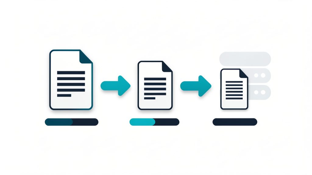
    A simple pipeline diagram showing two-step optimization: 1) 'Minification (removes whitespace/comments, shortens names)' applied to the code file, then 2) 'Compression (Gzip/Brotli)' applied at the server/network layer, with arrows and file-size bars indicating incremental size reduction at each step.

    These two methods are not competitors, they work best together. A minified file is already smaller before it reaches the server, and then compression can reduce it even further in transit. If you want better performance, using both is usually the right move.

    Why online tools appeal to non-technical users

    Not everyone wants to install Node.js, configure bundlers, or manage a command-line workflow just to optimize one JavaScript file. That is why online minifiers remain popular. They are fast, accessible, and useful for one-off tasks or lightweight projects.

    For freelancers updating client landing pages, marketers embedding scripts, or small teams maintaining a brochure site, an online tool can remove friction. Paste the code, click a button, copy the result, and publish the slimmer version. It is simple, and in many cases, that simplicity is exactly the point.

    Key Aspects of Minify js online

    Using an online JS minifier sounds straightforward, but there are important details that affect quality, reliability, and safety. The best results come from understanding what to expect from the tool and what trade-offs may come with convenience.

    Smaller file size and faster page loads

    The most obvious benefit of choosing to minify JS online is file size reduction. JavaScript written for humans tends to include indentation, comments, spacing, and descriptive variable names. All of that improves maintainability, but none of it is required for execution.

    When you minify the script, the browser downloads less data. That can shave milliseconds or more off the loading process, which matters more than many site owners realize. Performance is cumulative. A little improvement in one script, another in an image, and another in server caching can add up to a noticeably faster experience.

    This is especially valuable for mobile users. On high-speed desktop internet, a bulky script may feel acceptable. On a weaker connection, it becomes friction. Faster delivery can lead to better engagement, lower abandonment, and a smoother first impression.

    Cleaner delivery, not cleaner development

    A common misunderstanding is that minification is a way to improve the codebase itself. It is not. Minified JavaScript is harder to read, harder to debug, and unpleasant to maintain. Its purpose is delivery, not development.

    That means you should always keep the original, readable source file. Treat the minified output as a production asset, not as your working version. If something breaks later and the only version you have is minified, troubleshooting becomes far more difficult than it needs to be.

    Potential obfuscation, but not true security

    Some people assume minified code is protected code. That is only partly true, and not in a meaningful security sense. Minification can make JavaScript less pleasant to read at a glance, but it does not secure business logic, API keys, or sensitive operations.

    If confidential data or critical validation logic lives in client-side JavaScript, minification will not protect it. Browsers still receive the code, and determined users can still inspect it. Security must come from server-side design, authentication, authorization, and proper data handling, not from shrinking the script.

    Online convenience versus local control

    Online tools are convenient, but they come with trade-offs. When you paste code into a web-based tool, you are often sending that code through a third-party service. For public scripts or non-sensitive code, that may be acceptable. For proprietary client work, internal tools, or unreleased products, it may not be.

    This is where context matters. If you are minifying a simple front-end helper for a small website, an online tool is usually fine. If you are handling commercial code, scripts with tokens, or anything confidential, a local build process may be safer.

    The choice is not about which option is universally better. It is about matching the tool to the risk level and workflow.

    Minification and debugging

    One reason developers hesitate to minify too early is debugging. A readable source file makes it much easier to find syntax issues, inspect logic, and diagnose browser errors. Once code is minified, line numbers often collapse and stack traces become less intuitive.

    That is why the timing of minification matters. You should test the original version first, confirm it works, and only then create the minified build. If a problem appears after minification, compare the production file to the tested source and verify that no unsupported syntax or formatting issue crept in.

    Typical features of online JS minifiers

    Not all online tools do the exact same job. Some only remove whitespace and comments. Others perform more advanced optimizations, such as shortening variable names, collapsing expressions, or warning about syntax issues.

    If you are a casual user, basic functionality may be enough. If you are optimizing larger scripts or trying to squeeze out better performance, advanced options can make a measurable difference.

    How to Get Started with Minify js online

    The good news is that getting started is easy. The better news is that doing it well does not require much extra effort. A smart process helps you get the benefits of minification without introducing avoidable bugs.

    Start with a clean, tested JavaScript file

    Before you minify anything, make sure your original JavaScript works exactly as intended. This sounds obvious, but many users discover errors only after minification and assume the tool caused the issue. In reality, minification often exposes an existing problem, such as a missing semicolon in older code patterns, malformed syntax, or hidden formatting mistakes.

    Work from a readable source file that you have already tested in the browser. Keep that original version saved separately. If you are editing scripts for a client, preserve a backup before making any production changes.

    Use a simple workflow

    A reliable online minification workflow can be very short:

    1. Paste or upload your tested JavaScript into the online minifier.
    2. Run the minification and review the output for obvious issues.
    3. Replace or save the production version, then test it on your live or staging page.

    That is enough for many small projects. The key is not the complexity of the process, but the discipline of testing before and after.

    Check browser behavior after minification

    Once you publish the minified file, load the pages that depend on it and actually use the features involved. Click the menu. Submit the form. Open the modal. Trigger the slider. Watch for console errors and broken interactions.

    Minification should preserve behavior, but website environments are messy. Scripts can conflict, load in the wrong order, or depend on external libraries. If something changes after deployment, do not assume the minifier is inherently broken. Compare versions, check dependencies, and verify that file references are correct.

    Be careful with third-party or already minified files

    Many libraries already ship with a .min.js version. If you try to minify an already minified file again, you may not gain much, and you might make debugging harder. In some cases, aggressive reprocessing can even create avoidable issues depending on the tool and the script.

    If you are using common libraries, check whether an official minified build already exists. That version is often the safest production choice because it was generated and tested by the library maintainers.

    Know when online minification is enough

    For a small brochure site, a single landing page, a lightweight portfolio, or a few custom scripts, using an online tool to minify JS online is often all you need. It is quick, free, and low-friction.

    But once your project grows, your workflow may need to evolve. If you are managing multiple files, transpiling modern JavaScript, bundling dependencies, or deploying frequently, manual online minification becomes less practical. At that point, build tools such as bundlers, task runners, or CI-based workflows offer better consistency.

    This is not a reason to avoid online minifiers. It is simply a reminder that the right tool depends on the stage of the project.

    Practical signs you should switch to a local workflow

    An online tool is ideal when speed and simplicity matter most. A local or automated workflow starts making more sense when you notice repeatable friction. That usually happens when you are editing several JavaScript files each week, versioning production assets, or collaborating with other developers who need a predictable build process.

    Here is a quick comparison to help frame the decision:

    Situation Online JS Minifier Local Build Tool
    One or two files Excellent fit Possible, but more setup
    Non-technical user Easy to use Can feel complex
    Frequent deployments Repetitive Efficient
    Sensitive or proprietary code Less ideal Better control
    Team collaboration Limited Stronger workflow
    Advanced optimization Moderate Best option

    For many readers, the sweet spot is simple: use online minification for lightweight tasks, and graduate to local automation when your process starts repeating itself.

    Common mistakes to avoid

    One of the biggest mistakes is overwriting the original source file with the minified one. It saves a moment now and creates headaches later. Always keep your readable version. Future edits should happen there, not in the compressed file.

    Another frequent issue is minifying code that has not been tested in isolation. If you are copying snippets from plugins, forums, or mixed project files, syntax problems can slip through unnoticed. Minification is not a substitute for validation. It is the last polish before delivery.

    There is also a privacy mistake that many users do not think about. If your JavaScript contains tokens, endpoint details, client-specific logic, or unpublished features, pasting it into an online tool may not be appropriate. Convenience should not override basic caution.

    How minification supports SEO and user experience

    While JavaScript minification is not a magic SEO button, it contributes to the broader performance signals search engines care about. Faster pages tend to create better user experiences. Better user experiences can support stronger engagement. And technical efficiency helps reduce the drag that slows modern websites down.

    This matters even more on mobile-first websites. Search visibility is tied increasingly to real-world usability, not just keywords and metadata. If your pages feel sluggish because they rely on bloated scripts, that can affect both visitors and performance benchmarks.

    For small business websites, the value is practical. A faster site feels more professional. It reduces friction before a user calls, books, buys, or fills out a form. In many cases, the person visiting your site will never notice that your JavaScript was minified. They will only notice that the site feels quick and smooth. That is the outcome that matters.

    Conclusion

    Choosing to minify JS online is one of the simplest ways to make a website leaner without investing in a full development pipeline. It reduces unnecessary file weight, supports faster loading, and gives small teams and solo site owners a practical path to better front-end performance.

    Start with a tested source file, use an online minifier carefully, keep the original version untouched, and verify the result in a real browser. If your workflow stays small, that may be all you need. If your project grows, you can always move to a local build setup later. The next step is simple: take one JavaScript file from your site, minify it, test it, and measure the difference.