
JNTZN

Tag: performance

  • Step-by-Step Guide to Building a Developer Portfolio Website

    Step-by-Step Guide to Building a Developer Portfolio Website

    A developer portfolio can open doors before you ever speak to a recruiter, client, or hiring manager. It is often the first proof that you can build, communicate, and think like a professional. A weak portfolio gets skimmed and forgotten. A focused one creates trust in minutes.

    The good news is that building a developer portfolio website is not as complicated as many people assume. You do not need a flashy, animation-heavy homepage or weeks of design work. What you need is a clear structure, a few strong projects, clean presentation, and a site that loads fast and tells your story well.

    If you want to build a portfolio website step by step as a developer, this guide will walk you through the process from planning and structure to writing content, choosing tools, launching, and improving over time. The goal is not just to make a website that looks good. The goal is to create one that helps people understand what you can do and why they should contact you.

    What It Means to Build a Portfolio Website Step by Step as a Developer

    A developer portfolio website is a personal site that showcases your skills, projects, background, and professional identity. Think of it as a hybrid between a resume, a product demo, and a landing page for your career. It should answer a few core questions quickly: who you are, what kind of developer you are, what you have built, and how someone can work with or hire you.

    Many developers make the mistake of treating a portfolio like a scrapbook. They add every class project, every language they have touched, and a long list of technologies with no context. That approach usually creates noise, not credibility. A strong portfolio is curated. It highlights the most relevant work and explains it in a way that makes your value obvious.

    Building your portfolio step by step matters because it helps you make better decisions. Instead of jumping straight into templates, colors, and animations, you first define your audience and your message. Then you choose the structure, write content, build the site, optimize it, and publish it. This process leads to a portfolio that feels intentional rather than rushed.

    For developers, this site does double duty. It shows both your technical ability and your product thinking. Even simple choices, such as navigation, project descriptions, accessibility, performance, and mobile responsiveness, say something about how you build software. In that sense, your portfolio is itself a project.

    Key Aspects of Building a Developer Portfolio Website

    Start with the audience, not the design

    Before choosing a framework or a color palette, decide who the website is for. A freelance web developer trying to attract small business clients needs a different portfolio from a backend engineer applying to startups. The first may focus on outcomes, client communication, and service packages. The second may emphasize architecture, APIs, deployment, and engineering decisions.

    This affects everything from your homepage headline to the projects you feature. If your target audience is recruiters, clarity and speed matter most. If your target is clients, trust signals and business results become more important. If you want both, you need a portfolio that balances technical depth with simple explanations.

    When you understand the audience, the site becomes easier to build. You know what to include, what to leave out, and what tone to use. That is why the best portfolio websites feel clear. They are not trying to impress everyone.

    Focus on a simple structure that supports your goals

    A portfolio does not need ten pages. In most cases, a small, well-structured site performs better than a large one. Visitors usually scan quickly. They want to find key information without hunting through menus.

    A strong structure often includes these core sections:

    1. Home: A clear introduction, your role, and your value.
    2. Projects: A curated set of your best work with meaningful explanations.
    3. About: Your background, strengths, and what kind of work you enjoy.
    4. Contact: A simple way to reach you, plus links to GitHub and LinkedIn.

    If you have relevant writing, talks, open-source work, or a resume, those can be added thoughtfully. But the main experience should remain focused. Every page should support one central goal, helping the visitor understand your skills and take the next step.
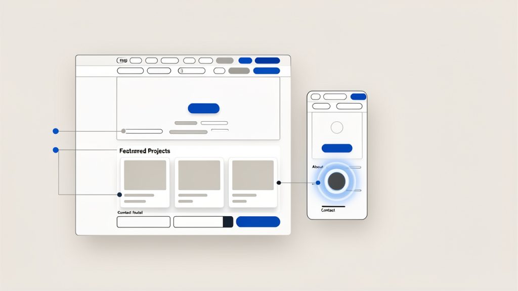
    A clean, minimal wireframe of a small portfolio site (desktop and mobile thumbnails) showing a top nav, hero section with headline and CTA, a 'Featured Projects' grid with 3 project cards, a compact 'About' block, and a 'Contact' footer. Labels annotate each area (Home, Projects, About, Contact) and a note: "one central goal per page."

    Your projects matter more than your tech stack list

    One of the most important parts of any guide on how to build a developer portfolio website step by step is project selection. Your projects are the strongest proof of your ability. A list of tools tells people what you have seen. Projects show what you can actually build.

    Choose two to five projects that represent your current level and direction. It is better to show three polished projects than twelve unfinished ones. Each project should explain the problem, your role, the tools used, the key decisions you made, and the result.

    This is where many portfolios fall short. Developers often link to a repository and expect the work to speak for itself. But most visitors will not read your code. They will read your explanation. A project description should help both technical and non-technical readers understand why the work matters.
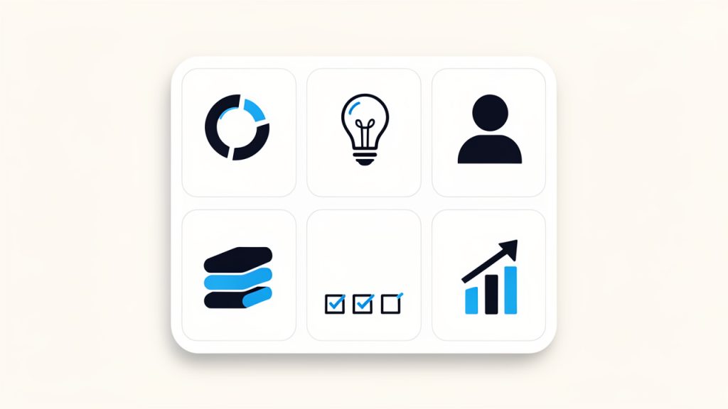
    A single project case-study card template divided into labeled sections: Challenge (problem statement icon), Solution (lightbulb/implementation), Role (person icon), Stack (tech icons or tag list), Key decisions (checkboxes), Result (metric or outcome). Keep layout compact so it can be reused for multiple projects.

    Good writing is part of good development

    Developers sometimes underestimate how much writing influences the effectiveness of a portfolio. Yet your words shape first impressions almost as much as the design does. A vague headline like “Passionate developer building innovative solutions” says almost nothing. A sharper line like “Frontend developer building fast, accessible interfaces for SaaS products” is specific and useful.

    The same applies to project descriptions, your about page, and calls to action. Clear writing signals clear thinking. It makes your technical work easier to trust. It also helps with search visibility, since relevant phrases around your niche, tools, and projects improve discoverability.

    If writing feels difficult, keep it simple. Describe what you built, why you built it, what challenges you solved, and what happened as a result. Use plain language. Avoid filler. The goal is not to sound impressive. The goal is to be understood.

    Design should support readability and trust

    A portfolio website does not need to win design awards. It needs to feel clean, modern, and easy to use. Visual hierarchy matters more than visual complexity. Typography, spacing, contrast, and consistency will do more for your site than fancy effects.

    Good portfolio design is often invisible. Visitors notice that it feels easy to scan, easy to navigate, and pleasant to read. That is exactly what you want. If your animations make the site harder to use, or your dark theme lowers readability, those choices hurt more than they help.

    Trust is also visual. A site with broken layouts, inconsistent spacing, cluttered sections, or obvious template leftovers makes people wonder how carefully you work. On the other hand, a calm and polished interface suggests discipline and professionalism.

    Performance, accessibility, and responsiveness are part of the portfolio

    Your portfolio is not just content. It is an example of your engineering standards. If the site is slow, inaccessible, or broken on mobile, visitors may assume your production work is similar.

    That is why performance and usability are not optional extras. Compress images, avoid unnecessary dependencies, use semantic HTML, and make sure the site works well on phones and tablets. Add descriptive alt text where appropriate. Use color contrast that supports readability. Test forms and links.

    These choices matter for users, and they also matter for credibility. A developer portfolio should demonstrate care. Even a simple static site can stand out if it is fast, accessible, and well-structured.

    Choose the right build approach for your goals

    There is no single correct tech stack for a portfolio. The best choice depends on your goals, time, and comfort level. Some developers want a fast launch with minimal maintenance. Others want the portfolio itself to showcase a modern stack.

    Approach Best For Pros Trade-offs
    Static HTML/CSS/JS Beginners, minimal portfolios Fast, lightweight, easy to host Less scalable for frequent content updates
    React or Next.js Frontend developers, modern app showcase Great for component-based design, flexible, strong ecosystem More setup and complexity
    Astro Content-focused portfolios with strong performance Excellent speed, modern workflow, low JS by default Smaller ecosystem than React
    Vue or Nuxt Developers already working in Vue Smooth developer experience, flexible architecture Slightly less common in portfolio tutorials
    Website builder or template platform Freelancers who need speed over customization Quick setup, low technical overhead Limited control, less technical showcase

    If you are early in your career, do not overthink the stack. A clean portfolio built with basic web technologies can outperform a half-finished site built with the latest framework. If you are applying for frontend roles, your stack can become part of the demonstration. But even then, usability matters more than novelty.

    How to Get Started with a Developer Portfolio Website

    Define the message before you write a single line of code

    Start by answering a few practical questions. What roles are you targeting? What type of work do you want more of? What are your strongest skills right now? Which projects best support that story?

    This exercise helps you avoid the common trap of building a generic site. For example, if you want full-stack roles, your featured projects should show both interface work and backend logic. If you want freelance work from small businesses, your messaging should emphasize outcomes, communication, reliability, and practical solutions.

    Once you know the message, write a simple positioning statement. It should explain who you are, what you build, and who you help. This line often becomes the core of your homepage hero section.

    Plan the content architecture

    Now sketch the structure of the site before building anything. Think of it as creating the skeleton before adding the skin. Decide what pages or sections you need, how navigation will work, and what each section should accomplish.

    A homepage should usually include a concise introduction, a snapshot of your best projects, a short skills section, and a clear call to action. Your projects page should make it easy to browse deeper. Your about page should add personality and context, not repeat your resume word for word.

    At this stage, it is useful to think like a visitor. If someone lands on your site and spends 90 seconds there, what should they learn? That question keeps the structure focused.

    Gather your assets and proof points

    Before development begins, collect everything you need. This includes project screenshots, live links, repository links, short summaries, your headshot if you plan to use one, social links, and your resume. Organizing this early makes the build process much smoother.

    Also gather evidence that strengthens your story. That might include GitHub contributions, measurable project outcomes, testimonials from clients or teammates, blog posts, certifications, or open-source activity. These are not mandatory, but they can add depth and trust when used selectively.

    Try to avoid empty claims. Saying you are “results-driven” means little unless the site shows actual results. Specific proof always beats generic adjectives.

    Build the core pages with clean, maintainable code

    If you are comfortable coding your own site, keep the first version lean. You can always expand later. Start with semantic markup, mobile-first layout decisions, and a reusable design system for spacing, type, buttons, and cards. A consistent system helps the site feel polished without requiring a complex visual design process.

    Here is a simple HTML starting point for a homepage structure:

    <!DOCTYPE html>
    <html lang="en">
    <head>
      <meta charset="UTF-8" />
      <meta name="viewport" content="width=device-width, initial-scale=1.0" />
      <meta name="description" content="Portfolio of Alex Kim, a full-stack developer building fast, scalable web applications." />
      <title>Alex Kim | Full-Stack Developer</title>
      <link rel="stylesheet" href="styles.css" />
    </head>
    <body>
      <header class="site-header">
        <nav>
          <a href="/" class="logo">Alex Kim</a>
          <ul>
            <li><a href="#projects">Projects</a></li>
            <li><a href="#about">About</a></li>
            <li><a href="#contact">Contact</a></li>
          </ul>
        </nav>
      </header>
    
      <main>
        <section class="hero">
          <h1>Full-stack developer building fast, user-focused web applications</h1>
          <p>I create modern web products with React, Node.js, and PostgreSQL, with a strong focus on performance and usability.</p>
          <a href="#projects">View Projects</a>
        </section>
    
        <section id="projects">
          <h2>Featured Projects</h2>
          <article>
            <h3>Project Name</h3>
            <p>A brief explanation of the problem, your solution, and the outcome.</p>
          </article>
        </section>
    
        <section id="about">
          <h2>About</h2>
          <p>I am a developer focused on building reliable, accessible products that solve real user problems.</p>
        </section>
    
        <section id="contact">
          <h2>Contact</h2>
          <p>Email me at <a href="mailto:alex@example.com">alex@example.com</a></p>
        </section>
      </main>
    </body>
    </html>
    

    This structure is intentionally simple. It covers the basics without distraction. Once the content is in place, you can improve the visual layer with CSS and, if necessary, add framework features such as routing, CMS integration, or component-based architecture.

    If you are using React, Next.js, Astro, or another framework, the same content principles still apply. Framework choice changes implementation, not the core strategy.

    Write project case studies, not just captions

    The strongest portfolio projects read like short case studies. They explain the challenge, your process, and the result. This tells readers how you think, not just what you made.

    For each featured project, cover a few essentials in compact form. Explain what problem the project solves. Clarify whether it was a personal build, freelance project, team product, or coursework. Mention the stack, but do not stop there. Include one or two key decisions that show engineering judgment. Then describe the outcome, even if the result is learning rather than business metrics.

    A simple structure works well: challenge, solution, stack, role, and result. You do not need to turn every project into a full essay. You just need enough context to make the work meaningful.

    Add SEO basics without making the writing awkward

    If you want your portfolio to be discoverable, basic SEO matters. This does not mean stuffing awkward phrases into every paragraph. It means using natural language around the topics people might search for, such as developer portfolio, frontend developer portfolio website, full-stack projects, JavaScript developer, or freelance web developer.

    Use a clear title tag and meta description for each page. Include descriptive headings. Give project pages meaningful names. If you write blog posts, choose topics related to your niche and technical expertise. Internal links between your home page, projects, and articles also help search engines understand the site.

    Search visibility grows over time when your content is useful and specific. A portfolio with thoughtful project write-ups often performs better than one with minimal text because search engines have more context to index.

    Make sure the site feels complete on mobile

    A surprising number of developer portfolios still look great on desktop and messy on phones. Since many recruiters, clients, and collaborators first view sites on mobile, this is a serious weakness.

    Responsive design is not just about shrinking elements. It is about preserving clarity. Headlines should remain readable, project cards should stack cleanly, navigation should stay simple, and touch targets should be easy to tap. Test on real devices if possible, not just browser tools.

    If your site feels effortless on mobile, visitors are more likely to explore. That extra minute of engagement can be the difference between a bounce and an inquiry.

    Deploy quickly and iterate in public

    Do not wait for the portfolio to feel perfect. Version one should be strong enough to publish, but not delayed by endless tweaks. Many developers spend weeks adjusting fonts and animations while their actual work remains hidden.

    Deploying early lets you learn faster. You can share the site with peers, mentors, or online communities and ask for direct feedback. Which projects feel strongest? Is the homepage message clear? Are there any confusing sections? This input often reveals blind spots that are hard to see alone.

    Modern deployment is easier than ever. Platforms like Vercel, Netlify, and GitHub Pages make it simple to host a portfolio, connect a custom domain, and push updates. A custom domain is especially worth getting because it makes your site feel more professional and easier to remember.

    Track what matters after launch

    A portfolio is not a one-time task. It is a living professional asset. After launch, pay attention to what is working. Which project links get clicked? Do visitors contact you after reading your home page, or after browsing a case study? Are people reaching your site through search, social media, or direct links?

    Simple analytics can help you refine the site. You may discover that one project consistently draws attention, which suggests expanding it into a deeper case study. You may notice visitors dropping off before reaching your contact section, which suggests improving page flow or calls to action.

    Regular updates matter too. Add stronger projects as your skills improve. Remove older work that no longer represents your level. Refresh your introduction if your focus changes. The best portfolios evolve with your career.

    Common Mistakes Developers Should Avoid

    Trying to impress with everything at once

    One of the fastest ways to weaken a portfolio is to overload it. Too many projects, too many colors, too many badges, too much jargon. Instead of looking advanced, the site feels unfocused.

    Restraint is a strength. When you choose only your best work and present it clearly, visitors can understand your value faster. That is what makes a portfolio effective.

    Writing generic copy that could belong to anyone

    If your homepage could be pasted onto a thousand other developer websites without anyone noticing, it is too generic. Statements like “I love solving problems with technology” are common because they feel safe. But safe copy is forgettable.

    Use specific language about what you build, what kind of problems you enjoy solving, and what tools or domains you work in. Specificity makes you memorable.

    Ignoring the business side of presentation

    Even if you are applying for technical roles, your portfolio still needs to communicate outcomes. What did your work improve? Speed, usability, conversions, maintainability, developer workflow, or customer experience? Outcomes help people connect your code to real value.

    This is especially important for freelancers. Clients often care less about the framework and more about whether you can deliver a website or product that helps their business. Your portfolio should meet them where they are.

    A Practical Launch Checklist

    Before publishing your first version, review these essentials:

    • Message clarity: Your homepage clearly states who you are and what kind of developer you are.
    • Project quality: You feature a small number of strong, relevant projects with context.
    • Contact path: Visitors can easily email you or find your professional profiles.
    • Mobile readiness: The site is easy to read and navigate on phones and tablets.
    • Performance basics: Images are optimized and pages load quickly.
    • Proofreading: Spelling, grammar, links, and button labels have been checked.

    This short checklist catches most of the issues that make a portfolio feel unfinished. It is not glamorous work, but it matters.

    Conclusion

    To build a portfolio website step by step as a developer, start with strategy before design. Know your audience, define your message, choose a focused structure, and present only your strongest work. Then build the site with clean code, clear writing, mobile responsiveness, and simple navigation. A good portfolio does not try to say everything. It says the right things well.

    Your next step is straightforward. Choose three projects, write one sharp homepage headline, and sketch the first version of your site today. Publish a simple version sooner than feels comfortable, then improve it as your skills and goals evolve. A live portfolio that clearly shows your value will do more for your career than a perfect draft sitting unfinished on your laptop.

  • How to Prepare for Common Frontend Interview Questions

    How to Prepare for Common Frontend Interview Questions

    Frontend interviews can feel deceptively simple. You look at the job description, see familiar words like HTML, CSS, JavaScript, React, and assume a few review sessions will be enough.

    Then the interview starts, and suddenly you are asked to explain event delegation, compare == and === (MDN), discuss rendering performance, or build a component while narrating your decisions in real time.

    That gap between knowing frontend development and being able to answer common frontend interview questions clearly is what trips up many candidates. Interviewers are rarely checking only whether you have memorized definitions. They want to see how you think, how you prioritize, how you debug, and whether you understand the trade-offs behind the tools you use every day.

    If you want to prepare for common questions in frontend interviews, the smartest approach is not endless cramming, it is structured preparation. You need a clear understanding of the topics that appear most often, the reasoning interviewers expect, and a repeatable way to practice. Once you do that, interviews become much less unpredictable and much more manageable.

    What It Means to Prepare for Common Frontend Interview Questions

    Preparing for frontend interviews is not just about collecting a giant list of questions and trying to memorize perfect answers. It is about building fluency across the core areas of frontend work. That usually includes HTML semantics, CSS layout, specificity, JavaScript fundamentals, browser behavior, accessibility, performance, frameworks, testing, and practical problem-solving.

    A good frontend interview often blends theory with real-world scenarios. One moment you may be asked what semantic HTML is, and the next you may need to explain why a page feels slow, how to improve a component’s accessibility, or what happens when a browser parses a script. In that sense, preparation is less like studying flashcards, and more like training for a conversation where your technical judgment matters.

    When candidates search for how to prepare for frontend interview questions, they usually mean learning to answer with both accuracy and context. For example, it is not enough to say that Flexbox is for one-dimensional layouts and Grid is for two-dimensional layouts. A stronger answer explains when each is more maintainable, how browser support factors in less today than in the past, and why choosing the right layout model reduces future complexity.

    What Interviewers Are Actually Evaluating

    Frontend interviewers are usually looking at several things at once. They care about technical correctness, but they also care about communication. If you know the answer but explain it in a confusing way, that can weaken your performance. If you make a small mistake but reason through it well, that can actually help.

    They also want to know whether your knowledge is shallow or durable. Someone who has only memorized terms often struggles when a question is reframed. Someone who understands the underlying concept can still answer when the exact wording changes. That is why interview preparation should focus on patterns, not just scripts.

    Another important factor is practical awareness. Modern frontend work is not isolated coding, it touches user experience, collaboration, performance, maintainability, and cross-browser behavior. The best answers often reflect that broader understanding.

    Key Aspects of Preparing for Frontend Interviews

    Master the Core Frontend Foundations

    The most common frontend interview questions still revolve around the basics. That surprises some candidates, especially those who have spent most of their time inside a framework. But strong frontend teams know that frameworks change, while the foundations remain essential.

    With HTML, expect questions about semantic elements, document structure, forms, accessibility, and SEO implications. Interviewers may ask why a <button> is better than a clickable <div>, or how proper heading hierarchy improves both usability and page structure. These questions sound basic, but they reveal whether you understand the web as a platform, not just as a canvas for components.

    With CSS, common questions often focus on the box model, positioning, specificity, inheritance, stacking context, Flexbox, Grid, responsive design, and layout debugging. Many interviewers also like scenario-based prompts, such as how you would center an element, build a responsive card layout, or prevent layout shifts. Strong answers connect CSS choices to maintainability and user experience, not just visual output.

    With JavaScript, the scope gets wider. You may be asked about data types, closures, scope, hoisting, promises, the event loop, asynchronous programming, prototypes, this, array methods, immutability, and DOM manipulation. This is often where candidates feel the most pressure because JavaScript questions can move from beginner-friendly to deeply conceptual very quickly.

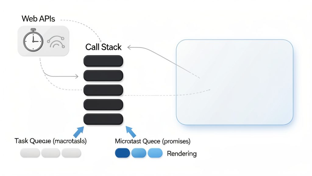
    Simplified event loop diagram: display the Call Stack, Web APIs (timers, XHR), Task Queue (macrotasks), Microtask Queue (promises), and the Rendering step. Use arrows to show how functions go to the Call Stack, async callbacks move to queues, microtasks drain before rendering, and rendering happens when the stack is empty.

    Understand Browser Behavior, Not Just Syntax

    A frontend developer works in the browser, so interviewers often test whether you understand how the environment behaves. This includes rendering, repaint versus reflow, caching, parsing, script loading, and how the DOM and CSSOM interact. You do not need to answer like a browser engineer, but you should understand enough to explain common performance and behavior issues.

    For example, if asked why a page is slow, a strong candidate might talk about oversized bundles, too many render-blocking resources, expensive DOM updates, unnecessary re-renders, image optimization, and network latency. That answer shows applied thinking. It turns abstract knowledge into practical diagnosis.

    The same is true for accessibility. Interviewers increasingly ask about keyboard navigation, ARIA usage, color contrast, focus management, and screen reader support. Accessibility is no longer a nice extra, it is part of competent frontend engineering. If you can explain how semantic HTML reduces the need for excessive ARIA, you already sound more experienced.

    Be Ready for Framework-Specific Questions

    If the role mentions React, Vue, Angular, or another framework, expect interview questions tailored to that ecosystem. In React interviews, for example, common topics include component lifecycle, hooks, state management, props, controlled versus uncontrolled inputs, memoization, reconciliation, and rendering behavior.

    The mistake many candidates make is answering framework questions as if they are reciting documentation. Interviewers usually want to know how you use the framework to solve problems. If asked about useEffect, a better answer goes beyond syntax. Explain when to use it, when not to use it, how dependencies affect execution, and what kinds of bugs can happen if it is misused.

    Framework knowledge is strongest when tied back to the underlying platform. A candidate who understands both React and the DOM often performs better than a candidate who only knows React patterns in isolation.

    Expect Practical Coding and Debugging Questions

    Not every frontend interview includes a live coding exercise, but many do. The task may be small, such as building a search filter, implementing a debounce function, or styling a responsive component. Sometimes the challenge is less about finishing and more about showing your approach.

    Interviewers pay attention to how you break down the problem, how you name things, whether you consider edge cases, and how you recover when something goes wrong. In frontend roles especially, debugging is often just as important as writing new code. You may be given a broken UI and asked to identify the issue, or shown a piece of code and asked how you would improve it.

    That means your preparation should include speaking while coding. Silent competence can be hard for an interviewer to evaluate. Clear reasoning, even when imperfect, often creates a stronger impression than a flawless but unexplained solution.

    Prepare for Behavioral Questions with a Frontend Lens

    Frontend interviews are not purely technical. You will likely be asked about collaboration, feedback, deadlines, and trade-offs. These questions matter because frontend developers frequently work across design, product, backend, QA, and support teams.

    A generic answer about teamwork is usually weak. A stronger answer uses frontend-specific situations. For instance, you might describe how you handled conflicting design requirements, advocated for accessibility despite time pressure, or improved performance without disrupting the release schedule. This shows maturity and real-world experience.

    Behavioral questions also reveal how you handle constraints. Frontend work often involves balancing ideal solutions with practical timelines. Employers want people who can make thoughtful decisions under real conditions.

    Common Frontend Interview Questions You Should Be Able to Answer

    The exact questions vary, but some themes appear again and again. The table below shows a practical way to think about them.

    Topic Area Common Question What Interviewers Want to Hear
    HTML What is semantic HTML and why does it matter? Understanding of structure, accessibility, maintainability, and SEO
    CSS What is the difference between Flexbox and Grid? Clear explanation of layout use cases and trade-offs
    CSS How does specificity work? Ability to reason about style conflicts and maintainable CSS
    JavaScript What is a closure? Conceptual understanding plus a practical use case
    JavaScript Explain the event loop Awareness of async execution, call stack, task queues
    JavaScript Difference between == and === Type coercion knowledge and safe comparison habits
    Browser What causes reflow and repaint? Performance awareness and rendering cost understanding
    Accessibility How do you make a component accessible? Semantic markup, keyboard support, focus states, ARIA when needed
    React What is the difference between state and props? Core component model understanding
    React When would you use useEffect? Ability to explain side effects and dependency management
    Performance How would you optimize a slow frontend app? Structured thinking across network, rendering, code splitting, assets
    Testing What should be tested in a frontend app? Balanced view of unit, integration, and user-focused testing

    You do not need a rehearsed speech for every question. What you need is a reliable answer framework. Start with a concise definition. Then explain why it matters. Then give a practical example. That structure works across a huge range of interview topics.

    For instance, with closures, define the concept simply. Then explain that closures allow a function to retain access to variables from its outer scope. Finally, mention real uses such as data privacy, event handlers, or factory functions. That format feels natural and demonstrates actual understanding.

    How to Build Better Answers Instead of Memorizing Scripts

    Use the Definition, Context, Example Method

    A common reason candidates freeze is that they try to remember the perfect wording. That rarely works under pressure. A better method is to build answers in three parts, definition, context, and example.

    The definition proves you know the concept. The context shows why it matters in frontend work. The example makes the answer concrete. This is much easier to recall than a rigid paragraph, and it sounds more human in conversation.

    Take event delegation as an example. You can define it as attaching a single event listener to a parent element to handle events from child elements through bubbling. Then give context by explaining that it helps with performance and dynamic content. Then share an example like handling clicks in a list where items are added later. That answer is both technical and practical.

    Diagram showing event delegation: a parent container with a single click listener and several child items. Arrows illustrate an event originating on a child, bubbling up to the parent listener; include labels for 'event target', 'event currentTarget (listener)', and 'bubbling phase'. Optional small inset shows how adding/removing child items doesn't require attaching new listeners.

    Practice Explaining Trade-Offs

    Senior and mid-level frontend interviews often become more interesting when trade-offs enter the conversation. It is one thing to define server-side rendering, it is another to explain when it helps, when it adds complexity, and what kinds of applications benefit most.

    Trade-off thinking is a strong signal of real experience. It shows that you do not treat tools as magic. You understand that every choice affects maintainability, performance, developer experience, and user outcomes. If you can explain why one solution is appropriate in one case but excessive in another, your answers become much more credible.

    This applies to styling strategies, state management, testing approaches, and optimization techniques. Mature frontend engineering is rarely about one universally correct answer, it is about making informed decisions under constraints.

    How to Get Started with Frontend Interview Preparation

    The most effective way to prepare for common frontend interview questions is to create a focused study plan. Random review sessions often feel productive, but they leave major gaps. A better approach is to separate your preparation into core foundations, framework knowledge, coding practice, and communication.

    Start by identifying the role level and stack. If you are interviewing for a junior frontend role, the emphasis may be on HTML, CSS, JavaScript fundamentals, and simple component work. If you are interviewing for a mid-level or senior role, expect deeper questions about architecture, performance, testing, accessibility, and collaboration.

    Then review the fundamentals in a deliberate order. HTML and accessibility first, then CSS and layouts, then JavaScript concepts, then browser behavior, then your framework. That sequence works because it mirrors how frontend applications are actually built. It also helps you connect higher-level abstractions back to the platform underneath.

    A Simple Preparation Routine

    If you need a starting point, keep it compact and repeatable:

    1. Review one core topic daily, such as closures, Flexbox, semantic HTML, or React state.
    2. Answer 3 to 5 common interview questions out loud without reading notes.
    3. Solve one small coding or debugging problem related to frontend work.
    4. Refine one weak answer by adding context and a real example.

    This kind of routine works because it combines recall, explanation, and practical application. It also exposes weak spots quickly. If you cannot explain something simply, you probably do not know it as well as you think.

    Practice Out Loud, Not Only in Your Head

    This step is often overlooked. Reading articles and watching videos can create the illusion of readiness, but interviews are verbal. You need to hear yourself explain concepts. That is how you notice where your answer is vague, rambling, or too abstract.

    Practicing aloud also improves pacing. Many candidates know the material but answer too quickly, too defensively, or with too much jargon. When you rehearse speaking, you become more comfortable giving concise and structured responses. That alone can significantly improve interview performance.

    If possible, do mock interviews with another developer. If not, record yourself. It may feel awkward, but it is one of the fastest ways to improve clarity and confidence.

    Use Projects as Proof of Understanding

    One of the best ways to prepare for frontend interviews and the common questions that come with them is to revisit your own work. Your projects are evidence. They give you real examples for technical and behavioral answers, and they help you move beyond textbook responses.

    If an interviewer asks about performance optimization, it is much stronger to describe how you reduced bundle size, lazy-loaded components, or fixed unnecessary re-renders in a real project. If asked about accessibility, you can discuss keyboard navigation, semantic markup, or screen reader improvements you actually implemented.

    Before any interview, review two or three projects you know well. Be ready to explain the architecture, the challenges, the trade-offs, the bugs, and what you would improve. These stories are often more memorable than polished definitions.

    Know the Difference Between Not Knowing and Panicking

    Even strong candidates get questions they cannot fully answer. What matters is how you respond. Interviewers usually do not expect perfection. They expect thoughtfulness, honesty, and the ability to reason from what you do know.

    If you are unsure, start with the part you understand. Clarify the question if needed. Think aloud. Relate it to a nearby concept. That approach is much better than guessing wildly or going silent. Frontend work constantly involves ambiguity, so calm reasoning under uncertainty is itself a valuable skill.

    Mistakes That Hurt Frontend Interview Performance

    One frequent mistake is over-focusing on framework trivia while neglecting core web fundamentals. A candidate may know many React hooks but struggle to explain form behavior, CSS positioning, or the event loop. That imbalance becomes obvious quickly.

    Another issue is giving answers that are technically correct but disconnected from real frontend work. Interviewers are usually not impressed by memorized definitions alone. They want relevance. Explain why the concept matters in a product, a team, or a user experience.

    Candidates also hurt themselves when they rush into coding without clarifying the problem. In frontend interviews, requirements matter. Responsive behavior, accessibility, edge cases, and user interaction details often matter just as much as raw implementation speed. A few thoughtful questions at the start can make your solution much stronger.

    Final Thoughts and Your Next Step

    To prepare for common questions in frontend interviews, focus on understanding rather than memorization. Build confidence in the fundamentals, connect concepts to real browser behavior, practice framework-specific topics in context, and get comfortable explaining your reasoning out loud. That combination is what turns scattered knowledge into interview readiness.

    Your next step is simple. Pick the top ten frontend interview questions most relevant to your target role, answer each one aloud using the definition, context, example format, and refine the weak spots. Do that consistently for a week, and your interviews will start to feel less like a test and more like a conversation you are ready to lead.

  • Mobile Detection in JavaScript — Capability-First

    Mobile Detection in JavaScript — Capability-First

    Mobile users now make up a huge share of web traffic, yet many sites still handle mobile detection on JavaScript poorly. The result is familiar, slow-loading pages, broken touch interactions, unnecessary popups, or features that behave differently on phones and tablets than they do on desktops. For developers, freelancers, and small business owners trying to build practical, fast web experiences, this is not a minor detail. It directly affects usability, conversion, and customer trust.

    The tricky part is that mobile detection on JavaScript is not a single technique. It can mean checking screen size, reading the user agent, detecting touch capability, or observing feature support in the browser. Each method solves a different problem, and each has limitations. The best approach is usually not to ask, “Is this a mobile device?” but rather, “What capabilities does this device and browser actually have?”

    What is Mobile detection on javascript?

    At its core, mobile detection on JavaScript is the process of identifying whether a visitor is likely using a mobile device, and sometimes what kind of mobile environment they are using. This information can be used to adapt navigation, optimize interactions, load lighter assets, adjust layouts, or tweak behaviors for touch-first use cases.

    Many people assume this is as simple as checking if the screen is small. In practice, it is more nuanced. A small browser window on a desktop is not the same as a phone. A large tablet can have a screen wider than some laptops. A foldable device may change shape while the user is interacting with your app. JavaScript can help detect these situations, but only when you understand what signal you are actually measuring.

    The older style of mobile detection relied heavily on the user agent string, which is a text identifier sent by the browser. For years, developers parsed this string to guess whether the device was an iPhone, Android phone, iPad, or desktop browser. That method still exists, but it is less reliable than it used to be. Browsers increasingly reduce or standardize user agent data for privacy and compatibility reasons. See more about the user agent string on MDN: user agent string.

    Modern front-end development leans more toward responsive design and feature detection. Instead of making broad assumptions about device category, developers use CSS media queries and JavaScript checks to respond to viewport size, touch support, orientation, pointer type, network conditions, or browser features. This produces more resilient applications and reduces edge-case failures.

    Why developers still use mobile detection

    Even though responsive design handles much of the layout work, there are still practical reasons to detect mobile contexts with JavaScript. A business website might want to simplify a complex pricing table on smaller viewports. A booking app may switch from hover-driven interactions to tap-based controls. A dashboard could delay nonessential scripts for users on constrained mobile connections.

    There is also a performance angle. If you know a user is likely on a mobile environment, you may choose to lazy-load high-resolution media, compress interactions, or avoid expensive animations. That does not mean serving a lesser experience. It means serving a more appropriate one.

    Device detection versus capability detection

    This distinction matters. Device detection tries to answer what the device is. Capability detection tries to answer what the browser can do. If your goal is to improve usability, capability detection is usually safer.

    For example, if you want to know whether to show hover-based tooltips, checking for a “mobile” user agent is a weak solution. A better approach is to ask whether the device has a fine pointer or supports hover. That is a capability question, and JavaScript can work with those signals more effectively than a broad mobile label.

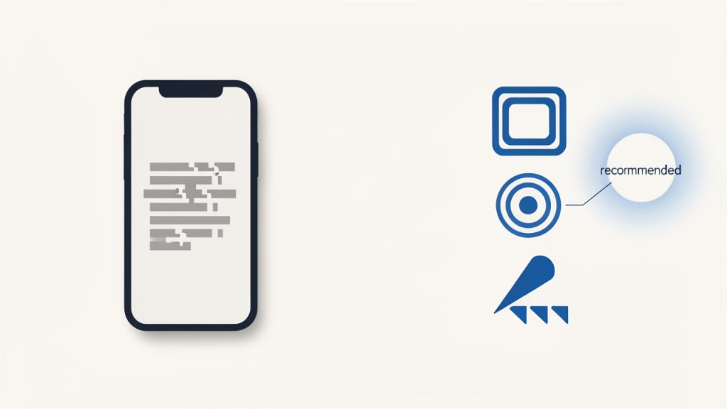
    Side-by-side comparison showing device detection vs capability detection

    Key Aspects of Mobile detection on javascript

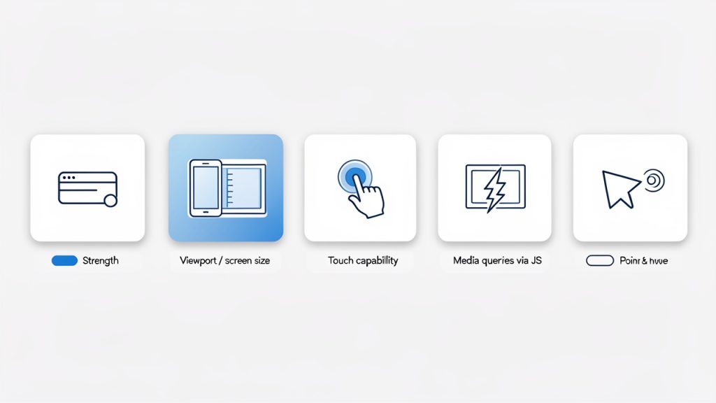
    Infographic showing main detection methods as tiles: User agent, Viewport, Touch, Media queries, Pointer & hover

    To make smart decisions, you need to understand the main detection methods and what they are good at. No single method is perfect, so the strength comes from using the right tool for the right job.

    User agent detection

    User agent detection is still widely used because it is simple and familiar. In JavaScript, developers often inspect navigator.userAgent and search for markers like Android, iPhone, or iPad.

    function isMobileByUserAgent() {
      return /Android|iPhone|iPad|iPod|Opera Mini|IEMobile|WPDesktop/i.test(
        navigator.userAgent
      );
    }
    
    console.log(isMobileByUserAgent());
    

    This approach can work for quick heuristics, especially in legacy codebases or analytics scripts. It is also helpful when you need rough categorization for known device families.

    The downside is reliability. User agent strings can be spoofed, changed, or normalized across browsers. They are not future-proof, and they often break when new devices appear. If your business logic depends heavily on them, maintenance becomes painful.

    Viewport and screen size detection

    A more common pattern is to detect the viewport width and adapt behavior accordingly. This aligns closely with responsive web design and often matches what users actually experience on screen.

    function isSmallViewport() {
      return window.innerWidth <= 768;
    }
    
    console.log(isSmallViewport());
    

    This is useful when your concern is layout or available screen real estate. If a side menu should collapse below a certain width, viewport detection is a perfectly reasonable solution.

    Still, it is important to be precise about what this means. It does not tell you whether the user is on a phone. It only tells you the current viewport is small. A resized desktop browser may trigger the same result. For many interface decisions, that is fine. For device classification, it is not enough.

    Touch capability detection

    Some developers equate touch support with mobile usage, but that shortcut can be misleading. Many laptops support touch, and some mobile browsers may behave differently than expected. Even so, touch capability is still valuable when your interface needs different gestures or controls.

    function supportsTouch() {
      return (
        'ontouchstart' in window ||
        navigator.maxTouchPoints > 0 ||
        navigator.msMaxTouchPoints > 0
      );
    }
    
    console.log(supportsTouch());
    

    This works best when you are answering a specific interaction question. If you need bigger tap targets, swipe gestures, or drag behavior tuned for touch, this check can help. If you are trying to decide whether the visitor is “mobile,” it is too broad on its own.

    Media queries in JavaScript

    JavaScript can also read the same kinds of conditions used in CSS media queries. This is often one of the cleanest ways to align styling and scripting logic.

    const mobileQuery = window.matchMedia('(max-width: 768px)');
    
    function handleViewportChange(e) {
      if (e.matches) {
        console.log('Likely mobile-sized viewport');
      } else {
        console.log('Larger viewport');
      }
    }
    
    handleViewportChange(mobileQuery);
    mobileQuery.addEventListener('change', handleViewportChange);
    

    This approach is especially useful when your UI changes dynamically. A user may rotate a phone, resize a browser, or move between split-screen modes. Media-query-based detection lets your scripts respond in real time instead of assuming the device state never changes.

    Pointer and hover detection

    A more modern and often overlooked strategy is checking input behavior. This matters because many mobile-specific UX issues are actually input issues.

    const hasCoarsePointer = window.matchMedia('(pointer: coarse)').matches;
    const supportsHover = window.matchMedia('(hover: hover)').matches;
    
    console.log({ hasCoarsePointer, supportsHover });
    

    A coarse pointer usually indicates finger-based interaction, while hover support tends to correlate with mouse or trackpad use. This is often more useful than broad mobile detection when deciding how menus, tooltips, and interactive controls should behave.

    Comparing common approaches

    The most effective mobile detection strategy depends on the question you are asking. The table below shows where each method fits best.

    Method Best For Strengths Limitations
    User agent detection, Rough device categorization Rough device categorization Simple, familiar, quick to implement Fragile, spoofable, less future-proof
    Viewport width, Layout and responsive behavior Layout and responsive behavior Matches screen space, easy to maintain Does not identify actual device type
    Touch detection, Touch-specific interactions Touch-specific interactions Good for gesture and tap-related logic Touch does not always mean mobile
    Media queries via JavaScript, Dynamic responsive behavior Dynamic responsive behavior Syncs with CSS logic, reacts to changes Still focused on conditions, not device identity
    Pointer and hover detection, Input-specific UX adjustments Input-specific UX adjustments Excellent for interaction design Not a complete mobile classification system

    Why “mobile” is often the wrong target

    One of the biggest mistakes in JavaScript mobile detection is treating all phones and tablets as a single category. A modern flagship phone on a fast connection can outperform an old desktop machine in some tasks. A tablet with a keyboard may behave more like a laptop than a phone. A foldable device can switch from narrow to wide layouts instantly.

    That is why a context-first approach works better. If you need to adapt layout, use viewport logic. If you need to adjust interactions, use pointer and hover detection. If you need to reduce heavy effects on constrained devices, combine feature and performance signals. This gives you fewer false assumptions and a cleaner architecture.

    How to Get Started with Mobile detection on javascript

    The easiest way to begin is to stop chasing a perfect definition of mobile and instead define the exact behavior you want to change. That framing simplifies the implementation. You are no longer trying to identify every possible device. You are solving a specific user experience problem.

    For example, if your navigation breaks on touch-first devices, focus on pointer and touch detection. If your content feels cramped on smaller screens, focus on viewport-based logic. If a third-party script causes slowdowns on smaller devices, focus on screen width, network-aware loading, and progressive enhancement.

    Start with responsive design first

    Before writing JavaScript detection logic, make sure your layout is already responsive with CSS. In many cases, CSS media queries solve the problem more elegantly than JavaScript. Mobile detection on JavaScript should usually support behavior, not replace responsive design.

    When the visual layout and spacing are already responsive, your JavaScript becomes lighter and more intentional. You only add device-aware logic where interaction, performance, or conditional loading truly requires it.

    Use feature detection for behavior changes

    If the goal is to change how an interface behaves, feature detection is usually the right starting point. This means checking whether the browser supports a capability rather than trying to infer it from the device label. See more on feature detection: feature detection.

    Here is a practical example that adapts a menu interaction based on hover support:

    const canHover = window.matchMedia('(hover: hover)').matches;
    
    const menuButton = document.querySelector('.menu-button');
    const menu = document.querySelector('.menu');
    
    if (canHover) {
      menuButton.addEventListener('mouseenter', () => {
        menu.classList.add('open');
      });
    
      menuButton.addEventListener('mouseleave', () => {
        menu.classList.remove('open');
      });
    } else {
      menuButton.addEventListener('click', () => {
        menu.classList.toggle('open');
      });
    }
    

    This is a strong pattern because it adapts to how the user interacts, not what device name they happen to use. A touch laptop and a phone may both avoid hover-dependent logic, while a desktop browser keeps the richer mouse-friendly behavior.

    Combine signals when necessary

    Sometimes one signal is not enough. If you need to make a broader guess about mobile usage, combining checks can improve accuracy without pretending you have certainty.

    function isLikelyMobile() {
      const smallScreen = window.matchMedia('(max-width: 768px)').matches;
      const coarsePointer = window.matchMedia('(pointer: coarse)').matches;
      const mobileUA = /Android|iPhone|iPad|iPod|Opera Mini|IEMobile|WPDesktop/i.test(
        navigator.userAgent
      );
    
      return smallScreen && (coarsePointer || mobileUA);
    }
    
    console.log(isLikelyMobile());
    

    This still should not be used as a hard security or business-critical rule. It is a heuristic. For UI tuning, though, it can be practical when you need a fallback category for analytics or lightweight experience adjustments.

    Watch for resize and orientation changes

    One common mistake is checking once on page load and never updating again. Mobile conditions can change while the page is open. Orientation changes, split-screen apps, foldable devices, and browser resizing all affect the environment.

    function updateDeviceState() {
      const mobileSized = window.matchMedia('(max-width: 768px)').matches;
      document.body.classList.toggle('mobile-sized', mobileSized);
    }
    
    window.addEventListener('resize', updateDeviceState);
    window.addEventListener('orientationchange', updateDeviceState);
    updateDeviceState();
    

    This kind of event-based update keeps your interface aligned with the current context. It is especially important for dashboards, web apps, booking systems, and tools that remain open for long sessions.

    Avoid common implementation mistakes

    The first mistake is using user agent detection as the only source of truth. It feels convenient, but it creates hidden bugs over time. The second is using mobile detection to gate essential content. Users should not lose core functionality because your script guessed wrong.

    Another common issue is overengineering. Not every site needs a complex device detection layer. If your goal is simply to stack cards on smaller screens or enlarge tap areas, CSS and a few targeted JavaScript checks are enough. Keep the logic tied to actual product needs.

    A practical setup for most websites

    For many business sites and web apps, a sensible approach looks like this:

    1. Use CSS media queries for layout and spacing.
    2. Use matchMedia() in JavaScript for behavior tied to viewport or input type.
    3. Use feature detection for touch, hover, or pointer-related interactions.
    4. Use user agent checks sparingly for edge cases or analytics, not as your main strategy.

    That workflow gives you flexibility without making your front end brittle. It is also easier to test, explain, and maintain across projects.

    Testing your mobile detection logic

    Testing matters because mobile detection bugs often hide in edge cases. A page can seem fine in a desktop browser resized to phone width, then behave differently on an actual device with touch input and browser chrome.

    Use browser developer tools for quick viewport checks, but also test on real phones and tablets whenever possible. Pay attention to orientation changes, keyboard overlays, tap behavior, hover states, and performance under slower conditions. If your site serves customers, not just developers, these details shape the user experience more than the detection method itself.

    Conclusion

    Mobile detection on JavaScript is less about identifying a perfect device category and more about choosing the right signal for the job. User agent detection can still help in limited cases, but modern development works better when you focus on viewport size, feature support, touch capability, and input behavior. That approach is more resilient, more accurate for UX decisions, and easier to maintain.

    The next step is simple. Review one part of your site that behaves differently on phones, such as navigation, forms, media, or interactive widgets. Then ask what you really need to detect: screen space, touch, hover, or a rough mobile heuristic. Once you answer that clearly, your JavaScript becomes cleaner, and your users get a smoother experience on every device.