JNTZN

Tag: responsive-design

  • Modern CSS Grid: A Practical Layout Tutorial

    CSS Grid changed front-end layout from a pile of hacks into a system. If you have ever fought with floats, nested flex containers, awkward percentage widths, or fragile media queries, Grid is the reset button. It gives you a way to design two-dimensional layouts that are clean, predictable, and much easier to maintain.

    This guide is a practical tutorial on modern CSS Grid layout techniques for developers, freelancers, and site owners who want layouts that look professional without becoming hard to manage. You will learn what Grid is, why it matters in modern responsive design, and how to start using it in real projects with confidence.

    What a Modern CSS Grid Layout Tutorial Really Covers

    A modern CSS Grid layout tutorial is not just a list of properties. It is an explanation of how to think in rows, columns, tracks, gaps, and placement rules instead of relying on old layout workarounds. Grid is a browser-native layout system built specifically for arranging content in two dimensions, which means you can control horizontal and vertical structure at the same time.

    That matters because many page layouts are naturally two-dimensional. A dashboard, pricing section, gallery, magazine-style homepage, or admin panel usually needs both row and column control. Flexbox is excellent for one-dimensional alignment, such as laying items in a single row or column. Grid steps in when the structure itself needs to be more deliberate.

    In practical terms, Grid lets you define a container, create columns and rows, and then place child elements where they belong. You can build complex layouts with surprisingly little CSS. More importantly, you can make those layouts responsive without scattering width calculations throughout your stylesheet.

    Why Grid Feels So Different from Older Layout Methods

    Older CSS layout strategies often forced developers to fight the browser. Floats were intended for wrapping text around images, but they were stretched into page layout tools. Inline-block had spacing quirks. Absolute positioning removed items from normal flow. Even Flexbox, while powerful, can become awkward when you want true row-and-column control.

    Grid feels different because it was designed for layout from the start. You describe the structure first, then let the browser handle placement. That shift makes your CSS more declarative and easier to reason about later.

    A useful analogy is this: Flexbox is like arranging books on one shelf. Grid is like designing the whole bookcase. Both are useful, but they solve different problems.

    When to Use Grid Instead of Flexbox

    One of the most common beginner questions is whether Grid replaces Flexbox. It does not. Modern CSS usually uses both. Grid handles the macro layout of a section or page, while Flexbox often handles alignment inside smaller components.

    If you are building a card grid, a product gallery, or a page with sidebar, content, and footer areas, Grid is usually the stronger choice. If you are centering content inside a button row, aligning a logo with navigation links, or distributing items in a single line, Flexbox is often simpler.

    The best front-end developers do not treat this as a rivalry. They use the right tool for the right layer of the interface.

    Key Aspects of Modern CSS Grid Layout

    To use Grid well, you need to understand a few core concepts. Once these click, the rest becomes much easier.

    The Grid Container and Grid Items

    Every Grid layout starts with a grid container. This is the parent element where you apply display: grid. The direct children of that container become grid items.

    Here is a simple starting example:

    .container {
      display: grid;
      grid-template-columns: 1fr 1fr 1fr;
      gap: 1rem;
    }
    

    In this example, the container creates three equal columns. Each child automatically flows into the grid. The gap property adds consistent spacing between items, which is much cleaner than managing margins on each child.

    This simplicity is one reason Grid is so effective. You define the structure once, and the children fit into it without a lot of manual positioning.

    Understanding Columns, Rows, and Tracks

    In Grid terminology, a track is any column or row. When you write grid-template-columns, you are defining column tracks. When you write grid-template-rows, you are defining row tracks.

    For example:

    ## .layout {
      display: grid;
      grid-template-columns: 250px 1fr;
      grid-template-rows: auto 1fr auto;
      gap: 1.5rem;
    }
    

    This creates a layout with a fixed-width sidebar and a flexible main content column. The rows are set up for a header, main area, and footer. The browser distributes content according to those tracks, making it easier to build traditional page structures.

    The fr unit is especially important in modern Grid. It stands for fractional space. Instead of wrestling with percentages, you can let the browser divide available space proportionally. That makes layouts cleaner and more adaptive.

    The Power of repeat(), minmax(), and auto-fit

    Modern Grid becomes truly impressive when you combine a few advanced but approachable functions. These make responsive design far more elegant.

    The repeat() function reduces repetition:

    ## .grid {
      display: grid;
      grid-template-columns: repeat(4, 1fr);
      gap: 1rem;
    }
    

    Instead of typing 1fr four times, you define a repeat pattern. That is cleaner and easier to update.

    The minmax() function gives a track a minimum and maximum size:

    ## .grid {
      display: grid;
      grid-template-columns: repeat(3, minmax(200px, 1fr));
      gap: 1rem;
    }
    

    This means each column should never be smaller than 200 pixels, but can grow to share remaining space.

    Now add auto-fit or auto-fill, and you get one of the most useful modern responsive patterns in CSS:

    ## .grid {
      display: grid;
      grid-template-columns: repeat(auto-fit, minmax(220px, 1fr));
      gap: 1rem;
    }
    

    This pattern tells the browser to create as many columns as fit, with each column at least 220 pixels wide. As the screen shrinks, the number of columns adjusts automatically. For many layouts, this removes the need for multiple media queries.

    Grid Lines, Placement, and Spanning

    Grid also allows explicit placement. Each track has lines around it, and items can be placed between those lines.

    For example:

    .card-featured {
      grid-column: 1 / 3;
      grid-row: 1 / 2;
    }
    

    This makes the item span from column line 1 to column line 3, which usually means it takes up two columns. Spanning is useful for featured cards, hero blocks, promotional panels, or editorial layouts.

    This is where Grid becomes more than a simple equal-column system. You can create visual hierarchy by making certain elements larger or positioning them strategically, while still keeping the code readable.

    Named Areas Make Layouts Easier to Read

    For page-level structures, grid template areas can make your CSS much more understandable.

    .page {
      display: grid;
      grid-template-columns: 240px 1fr;
      grid-template-areas:
        "sidebar header"
        "sidebar main"
        "sidebar footer";
      gap: 1rem;
    }
    
    .sidebar { grid-area: sidebar; }
    .header  { grid-area: header; }
    .main    { grid-area: main; }
    .footer  { grid-area: footer; }
    

    This approach reads almost like a wireframe. Instead of remembering line numbers, you describe the layout in semantic terms. That is useful in team environments, client projects, and long-term maintenance.

    It also makes responsive redesigns easier. You can redefine the template areas in a media query without changing your HTML structure.

    Responsive Design with Fewer Breakpoints

    One of the biggest benefits of a modern CSS Grid layout approach is discovering how much responsiveness you can get with less code. Grid encourages layouts that adapt naturally because the browser does more of the work.

    For example, many old layouts required separate breakpoints for desktop, tablet, and mobile just to change column counts. With repeat(auto-fit, minmax(...)), the layout often rearranges itself intelligently. You still may need breakpoints for typography or major structural changes, but you use them more strategically.

    That reduces maintenance costs and lowers the risk of layout bugs across devices. For freelancers and small teams, that efficiency matters.

    Grid Versus Flexbox at a Glance

    Feature CSS Grid Flexbox
    Layout direction Two-dimensional One-dimensional
    Best for Page sections, galleries, dashboards, complex layouts Navigation, button groups, inline alignment
    Control over rows and columns Strong Limited
    Item placement Explicit or automatic Mostly flow-based
    Responsive behavior Excellent with minmax() and auto-fit Excellent for component alignment
    Typical use Macro layout Micro layout

    This comparison is not about choosing a winner. It is about understanding how modern CSS works best when both systems are used together.

    How to Get Started with Modern CSS Grid Layout

    The fastest way to learn Grid is to build small, real layouts. Start with a simple card section, then a sidebar layout, then a responsive gallery. Each pattern teaches a different part of the system.

    A Simple Responsive Card Grid

    A card grid is one of the best beginner examples because it is practical and easy to visualize.

    <section class="cards">
      <article class="card">Card 1</article>
      <article class="card">Card 2</article>
      <article class="card">Card 3</article>
      <article class="card">Card 4</article>
    </section>
    
    .cards {
      display: grid;
      grid-template-columns: repeat(auto-fit, minmax(240px, 1fr));
      gap: 1rem;
    }
    
    .card {
      padding: 1.25rem;
      background: #f5f5f5;
      border-radius: 12px;
    }
    

    This is a modern, production-friendly pattern. On a wide screen, several cards appear in a row. On a narrower screen, the cards wrap into fewer columns automatically. You get responsiveness without micromanaging breakpoints.

    For small business sites, portfolios, and service pages, this pattern is useful everywhere. Testimonials, pricing options, blog cards, features, and product listings can all use the same approach.

    Building a Classic Sidebar Layout

    Another useful exercise is a page layout with sidebar and content.

    <div class="dashboard">
      <aside class="sidebar">Sidebar</aside>
      <main class="content">Main content</main>
    </div>
    
    .dashboard {
      display: grid;
      grid-template-columns: 280px 1fr;
      gap: 1.5rem;
    }
    
    @media (max-width: 768px) {
      .dashboard {
        grid-template-columns: 1fr;
      }
    }
    

    This shows a common pattern where Grid handles the page structure and a media query collapses the layout for smaller screens. It is simple, readable, and flexible enough for dashboards, admin pages, documentation layouts, or service directories.

    As your confidence grows, you can refine this with named areas or add a sticky sidebar. Grid does not force complexity. It scales with you.

    Learn Auto-Placement Before Over-Positioning

    A common beginner mistake is trying to place every item manually. Grid can do that, but you often do not need to. Its auto-placement algorithm is powerful enough for many layouts.

    If your items can simply flow left to right and wrap into new rows, let the browser handle it. Use explicit placement only for special elements, such as a featured card or an asymmetrical section.

    This keeps your CSS lighter and makes the layout more resilient when content changes. That matters in real-world sites, where card counts, text length, and image dimensions are rarely perfect.

    Use DevTools to See the Grid

    Browser DevTools make Grid much easier to understand. Chrome, Edge, and Firefox all include Grid overlays that visually show columns, rows, gaps, and line numbers.

    When you inspect a grid container and turn on the overlay, the abstract becomes concrete. You can see how tracks are sized and why items land where they do. If you are serious about learning Grid efficiently, this is one of the best habits to build early.

    Browser DevTools showing CSS Grid overlay

    Common Mistakes Beginners Make

    Most Grid problems come from a few predictable misunderstandings. Developers often forget that only the direct children of the grid container become grid items. They also sometimes define columns but forget to add display: grid, which means none of the grid properties take effect.

    Another common issue is using fixed widths too aggressively. If every column is hard-coded in pixels, the layout may break on smaller screens. Modern Grid works best when you combine flexible units like fr, minmax(), and content-aware sizing.

    There is also a tendency to overcomplicate layouts too early. Start with a simple structure, confirm the spacing and responsiveness, then add advanced placement only where the design genuinely needs it.

    A Practical Learning Path

    If you want a structured way to learn, follow this sequence:

    1. Create a basic grid container with equal columns and a gap.
    2. Build a responsive card layout using repeat(auto-fit, minmax(...)).
    3. Practice item spanning with a featured block across multiple columns.
    4. Create a page layout using sidebar and main content areas.
    5. Use named grid areas to make a layout easier to read and maintain.

    This order works because each step introduces one new idea without overwhelming you. By the end, you will understand not just the syntax, but the design logic behind Grid.

    Conclusion

    A strong tutorial on modern CSS Grid layout should leave you with more than vocabulary. It should give you a practical model for building layouts that are cleaner, more responsive, and easier to maintain. Grid excels when structure matters, especially for card systems, dashboards, galleries, and page-level arrangements.

    Your next step is simple: build one small section with Grid today. Start with a card layout, use repeat(auto-fit, minmax(240px, 1fr)), inspect it in DevTools, and resize the screen to watch it adapt. That one exercise will teach you more than reading ten property lists, and it will give you a modern foundation you can use across almost any website.

  • Mobile Detection in JavaScript — Capability-First

    Mobile Detection in JavaScript — Capability-First

    Mobile users now make up a huge share of web traffic, yet many sites still handle mobile detection on JavaScript poorly. The result is familiar, slow-loading pages, broken touch interactions, unnecessary popups, or features that behave differently on phones and tablets than they do on desktops. For developers, freelancers, and small business owners trying to build practical, fast web experiences, this is not a minor detail. It directly affects usability, conversion, and customer trust.

    The tricky part is that mobile detection on JavaScript is not a single technique. It can mean checking screen size, reading the user agent, detecting touch capability, or observing feature support in the browser. Each method solves a different problem, and each has limitations. The best approach is usually not to ask, “Is this a mobile device?” but rather, “What capabilities does this device and browser actually have?”

    What is Mobile detection on javascript?

    At its core, mobile detection on JavaScript is the process of identifying whether a visitor is likely using a mobile device, and sometimes what kind of mobile environment they are using. This information can be used to adapt navigation, optimize interactions, load lighter assets, adjust layouts, or tweak behaviors for touch-first use cases.

    Many people assume this is as simple as checking if the screen is small. In practice, it is more nuanced. A small browser window on a desktop is not the same as a phone. A large tablet can have a screen wider than some laptops. A foldable device may change shape while the user is interacting with your app. JavaScript can help detect these situations, but only when you understand what signal you are actually measuring.

    The older style of mobile detection relied heavily on the user agent string, which is a text identifier sent by the browser. For years, developers parsed this string to guess whether the device was an iPhone, Android phone, iPad, or desktop browser. That method still exists, but it is less reliable than it used to be. Browsers increasingly reduce or standardize user agent data for privacy and compatibility reasons. See more about the user agent string on MDN: user agent string.

    Modern front-end development leans more toward responsive design and feature detection. Instead of making broad assumptions about device category, developers use CSS media queries and JavaScript checks to respond to viewport size, touch support, orientation, pointer type, network conditions, or browser features. This produces more resilient applications and reduces edge-case failures.

    Why developers still use mobile detection

    Even though responsive design handles much of the layout work, there are still practical reasons to detect mobile contexts with JavaScript. A business website might want to simplify a complex pricing table on smaller viewports. A booking app may switch from hover-driven interactions to tap-based controls. A dashboard could delay nonessential scripts for users on constrained mobile connections.

    There is also a performance angle. If you know a user is likely on a mobile environment, you may choose to lazy-load high-resolution media, compress interactions, or avoid expensive animations. That does not mean serving a lesser experience. It means serving a more appropriate one.

    Device detection versus capability detection

    This distinction matters. Device detection tries to answer what the device is. Capability detection tries to answer what the browser can do. If your goal is to improve usability, capability detection is usually safer.

    For example, if you want to know whether to show hover-based tooltips, checking for a “mobile” user agent is a weak solution. A better approach is to ask whether the device has a fine pointer or supports hover. That is a capability question, and JavaScript can work with those signals more effectively than a broad mobile label.

    Side-by-side comparison showing device detection vs capability detection

    Key Aspects of Mobile detection on javascript

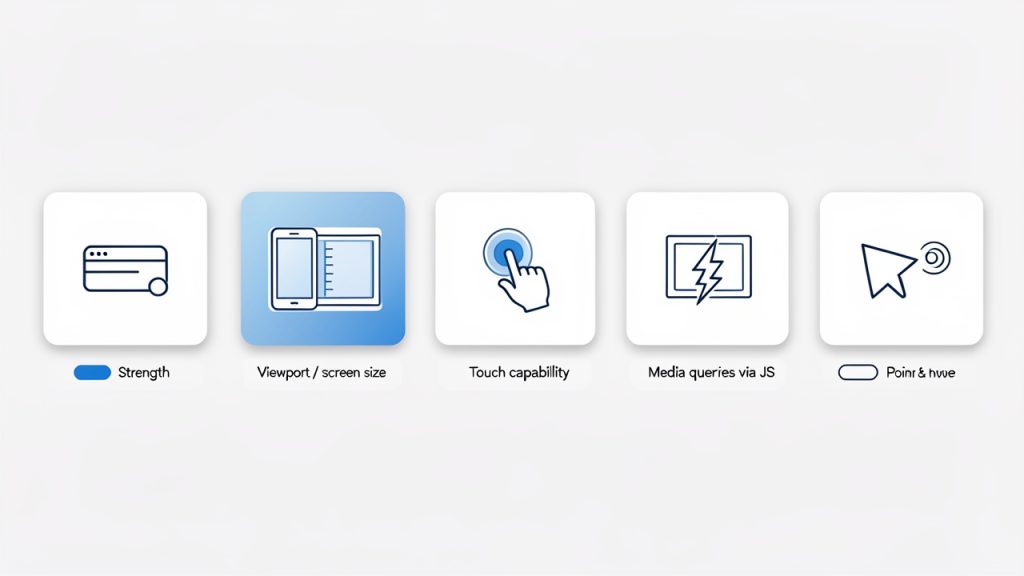
    Infographic showing main detection methods as tiles: User agent, Viewport, Touch, Media queries, Pointer & hover

    To make smart decisions, you need to understand the main detection methods and what they are good at. No single method is perfect, so the strength comes from using the right tool for the right job.

    User agent detection

    User agent detection is still widely used because it is simple and familiar. In JavaScript, developers often inspect navigator.userAgent and search for markers like Android, iPhone, or iPad.

    function isMobileByUserAgent() {
      return /Android|iPhone|iPad|iPod|Opera Mini|IEMobile|WPDesktop/i.test(
        navigator.userAgent
      );
    }
    
    console.log(isMobileByUserAgent());
    

    This approach can work for quick heuristics, especially in legacy codebases or analytics scripts. It is also helpful when you need rough categorization for known device families.

    The downside is reliability. User agent strings can be spoofed, changed, or normalized across browsers. They are not future-proof, and they often break when new devices appear. If your business logic depends heavily on them, maintenance becomes painful.

    Viewport and screen size detection

    A more common pattern is to detect the viewport width and adapt behavior accordingly. This aligns closely with responsive web design and often matches what users actually experience on screen.

    function isSmallViewport() {
      return window.innerWidth <= 768;
    }
    
    console.log(isSmallViewport());
    

    This is useful when your concern is layout or available screen real estate. If a side menu should collapse below a certain width, viewport detection is a perfectly reasonable solution.

    Still, it is important to be precise about what this means. It does not tell you whether the user is on a phone. It only tells you the current viewport is small. A resized desktop browser may trigger the same result. For many interface decisions, that is fine. For device classification, it is not enough.

    Touch capability detection

    Some developers equate touch support with mobile usage, but that shortcut can be misleading. Many laptops support touch, and some mobile browsers may behave differently than expected. Even so, touch capability is still valuable when your interface needs different gestures or controls.

    function supportsTouch() {
      return (
        'ontouchstart' in window ||
        navigator.maxTouchPoints > 0 ||
        navigator.msMaxTouchPoints > 0
      );
    }
    
    console.log(supportsTouch());
    

    This works best when you are answering a specific interaction question. If you need bigger tap targets, swipe gestures, or drag behavior tuned for touch, this check can help. If you are trying to decide whether the visitor is “mobile,” it is too broad on its own.

    Media queries in JavaScript

    JavaScript can also read the same kinds of conditions used in CSS media queries. This is often one of the cleanest ways to align styling and scripting logic.

    const mobileQuery = window.matchMedia('(max-width: 768px)');
    
    function handleViewportChange(e) {
      if (e.matches) {
        console.log('Likely mobile-sized viewport');
      } else {
        console.log('Larger viewport');
      }
    }
    
    handleViewportChange(mobileQuery);
    mobileQuery.addEventListener('change', handleViewportChange);
    

    This approach is especially useful when your UI changes dynamically. A user may rotate a phone, resize a browser, or move between split-screen modes. Media-query-based detection lets your scripts respond in real time instead of assuming the device state never changes.

    Pointer and hover detection

    A more modern and often overlooked strategy is checking input behavior. This matters because many mobile-specific UX issues are actually input issues.

    const hasCoarsePointer = window.matchMedia('(pointer: coarse)').matches;
    const supportsHover = window.matchMedia('(hover: hover)').matches;
    
    console.log({ hasCoarsePointer, supportsHover });
    

    A coarse pointer usually indicates finger-based interaction, while hover support tends to correlate with mouse or trackpad use. This is often more useful than broad mobile detection when deciding how menus, tooltips, and interactive controls should behave.

    Comparing common approaches

    The most effective mobile detection strategy depends on the question you are asking. The table below shows where each method fits best.

    Method Best For Strengths Limitations
    User agent detection, Rough device categorization Rough device categorization Simple, familiar, quick to implement Fragile, spoofable, less future-proof
    Viewport width, Layout and responsive behavior Layout and responsive behavior Matches screen space, easy to maintain Does not identify actual device type
    Touch detection, Touch-specific interactions Touch-specific interactions Good for gesture and tap-related logic Touch does not always mean mobile
    Media queries via JavaScript, Dynamic responsive behavior Dynamic responsive behavior Syncs with CSS logic, reacts to changes Still focused on conditions, not device identity
    Pointer and hover detection, Input-specific UX adjustments Input-specific UX adjustments Excellent for interaction design Not a complete mobile classification system

    Why “mobile” is often the wrong target

    One of the biggest mistakes in JavaScript mobile detection is treating all phones and tablets as a single category. A modern flagship phone on a fast connection can outperform an old desktop machine in some tasks. A tablet with a keyboard may behave more like a laptop than a phone. A foldable device can switch from narrow to wide layouts instantly.

    That is why a context-first approach works better. If you need to adapt layout, use viewport logic. If you need to adjust interactions, use pointer and hover detection. If you need to reduce heavy effects on constrained devices, combine feature and performance signals. This gives you fewer false assumptions and a cleaner architecture.

    How to Get Started with Mobile detection on javascript

    The easiest way to begin is to stop chasing a perfect definition of mobile and instead define the exact behavior you want to change. That framing simplifies the implementation. You are no longer trying to identify every possible device. You are solving a specific user experience problem.

    For example, if your navigation breaks on touch-first devices, focus on pointer and touch detection. If your content feels cramped on smaller screens, focus on viewport-based logic. If a third-party script causes slowdowns on smaller devices, focus on screen width, network-aware loading, and progressive enhancement.

    Start with responsive design first

    Before writing JavaScript detection logic, make sure your layout is already responsive with CSS. In many cases, CSS media queries solve the problem more elegantly than JavaScript. Mobile detection on JavaScript should usually support behavior, not replace responsive design.

    When the visual layout and spacing are already responsive, your JavaScript becomes lighter and more intentional. You only add device-aware logic where interaction, performance, or conditional loading truly requires it.

    Use feature detection for behavior changes

    If the goal is to change how an interface behaves, feature detection is usually the right starting point. This means checking whether the browser supports a capability rather than trying to infer it from the device label. See more on feature detection: feature detection.

    Here is a practical example that adapts a menu interaction based on hover support:

    const canHover = window.matchMedia('(hover: hover)').matches;
    
    const menuButton = document.querySelector('.menu-button');
    const menu = document.querySelector('.menu');
    
    if (canHover) {
      menuButton.addEventListener('mouseenter', () => {
        menu.classList.add('open');
      });
    
      menuButton.addEventListener('mouseleave', () => {
        menu.classList.remove('open');
      });
    } else {
      menuButton.addEventListener('click', () => {
        menu.classList.toggle('open');
      });
    }
    

    This is a strong pattern because it adapts to how the user interacts, not what device name they happen to use. A touch laptop and a phone may both avoid hover-dependent logic, while a desktop browser keeps the richer mouse-friendly behavior.

    Combine signals when necessary

    Sometimes one signal is not enough. If you need to make a broader guess about mobile usage, combining checks can improve accuracy without pretending you have certainty.

    function isLikelyMobile() {
      const smallScreen = window.matchMedia('(max-width: 768px)').matches;
      const coarsePointer = window.matchMedia('(pointer: coarse)').matches;
      const mobileUA = /Android|iPhone|iPad|iPod|Opera Mini|IEMobile|WPDesktop/i.test(
        navigator.userAgent
      );
    
      return smallScreen && (coarsePointer || mobileUA);
    }
    
    console.log(isLikelyMobile());
    

    This still should not be used as a hard security or business-critical rule. It is a heuristic. For UI tuning, though, it can be practical when you need a fallback category for analytics or lightweight experience adjustments.

    Watch for resize and orientation changes

    One common mistake is checking once on page load and never updating again. Mobile conditions can change while the page is open. Orientation changes, split-screen apps, foldable devices, and browser resizing all affect the environment.

    function updateDeviceState() {
      const mobileSized = window.matchMedia('(max-width: 768px)').matches;
      document.body.classList.toggle('mobile-sized', mobileSized);
    }
    
    window.addEventListener('resize', updateDeviceState);
    window.addEventListener('orientationchange', updateDeviceState);
    updateDeviceState();
    

    This kind of event-based update keeps your interface aligned with the current context. It is especially important for dashboards, web apps, booking systems, and tools that remain open for long sessions.

    Avoid common implementation mistakes

    The first mistake is using user agent detection as the only source of truth. It feels convenient, but it creates hidden bugs over time. The second is using mobile detection to gate essential content. Users should not lose core functionality because your script guessed wrong.

    Another common issue is overengineering. Not every site needs a complex device detection layer. If your goal is simply to stack cards on smaller screens or enlarge tap areas, CSS and a few targeted JavaScript checks are enough. Keep the logic tied to actual product needs.

    A practical setup for most websites

    For many business sites and web apps, a sensible approach looks like this:

    1. Use CSS media queries for layout and spacing.
    2. Use matchMedia() in JavaScript for behavior tied to viewport or input type.
    3. Use feature detection for touch, hover, or pointer-related interactions.
    4. Use user agent checks sparingly for edge cases or analytics, not as your main strategy.

    That workflow gives you flexibility without making your front end brittle. It is also easier to test, explain, and maintain across projects.

    Testing your mobile detection logic

    Testing matters because mobile detection bugs often hide in edge cases. A page can seem fine in a desktop browser resized to phone width, then behave differently on an actual device with touch input and browser chrome.

    Use browser developer tools for quick viewport checks, but also test on real phones and tablets whenever possible. Pay attention to orientation changes, keyboard overlays, tap behavior, hover states, and performance under slower conditions. If your site serves customers, not just developers, these details shape the user experience more than the detection method itself.

    Conclusion

    Mobile detection on JavaScript is less about identifying a perfect device category and more about choosing the right signal for the job. User agent detection can still help in limited cases, but modern development works better when you focus on viewport size, feature support, touch capability, and input behavior. That approach is more resilient, more accurate for UX decisions, and easier to maintain.

    The next step is simple. Review one part of your site that behaves differently on phones, such as navigation, forms, media, or interactive widgets. Then ask what you really need to detect: screen space, touch, hover, or a rough mobile heuristic. Once you answer that clearly, your JavaScript becomes cleaner, and your users get a smoother experience on every device.