JNTZN

Tag: ICO

  • How to Convert ICO Files to JPG Without Losing Quality

    How to Convert ICO Files to JPG Without Losing Quality

    Converting an ICO file to a JPG sounds simple until you hit common frustrations: the image looks blurry, the background turns black, the size comes out wrong, or the final file does not work where you need it. If you handle website assets, app icons, client files, or legacy Windows graphics, those small issues can waste more time than they should.

    The good news is that converting an ICO file to a JPG is straightforward once you understand what each format is designed to do. The key is not just changing the file extension, but choosing the right size, preserving visual quality, and knowing when a JPG is the appropriate destination format.

    What does converting an ICO file to a JPG involve?

    An ICO file is a Windows icon format. It is commonly used for desktop shortcuts, software icons, browser favicons, and system graphics. One ICO file often contains multiple versions of the same icon at different sizes, such as 16×16, 32×32, 48×48, or larger. That is what makes icons scale across different parts of an interface.
    Multiple sizes inside one ICO file, labeled 16x16, 32x32, 48x48, 128x128, 256x256

    A JPG file, also called JPEG, is a compressed image format built for photographs and general-purpose visuals. It is widely supported across websites, email clients, phones, editing software, and business tools. When you convert an ICO image to a JPG, you are turning a specialized icon file into a standard flat image.

    That conversion is useful if you want to insert the icon into a document, upload it to a platform that does not accept ICO files, or reuse it in marketing materials, slide decks, mockups, or client presentations.

    There is one important trade-off, ICO files can support transparency and multiple embedded sizes, while JPG does not support transparency at all. That means a transparent icon background will usually be replaced with white, black, or another solid color during conversion. For many use cases that is perfectly fine, but it matters if the icon needs to blend into a design.

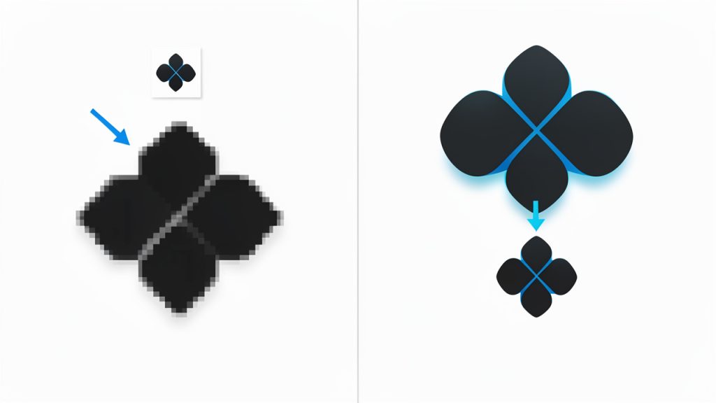
    Side-by-side showing a transparent icon (left) and the same icon converted to JPG with a white background (right)

    Key aspects of converting an ICO file to a JPG

    Why people convert ICO files

    Most users do not search for conversions for the love of file formats, they do it because a platform, workflow, or client requirement forces the change. A freelancer may need to place a software icon into a proposal. A small business owner might want to reuse an old favicon in a brochure. A developer may need a quick preview image for documentation or asset libraries.

    JPG also works well when compatibility matters more than editability. Nearly every device and browser can open a JPG instantly, which makes it practical for collaboration, especially when sending files to people who are not working in design or development tools.

    The difference between an ICO file and a JPG

    The biggest difference is purpose. An ICO file is functional, while a JPG is presentational. ICO exists to serve interfaces and operating systems. JPG exists to display images efficiently across common platforms.

    Compression is another difference. JPG uses lossy compression, which reduces file size by discarding some image data. That is usually fine for photos, but it can be harsh on small icons with sharp edges or text. A tiny symbol that looks crisp in ICO format can become soft or artifacted in JPG if exported carelessly.

    Transparency is critical. If the original icon has a transparent background, converting it to JPG will flatten that transparency. This is one of the most common surprises users run into, because what looked clean on a website tab may suddenly appear inside a white box after conversion.

    Quality considerations before you convert

    The quality of the final JPG depends heavily on which icon layer you extract from the ICO file. Since ICO files can contain multiple sizes, choosing the smallest version and enlarging it will produce poor results. For best output, extract the largest available icon size before converting.

    This matters more for logos, badges, and branded graphics. A 16×16 favicon may be fine for a browser tab, but it is not enough for a presentation slide or a social media graphic. If your ICO contains a 256×256 version, that is usually the best source for conversion.

    Compression settings also matter. Very high compression makes the JPG lighter, but it can introduce ringing, blur, and rough edges around text or curves. For icons, medium to high quality settings usually produce the best balance.

    When JPG is the wrong format

    In some cases, converting an ICO file to a JPG is not the best move. If the icon has transparency, crisp line art, or simple flat-color shapes, PNG is often the better destination because it preserves sharp edges and supports transparent backgrounds.

    JPG makes more sense when the image will sit on a fixed background, be embedded into standard office documents, or be shared in environments where JPG is the easiest accepted format. If your goal is maximum compatibility, JPG is practical. If visual precision matters, consider PNG first.

    Common use cases

    A quick comparison of where a JPG version of an ICO file fits well, and where it may cause problems:

    Use Case Is JPG a Good Choice? Why
    Presentation slides Yes Easy to insert and widely supported
    Email attachments Yes Simple for recipients to open
    Website favicon No Browsers typically expect ICO, PNG, or SVG
    Logo reuse with transparent background No JPG removes transparency
    Printed brochure mockups Usually yes Works if resolution is high enough
    Documentation screenshots or previews Yes Convenient and universal
    UI assets for apps No ICO or PNG is usually more suitable

    How to get started converting an ICO file to a JPG

    Choose the right conversion method

    There are three common ways to convert an ICO file into a JPG. You can use an online converter, an image editor, or a built-in operating system workflow such as opening the file in a graphics app and exporting it in another format.

    Online tools are usually the fastest option for small tasks. They are ideal when you need a quick result and do not want to install software. For freelancers and small business users, this is often the most convenient route. If the icon is part of proprietary software, client assets, or sensitive branding files, consider privacy before uploading anything to a third-party website.

    An image editor gives you more control. You can pick the icon size, set the background color, crop the image, and choose the JPG quality level. This is the better path if presentation quality matters, or if the icon needs to be placed into a branded asset.

    If you prefer command-line tools, you can use ImageMagick to convert an ICO image to a JPG, see the ICO to JPG documentation for examples.

    A simple conversion workflow

    The process is typically straightforward:

    1. Open the ICO file in a trusted converter or image editor.
    2. Select the largest available icon size for the best output quality.
    3. Set a background color if the original uses transparency.
    4. Export or save as JPG with medium to high quality settings.
    5. Review the result at actual display size before sharing or publishing.

    These five steps prevent most of the problems people associate with image conversion. The biggest mistake is rushing the export and later discovering that the icon looks jagged, off-center, or boxed in by an awkward background.

    What to check after conversion

    Once the JPG is ready, inspect it in the context where it will be used. A file can look acceptable in a folder preview and still perform poorly in a slide deck, printed page, or web asset library.

    Pay attention to edge sharpness, background fill, and overall dimensions. If the icon looks soft, the source image was probably too small or the JPG compression was too aggressive. If the background is wrong, use a different export setting or switch to PNG.

    For business users, consistency matters. If you are converting multiple icons for a website audit, brand guide, or product deck, keep the same dimensions and background treatment across all outputs. That small detail makes the final set look intentional rather than improvised.

    Best practices for better results

    A few habits make converting an ICO file to a JPG much cleaner in real-world work. Start with the largest icon layer available, avoid extreme resizing after export, and test both JPG and PNG if the icon contains fine text or very thin strokes.

    Think about the final destination before you export. If the image is going into Google Docs, PowerPoint, Notion, or email, JPG may be perfect. If it is going into a website header, software interface, or layered design file, another format may hold up better.

    For teams and solo professionals who care about productivity, the ideal workflow minimizes rework. A fast conversion is useful, but a correct conversion is better. Spending an extra minute on size and quality settings often saves ten minutes of fixing the result later.

    Online tools versus desktop software

    The best option depends on priorities:

    • Online converter: Best for quick one-off tasks, fast and no install, but less control and possible privacy concerns.
    • Desktop image editor: Best for quality-focused work, offers precise control over size, background, and quality, but requires more setup.
    • Built-in OS tools: Good for basic convenience, often already available, but may have limited export options.

    If you handle occasional files, an online converter usually suffices. If image quality affects branding, client delivery, or documentation standards, a desktop editor is the better investment of time.

    Practical notes and related formats

    If the icon needs transparency or very sharp edges, prefer PNG. If you are preparing assets for web use, consider supplying both the ICO or PNG for favicons and a high-quality JPG for documentation previews.

    Remember that an ICO file can be used directly for browser favicons in many cases, but modern practices often use PNG or SVG for responsive icons. If you need to reuse icons across non-technical audiences, converting a high-resolution icon layer to JPG simplifies sharing and reduces confusion.

    Conclusion

    Converting an ICO file to a JPG is really about translating an icon from a system-focused format into something easier to share, view, and reuse. The conversion itself is simple, but the result depends on three decisions: choosing the right source size, handling transparency correctly, and deciding whether JPG is actually the best output format.

    If you need a universal image for documents, previews, or client communication, JPG is often the right choice. If quality, transparency, or sharp edges matter more, compare it against PNG before finalizing. Your next step is simple: extract the largest version from one ICO file, export it as a JPG at moderate to high quality, test the JPG where you plan to use it, and confirm that the result meets both your visual and practical needs.
  • How to Convert ICO Files to PNG

    Need a favicon, app icon, or legacy website asset in a more usable format? Converting an ICO file to PNG is one of those small tasks that becomes surprisingly important when you are updating branding, building a website, preparing UI assets, or simply trying to open an old icon file on a modern device.

    For small business owners, freelancers, developers, and productivity-focused users, the goal is usually simple: get a clean PNG image from an ICO file quickly, without quality loss or unnecessary software. The good news is that the process is straightforward once you understand how ICO files work, what can go wrong during conversion, and how to choose the right output for your use case.

    What Is an ICO to PNG Conversion?

    An ICO to PNG conversion means taking an icon file in the Windows .ico format and turning it into a .png image file. While that sounds basic, ICO files are a little unusual compared with standard image formats.

    An ICO file often contains multiple versions of the same icon inside one file. These versions may vary by size, color depth, or resolution. For example, a single ICO file might include 16×16, 32×32, 48×48, and 256×256 pixel versions of the same icon. That makes the format useful for software, desktop shortcuts, and favicons, because systems can choose the most appropriate size automatically.

    PNG, by contrast, is typically a single raster image with support for transparency and strong image quality. It is widely used across websites, apps, design tools, presentations, and digital documents. When people search for how to convert an ICO file to PNG, they are usually trying to make the icon easier to edit, preview, share, or reuse.

    Why People Convert ICO Files to PNG

    The most common reason is compatibility. Many everyday tools, from design platforms to content editors, handle PNG files more gracefully than ICO files. If you want to drag an icon into a slideshow, upload it to a website builder, or edit it in a graphics tool, PNG is often the easier option.

    Another reason is visual control. Because PNG files are simple, visible image assets, they are easier to inspect. You can see whether the icon looks crisp, whether the transparent backgrounds are preserved, and whether the exported size fits your project.

    There is also a practical workflow benefit. If you are managing digital assets for a brand, a SaaS product, or a client project, PNG files integrate more naturally into file libraries, cloud drives, and design systems. ICO files are great for specific technical uses, but PNG is often the format people actually work with day to day.

    ICO vs PNG at a Glance

    Format Best Use Key Strength Limitation
    ICO Favicons, Windows icons, software assets Can store multiple icon sizes in one file Less convenient for editing and general sharing
    PNG Web graphics, UI assets, presentations, design workflows High quality with transparency support Usually contains only one image size per file

    Key aspects of converting an ICO file to PNG

    A good conversion is not just about changing the file extension. The real issue is whether the output PNG matches the quality, size, and transparency you need. That matters more than most users expect.

    Size selection matters

    Because ICO files can include several icon sizes, the conversion tool or software may ask you which version to export. This is important. If you accidentally export the 16×16 version when you need a 256×256 PNG, the image will look blurry when enlarged.

    For website work, a small PNG may be fine if the icon is only being used in tight interface spaces. For branding, app mockups, documentation, or marketplace listings, you will want the largest embedded icon size available. Starting from the highest-resolution version gives you more flexibility.

    Think of it like choosing a source photo before printing. If you begin with a tiny image, no conversion tool can magically create sharp detail that was never there.

    Transparency should be preserved

    One of the biggest reasons people prefer PNG is its support for transparent backgrounds. Many ICO files also support transparency, but not every converter handles it equally well.

    A poor conversion may add a black, white, or jagged background around the icon edges. That becomes obvious when you place the PNG on a colored website section, a dark app theme, or marketing material. If clean visual integration matters, always check the output on both light and dark backgrounds.

    For logos, UI icons, and interface graphics, transparency is not a minor detail. It is often the difference between a professional-looking result and something that feels broken.

    Quality depends on the source file

    Not every ICO file is high quality. Some older icons were designed for very small screens and limited color palettes. Converting those icons to PNG does not improve them automatically. It simply makes them easier to use in modern tools.

    If the source icon looks pixelated, soft, or outdated, the PNG will reflect those same limitations. That is why it helps to inspect the ICO file before relying on it for public-facing materials. In some cases, recreating the icon as SVG or designing a fresh PNG asset may be the better long-term move.

    Online converters vs installed software

    Many users want a free online ICO to PNG converter because it is fast and requires no installation. For basic tasks, online tools are often enough. You upload the file, select the output, and download the PNG.

    That said, local software can be a better choice when you care about privacy, batch processing, or more precise control over export size and quality. If the icon is part of unreleased software, internal branding, or client-sensitive work, keeping the conversion offline may be the smarter path.

    The right option depends on the context. Convenience is valuable, but so are security and consistency.

    Common issues during conversion

    Several problems show up repeatedly when converting from ICO to PNG. The first is exporting the wrong embedded size. The second is losing transparency. The third is mistaking a low-resolution icon for a high-quality one just because the file converted successfully.

    There can also be workflow confusion. Some users believe they can rename .ico to .png and get a working image. That does not actually convert the file format. A proper conversion reads the icon data and exports a valid PNG image.

    If you handle digital assets regularly, it helps to build a simple habit: convert, preview, verify transparency, and store the file with a clear size label.

    How to get started with converting an ICO file to PNG

    If your goal is speed, the process is easier than it looks. You do not need to be a designer or developer to get good results, but you do need to make a few smart choices.

    A simple conversion workflow

    Use this short process when converting an ICO file to PNG:

    1. Choose the source ICO file, the file that contains the icon you want to export.
    2. Open it in a trusted converter or image tool that supports ICO files.
    3. Select the largest or most appropriate size for your intended use.
    4. Export as PNG and save the file with a descriptive name.
    5. Preview the PNG on different backgrounds to confirm transparency and clarity.

    This takes only a minute, but it prevents the most common mistakes.

    Choosing the right PNG for the job

    Not every output PNG should be treated the same way. If you are converting an icon for a website interface, file size may matter more than maximum resolution. If you are preparing assets for a client presentation or a product page, visual crispness may be the priority.

    A practical way to decide is to start with the largest available icon, then create smaller PNG versions later if needed. This gives you a clean master asset while keeping your workflow flexible.

    For teams and freelancers, naming helps more than people realize. A filename like brand-icon-256.png is far more useful than icon-final-new2.png. Good naming saves time when assets are shared across projects and collaborators.

    Best use cases for converting an ICO file to PNG

    A PNG converted from ICO can be useful in many real-world situations. It may be dropped into a website builder, inserted into onboarding documentation, used inside a social media graphic, or added to a product mockup.

    Developers often convert icons to PNG for design review or documentation. Small business owners may need a PNG version of an old favicon to use in ads, slide decks, or branded forms. Freelancers may need to extract icon assets from legacy client files and make them editable in modern design workflows.

    That is why this task shows up so often. It sits at the intersection of design, productivity, and compatibility.

    When PNG is not the final destination

    Sometimes PNG is only a stepping stone. You may convert from ICO to PNG to inspect the icon, place it in a layout, or hand it off to a designer who will recreate it in vector format later.

    This is especially common when an icon needs to scale cleanly across many screen sizes. PNG is excellent for everyday use, but if you are building a modern brand system or UI library, you may eventually want SVG or another scalable format for the long term.

    Still, PNG remains one of the most practical intermediate and final formats because it is widely supported, easy to preview, and simple to share.

    Conclusion

    Converting an ICO file to PNG is a small task with real practical value. It makes icon assets easier to edit, preview, upload, and reuse across websites, documents, apps, and marketing materials. The most important factors are choosing the correct embedded size, preserving transparency, and checking the output before using it publicly.

    If you need to convert an ICO to a PNG today, start with a trusted tool, export the largest useful version, and verify how it looks on real backgrounds. That simple workflow will save time, reduce asset issues, and give you a cleaner image you can use almost anywhere.

  • How to Convert a PNG into a Sharp ICO Icon

    How to Convert a PNG into a Sharp ICO Icon

    A blurry or badly sized icon can make even a polished app, website, or desktop shortcut look unfinished. If you have a logo, symbol, or brand mark in PNG format and need it to work as an icon, converting a PNG into an ICO file is often the fastest way to get a clean, usable result.

    This matters more than many people think. Small business owners use icons for web favicons and branded shortcuts. Freelancers need them for client deliverables. Developers rely on ICO files for Windows applications, installers, and desktop tools. If you are looking for an easy way to turn a PNG into an ICO file, the good news is that the process is simple once you understand what actually changes during the conversion.

    What is converting a PNG to an ICO file?

    Converting a PNG into an ICO file means taking a standard image format and packaging it into a format designed specifically for icons. A PNG file is great for storing high-quality images with transparency. An ICO file, by contrast, is built for icon use, especially in Windows environments and sometimes for favicon compatibility in browsers and web projects.

    The important difference is not just the file extension. An ICO file can contain multiple image sizes in one file, which allows the operating system or browser to display the icon clearly at different resolutions. That is why a proper icon can look sharp in a browser tab, a taskbar, a file explorer view, or a desktop shortcut, even though each of those contexts uses a different size.

    A single ICO file icon with a stack or grid of smaller images inside it, labeled with common sizes (16x16, 32x32, 48x48, 64x64, 128x128, 256x256) to show that one ICO can contain multiple embedded sizes.

    For many users, converting a PNG into an ICO file sounds like a basic file conversion. In reality, it is also a formatting and optimization step. You are not simply renaming an image. You are preparing it to function well as an icon, which means considering dimensions, transparency, sharpness, and how the design reads at very small sizes.

    Why ICO still matters

    Even though PNG is widely supported and often preferred for general graphics, ICO remains relevant because of how Windows and certain platforms handle icons. If you are creating a desktop application, a custom executable, an installer, or even a website that needs broad favicon support, the ICO format is often still expected.

    This is especially important for productivity-minded users who want their tools and assets to work without friction. An icon is a small detail, but it affects recognition, consistency, and professionalism. A clean ICO file helps your project look intentional from the first click.

    Common use cases

    A converted icon is useful in more places than most people realize. Web designers use ICO files for favicons. Software developers use them for application branding. Business owners use custom icons for internal tools, shortcuts, and branded resources.

    If you have a PNG logo, social profile image, or minimal symbol, you may already have everything needed to create an icon. The real task is making sure it converts in a way that preserves clarity, especially at small sizes where visual noise becomes a problem.

    Key aspects of converting a PNG into an ICO file

    The quality of an ICO file depends less on the converter itself and more on the source image and export choices. A great converter helps, but it cannot rescue a poor design. If your original PNG is overcrowded, low resolution, or lacks contrast, the final icon will struggle no matter which tool you use.

    That is why successful conversion starts with thinking like an icon designer. Icons are tiny, functional graphics. They need to be recognized quickly. A detailed logo that looks fantastic on a website header may become unreadable when reduced to 16×16 pixels.

    Size and resolution matter

    One of the biggest strengths of the ICO format is support for multiple embedded sizes. Common icon dimensions include 16×16, 32×32, 48×48, 64×64, 128×128, and 256×256. A good converter that creates ICO files from PNG images often lets you export several of these at once, which improves compatibility across devices and contexts.

    If you start with a very small PNG and try to scale it up, the result can look soft or pixelated. It is usually better to begin with a larger, high-resolution PNG and let the converter generate smaller icon sizes from that source. This gives the file more visual information to work with and generally produces a cleaner result.

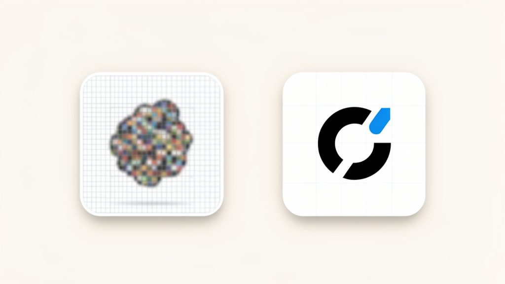
    Side-by-side comparison showing the same logo: left column uses a small low-resolution PNG scaled up (blurry/pixelated), right column uses a large high-resolution PNG scaled down (crisp). Include captions like "Start small and scale up -> blurry" and "Start large and scale down -> clean."

    Transparency is a major advantage

    PNG files are popular because they support transparent backgrounds, and this carries over well into ICO conversion. Transparency is crucial for modern icons because it allows the shape to sit naturally on different backgrounds without an ugly white box around it.

    That said, not all transparency behaves perfectly if the source image has rough edges, faint anti-aliasing, or poor contrast. Before conversion, it helps to inspect your PNG closely. A polished transparent edge can make the difference between an icon that looks crisp and one that appears messy.

    Simplicity wins at small sizes

    An icon is not a flyer. It is not a banner. It has a very small job, and it needs to do it fast. The best icon designs use simple shapes, strong contrast, and minimal text. In fact, text often performs badly in icons unless it is a single letter or an extremely bold abbreviation.

    Think of it like signage from across a room. If you cannot recognize the mark quickly, it is probably too complex. When converting a PNG into an ICO file, this design principle becomes even more important because the final file will likely be viewed in multiple reduced sizes.

    One file, multiple contexts

    The reason ICO is still so practical is that one file can serve many visual contexts. A browser may use one embedded size, while a Windows desktop shortcut uses another. This flexibility makes the format efficient, but it also means your design has to hold up under different viewing conditions.

    A strong icon looks consistent whether it is tiny in a browser tab or slightly larger in a taskbar. That consistency is what makes branding feel cohesive. It also reduces the need to manually create separate assets for every environment.

    Choosing the right tool

    Most users today convert a PNG into an ICO file with an online tool, and for good reason. Web-based converters are fast, free in many cases, and require no installation. That makes them especially attractive for freelancers, small teams, and anyone working on quick deliverables.

    Still, not all tools are equal. Some compress too aggressively. Others offer limited size options or strip useful quality settings. If privacy matters, such as when working with unreleased branding assets or client materials, an offline converter or design application may be the better option.

    The table below highlights the trade-offs between common approaches.

    Method Best For Strengths Limitations
    Online converter Quick one-off tasks Fast, easy, no install required May have file limits or privacy concerns
    Design software export Designers and brand teams Better control over sizing and visual quality Can take longer and may require paid software
    Developer toolchain App and software projects Easy to integrate into workflows Less ideal for non-technical users
    Desktop converter app Frequent offline use Good privacy, often supports batch processing Requires installation

    How to get started converting a PNG into an ICO file

    If you want a smooth result, treat conversion as a short workflow rather than a single button click. The process is still easy, but a little preparation helps you avoid the most common problems, such as fuzzy edges, unreadable details, or incorrect sizing.

    Start by reviewing the PNG you plan to use. Is it high resolution? Does it have a transparent background? Is the design still recognizable when shrunk dramatically? These questions matter because icons live in tiny spaces where every pixel counts.

    Prepare the PNG first

    Before you convert anything, clean up the source file. Remove unnecessary background areas and make sure the graphic is centered. If the image includes extra whitespace, the icon may appear visually smaller than intended once converted.

    You should also test how the PNG looks at reduced dimensions. Shrink it to a small preview and see whether the key shape still reads clearly. If not, simplify it before conversion. This is often the difference between a professional icon and one that feels improvised.

    Follow a simple conversion process

    For most users, the practical steps are straightforward:

    1. Choose a clean PNG with high resolution and transparency if possible.
    2. Upload it to a trusted online converter or open it in software that supports ICO export.
    3. Select multiple icon sizes if that option is available.
    4. Download and test the ICO file in the environment where it will be used.

    That final step matters. A file that looks fine in a preview window may behave differently once assigned to a shortcut, browser tab, or application. Testing saves time and avoids last-minute fixes.

    Best practices for better results

    A few practical habits can improve your icon quality immediately. Use a square image whenever possible, because icons are typically displayed in square dimensions. Keep the design centered and avoid thin lines that disappear at small sizes.

    It also helps to prioritize contrast and shape recognition over decorative detail. If your brand mark is intricate, consider making a simplified icon version rather than forcing the full logo into an ICO file. Many strong brands use a minimal symbol for icons and reserve the full logo for larger placements.

    Common mistakes to avoid

    One common mistake is assuming a large logo will automatically scale down well. It often does not. Another is using a JPG as the starting point, then converting that to PNG and finally to ICO. Since JPG does not support transparency and may introduce compression artifacts, this usually leads to lower-quality results.

    Users also run into issues when they export only one size. A single-dimension icon may work in one place but look poor elsewhere. Whenever possible, choose a conversion method that includes several sizes inside the ICO file.

    The table below shows frequent problems and how to solve them.

    Problem Likely Cause Better Approach
    Blurry icon Source PNG too small Start with a larger, sharper PNG
    White box around icon No real transparency Use a transparent PNG source
    Unreadable at small size Design too detailed Simplify the icon before converting
    Looks fine in one place, bad in another Only one size included Export an ICO with multiple sizes
    Soft or jagged edges Poor source quality or bad scaling Clean the PNG and test scaling first

    When an online converter is the best choice

    For many readers, an online converter that creates ICO files from PNG images is the most practical option. It is fast, accessible from any device, and usually free for basic use. If you only need a favicon or a desktop icon once in a while, this approach is hard to beat.

    The key is choosing a tool that is simple and trustworthy. Look for support for multiple icon sizes, transparent backgrounds, and straightforward downloads. If a site feels cluttered, confusing, or pushes aggressive ads and redirects, it is usually worth trying a different option.

    When you may need more control

    If you are preparing assets for a client project, software release, or branded product, you may want more than a quick conversion. In those cases, using design software or a dedicated desktop tool gives you better control over export settings, crisp edges, and file testing.

    Developers may also prefer a repeatable workflow, especially when shipping updates regularly. That does not make the process harder. It simply means the icon becomes part of a broader asset pipeline rather than a one-time task.

    Conclusion

    Turning a PNG into an ICO file is a small task with a visible impact. Done well, it gives your app, shortcut, website, or tool a cleaner and more professional presence. The core idea is simple, but the best results come from understanding that icon conversion is really about format, sizing, and clarity, not just changing a file extension.

    Your next step is straightforward. Start with the cleanest PNG you have, make sure it works visually at small sizes, then convert it into an ICO file that includes multiple dimensions. Test it where it will actually appear. That extra minute of care is what turns a basic image into an icon that looks sharp, polished, and ready to use.

  • How to Convert a JPG into a Professional ICO File

    How to Convert a JPG into a Professional ICO File

    A simple image file can quietly make your brand look polished, or make it look unfinished. If you have ever uploaded a logo, favicon, or app icon and realized the platform wants an ICO file instead of a JPG, you are not alone. This is one of those small technical tasks that seems trivial until it blocks a website launch, desktop shortcut, or software packaging workflow.

    Converting a JPG to an ICO file is usually easy, but doing it well takes a little more care than most people expect. The right dimensions, transparency, sharpness, and file quality all affect how your icon appears in browser tabs, Windows folders, shortcuts, and app interfaces. A rushed conversion can leave you with blurry edges, awkward backgrounds, or an icon that looks fine in one place and terrible in another.

    What Is Converting a JPG to an ICO File?

    A conversion from a JPEG image into an ICO file turns a photograph-style image into the icon format commonly used by Windows and often associated with website favicons and application icons. While a JPG is designed for photographs and general image sharing, an ICO file is built specifically to display small icons clearly across different sizes.

    An ICO file can contain multiple image sizes in one file, which allows the operating system or browser to choose the most appropriate version depending on where the icon is displayed. That is why a proper icon can still look crisp at 16×16 pixels and remain usable at 32×32 or 64×64.

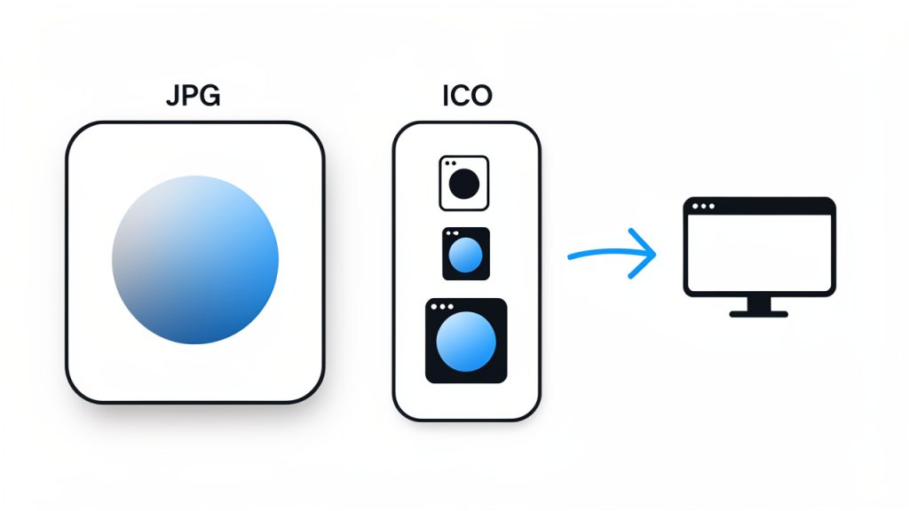
    Side-by-side diagram showing a single JPG image on one side and an ICO file on the other containing multiple embedded icons at different pixel sizes (16x16, 32x32, 48x48, 64x64). Label the ICO variants and show an arrow indicating the OS/browser choosing the appropriate size.

    This difference matters more than it seems. A JPG usually contains a single flat image, often compressed in a way that sacrifices some fine detail. An ICO file, in contrast, is optimized for clarity at small dimensions. If the source image is too detailed, too rectangular, or lacks contrast, the final icon may be technically correct but visually weak.

    For small business owners and freelancers, this often comes up when setting up a favicon for a website, creating a branded desktop shortcut, or preparing assets for a Windows application. For developers, it may be part of the packaging process for software, browser extensions, or desktop tools. In all of these cases, the goal is the same: create a small, recognizable image that still works when scaled down dramatically.

    Key aspects of converting JPG images to ICO files

    File format differences matter

    A JPG is excellent for photos because it keeps file sizes low while preserving acceptable visual quality. The trade-off is that JPEG compression can introduce artifacts, especially around text, logos, and hard edges. Those imperfections become much more visible when the image is reduced to icon size.

    An ICO file serves a different purpose. It is designed for clarity at small dimensions, not for photographic realism. In practice, clean lines, strong contrast, and simple shapes perform far better than busy graphics. If your source image is a detailed banner or a full-color photograph, converting it directly into an icon may technically work, but the result often looks muddy and unreadable.

    Size and scalability are critical

    Most icons are viewed at very small sizes. A logo that looks sharp on a website header at 500 pixels wide may become impossible to recognize at 16×16. That is why resizing is not just a mechanical step, it is a design decision.

    A good icon usually starts with a simple, centered subject. If your JPG includes extra background space, long text, or multiple visual elements, the icon will likely lose impact. Cropping and simplifying the image before conversion often makes a bigger difference than the conversion tool itself.

    Comparison of two icons at tiny size (16x16): one produced from a detailed photo/logo that looks muddy and unreadable, and one from a simplified monogram/symbol that remains clear and recognizable. Include captions like 'Too detailed → unreadable' and 'Simple → recognisable'.

    The most common icon sizes include 16×16, 32×32, 48×48, and 64×64 pixels. Some tools let you generate several sizes in a single ICO file, which is usually the best option. This allows systems to choose the size they need rather than scaling one version up or down.

    If you are creating a favicon, your smallest size matters a lot. Fine details vanish quickly. Test whether the icon still looks recognizable at 16×16 before finalizing it. If it does not, the design likely needs to be simplified rather than merely resized.

    Transparency can be a hidden issue

    One of the biggest limitations of a JPG source file is that JPEG does not support transparency. If your original image has a white or colored background, that background will usually stay visible after conversion unless you edit the image first.

    This becomes especially noticeable when the icon is displayed against dark mode interfaces, colored browser themes, or custom desktop backgrounds. A white box around a logo can make an otherwise professional brand asset look unfinished. If transparency matters, it may be better to first edit the image in a format like PNG, remove the background, and then create the ICO file from that cleaner source.

    For users who only have a JPG available, this does not mean the project is doomed. It simply means expectations need to be realistic. Some icons work perfectly well with a solid background, especially if they are designed intentionally as square badges. Others need a transparent edge to blend naturally into their environment.

    Quality depends on the source image

    The phrase garbage in, garbage out applies here. A low-resolution JPG will not magically become a sharp icon because it has been converted to ICO. If the original image is blurry, heavily compressed, or poorly cropped, the final result will reflect those flaws.

    The best source images are usually high-resolution, square or near-square, and visually simple. Logos, initials, symbols, and bold marks convert well. Detailed flyers, photos of people, and full website screenshots do not. Think of an icon like a road sign. It needs to be understandable instantly, even from a distance, or in this case, at a tiny scale.

    Use case shapes the right output

    Not every icon is for the same environment. A favicon for a website has different practical needs than a Windows application icon. A browser tab icon needs to be recognizable at a glance and often appears at very small dimensions. A desktop application icon may appear in shortcuts, file explorers, taskbars, and installation files, sometimes at several sizes.

    For that reason, a smart JPG-to-ICO workflow considers where the icon will actually be used. If the file is for a website, prioritize simplicity and contrast. If it is for a software product, consider multiple sizes and how the icon will appear on both light and dark backgrounds.

    How to get started converting a JPG to an ICO file

    Start with the right image

    Before you use any converter, look at the JPG critically. Ask whether the image is truly suited to icon use. If it includes small text, busy textures, or multiple focal points, simplify it first. Often the best approach is to isolate the brand mark, monogram, or symbol rather than using the full logo lockup.

    If possible, crop the image into a square. Most icons display best in square proportions, and many conversion tools will otherwise force the image into a square area in ways that create awkward spacing or distortion. Centering the important visual element before conversion gives you much more predictable results.

    Choose an appropriate size

    Generate icon sizes that match common usage, such as 16×16, 32×32, 48×48, and 64×64. If your tool allows multiple embedded sizes in one ICO file, use that feature so systems can pick the best resolution.

    If you are creating a favicon, your smallest size matters a lot. Fine details vanish quickly, so simplify the design until it remains readable at 16×16.

    Use a reliable conversion tool

    Many online tools can convert a JPG to an ICO file in seconds. That convenience is useful, especially for freelancers or small teams who do not want to install extra software for a one-time task. Still, not all converters produce equally clean results. Some compress aggressively, some offer limited size options, and some do not preserve image quality as well as expected.

    When evaluating a tool, focus on whether it lets you control icon dimensions, generate multiple sizes, and preview the result. If the task is business-critical, such as preparing a branded favicon for a live website or packaging a software release, it is worth testing more than one tool and comparing outputs side by side.

    Follow a simple workflow

    For most users, the process is straightforward. Select a clean JPG image that is high-resolution and square if possible. Crop or simplify the image so the core visual remains clear at small sizes. Upload it to a converter that supports ICO output and size selection. Download and test the file in the environment where it will actually appear.

    Testing in context is often skipped, and it should not be. An icon that looks fine in a preview may appear too small, too soft, or too cluttered once placed in a browser tab or Windows shortcut. Real-world testing is part of the conversion process.

    Check the result in context

    A favicon should be tested in a browser tab, bookmark bar, and mobile browser if relevant. A desktop icon should be viewed on different background colors and at different scaling settings. Developers should also verify that the file is accepted by the build system, installer, or framework they are using.

    This context-based testing separates a merely converted file from a usable one. It is the difference between checking a box and creating an asset that actually supports brand recognition and usability.

    Common mistakes to avoid

    Here are predictable problems and better alternatives:

    • Using a detailed photo: Icon becomes blurry and unreadable, use a simple symbol, logo mark, or initial instead.
    • Starting with a low-resolution JPG: Final ICO looks soft or pixelated, use the highest-quality source available.
    • Ignoring background color: White or awkward box appears around icon, edit the background first or use a cleaner source image.
    • Using only one size: Icon scales poorly in different contexts, create an ICO with multiple size variants.

    Conclusion

    Converting a JPG to an ICO file is simple on the surface, but quality depends on more than just uploading and downloading. The source image, its clarity at small sizes, the presence or absence of transparency, and the intended use all shape whether the final icon looks professional or improvised.

    If you need an icon for a website, app, shortcut, or branded digital asset, start with the cleanest possible image and think like a designer, not just a file converter. A strong icon is small, clear, and instantly recognizable. Your next step is straightforward: choose your best source image, create the ICO file, and test it where your audience will actually see it.