JNTZN

Tag: automation

  • How to Convert a PDF to PNG for Sharp, Shareable Images

    How to Convert a PDF to PNG for Sharp, Shareable Images

    Turning a PDF into a PNG sounds simple, until you actually need to do it well. Maybe you want to pull a page from a proposal for a presentation, share a document preview on social media, send a clean image to a client, or extract a form without asking someone to open a PDF viewer. That is where converting PDF to PNG becomes genuinely useful, not just convenient.

    For small business owners, freelancers, developers, and productivity-focused users, this conversion solves a very practical problem. PDFs are great for preserving layout and formatting, but they are not always the easiest format to preview, embed, annotate, or reuse. PNG files, on the other hand, are image-based, widely supported, and ideal when visual consistency matters. Understanding when and how to convert a PDF into a PNG can save time, reduce friction, and make your files much easier to work with.

    What Is PDF to PNG?

    At its core, converting a PDF to a PNG means taking one or more pages from a Portable Document Format file and exporting them as image files in the PNG format. Instead of a document with selectable text, embedded fonts, and multiple pages, you end up with a flat image representation of each page.

    That distinction matters. A PDF is built for structured documents. It can contain text layers, vector graphics, links, forms, and multiple pages in one file. A PNG is an image format designed for high-quality raster graphics, especially when you need sharp lines, transparent backgrounds, or lossless compression. When you convert from PDF to PNG, you are essentially transforming a document into a visual snapshot.

    Side-by-side comparison: left shows a PDF page with selectable text, vector shapes, multiple layers; right shows the same page flattened into a PNG raster image

    This is especially useful when the goal is display, not editing. If you are uploading a document preview to a website, sharing a single page in a chat app, using a page inside a design mockup, or preserving a specific layout exactly as it appears, PNG is often the better output format. It gives you a clean, fixed image that looks the same across devices and platforms.

    Why People Convert PDFs Into PNG Images

    In everyday workflows, people usually convert PDF files to PNG because they need accessibility and flexibility. A PDF may require a dedicated viewer, while a PNG opens almost anywhere instantly. For a busy freelancer sending proofs to a client, or a business owner posting a menu, flyer, or invoice preview online, that difference is meaningful.

    There is also a visual advantage. PNG uses lossless compression, which means image quality is preserved better than with formats like JPG, especially for text-heavy pages, diagrams, logos, and interface screenshots. If your PDF contains crisp typography, tables, branding elements, or line art, PNG often produces a cleaner result.

    Developers and digital teams also use PDF-to-PNG conversion in automated workflows. They may generate page thumbnails, create document previews in web apps, archive visual versions of reports, or process user uploads into image-friendly formats. In those cases, the conversion is not just a convenience feature, it becomes part of a larger document handling system.

    PDF vs PNG at a Glance

    Format Best For Strengths Limitations
    PDF Documents, forms, reports, printable files Multi-page support, selectable text, layout preservation, compact structure Less convenient for quick visual sharing or image-based workflows
    PNG Page previews, graphics, screenshots, web use Lossless quality, broad compatibility, sharp text and graphics Single-image format, larger file sizes than some compressed alternatives

    Key Aspects of PDF to PNG

    A good PDF-to-PNG conversion is not just about pressing a button. The quality of the output depends on several factors, and knowing them helps you avoid blurry pages, oversized files, and frustrating results.

    Image Quality and Resolution

    The first major factor is resolution, usually measured in DPI, or dots per inch. A low-resolution PNG might be fine for quick previews or on-screen sharing, but it can look soft when zoomed in or reused in print. Higher DPI settings produce sharper images, which is ideal for documents with small text, charts, or design details.

    The trade-off is file size. A 72 DPI export may load quickly and work well for a lightweight web preview, while a 300 DPI export can look significantly sharper but create much larger PNG files. The right choice depends on how the image will be used. If the PNG is for internal sharing, speed may matter more. If it is for a portfolio, presentation, or design review, clarity usually wins.

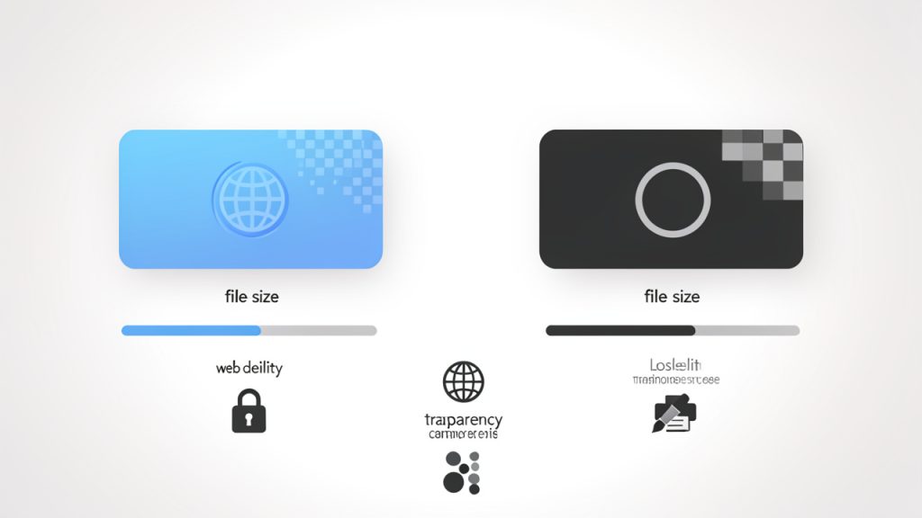
    Low vs high DPI: left low resolution appears soft and blurry, right high resolution looks crisp, with filesize indicators

    This is one of the most common mistakes people make. They assume all conversions are equal. They are not. The same PDF page exported at different resolutions can look dramatically different, especially when text or thin lines are involved.

    Single Page vs Multi-Page Conversion

    Another key aspect is how the tool handles multiple pages. Since a PNG is an image file, each PDF page typically becomes a separate PNG. If you have a 10-page PDF, you will usually get 10 image files after conversion.

    That sounds obvious, but it affects workflow. If you only need one page, choose a tool that lets you extract or convert selected pages rather than the entire document. This keeps file management simpler and avoids unnecessary clutter. For business users handling contracts, presentations, or scanned reports, page selection can save time quickly.

    For developers or teams automating this process, file naming also matters. Well-structured output, such as page-1.png, page-2.png, and so on, makes integration much easier in content systems and cloud workflows.

    Transparency, Backgrounds, and Visual Fidelity

    PNG supports transparency, which can be useful in some conversions, but not all PDF-to-PNG tools handle this the same way. If your PDF includes transparent elements, layered artwork, or vector graphics, the output may vary depending on the converter used.

    In many cases, PDFs are exported with a white background because they are document-based rather than image-based. Still, if you are working with logos, illustrations, or design files saved as PDF, preserving transparency can be important. This is especially true for marketers, designers, and online sellers who need flexible image assets.

    Visual fidelity also includes font rendering, line sharpness, and spacing accuracy. Better conversion tools preserve these details more reliably. Weak tools may flatten the page poorly, distort fonts, or create jagged edges around text and graphics.

    File Size and Performance

    PNG is excellent for quality, but it is not always the smallest format. If you convert a high-resolution PDF page into PNG, the result can be large, especially if the original page contains images, gradients, or complex layouts.

    For websites, dashboards, or apps, this affects loading speed. For email and cloud sharing, it affects convenience. A high-quality PNG is useful, but if the file is too heavy for the task, it becomes inefficient. That is why many users should think in terms of purpose, not just maximum quality.

    If the priority is crisp text and faithful reproduction, PNG is a strong choice. If the priority is minimum file size, another format might be more practical. Still, for sharp document previews and reusable visual assets, PNG remains one of the most dependable options.

    How to Get Started with PDF to PNG

    Getting started is usually straightforward, but choosing the right approach depends on your workflow, privacy needs, and quality expectations. Some users prefer a quick online converter. Others want offline tools for sensitive files. The best method is the one that fits the job without adding unnecessary steps.

    Choosing the Right Conversion Method

    Online tools are often the fastest place to start. You upload a PDF, select output settings if available, and download one or more PNG files. This works well for occasional use, especially when speed matters and the document is not confidential.

    Offline tools are better when privacy, control, or batch processing is important. If you are handling invoices, legal files, HR forms, internal reports, or client documents, keeping everything local may be the smarter choice. Many desktop applications and built-in operating system tools can convert PDFs into images without sending files to a third-party service.

    Developers and advanced users may prefer command-line or API-based solutions for automation. That route makes sense if you routinely generate previews, process uploaded PDFs, or build conversion into a larger system. It is not necessary for everyone, but it becomes valuable at scale.

    A Simple Start for Most Users

    1. Choose your PDF file and decide whether you need all pages or just specific ones.
    2. Set the output quality based on use, lower for quick previews, higher for readability and detail.
    3. Convert and review the PNG files closely, especially text sharpness and page alignment.
    4. Rename and organize the output if the PDF contains multiple pages.

    That review step is more important than many people realize. A converted image may technically work while still looking poor. Zoom in. Check the text. Make sure charts, signatures, logos, and margins appear the way you expect. If they do not, try a higher resolution or a more capable converter.

    Best Practices for Better Results

    If the PDF contains small text, technical diagrams, or branding details, export at a higher resolution from the beginning. This reduces the chance of fuzzy output and saves you from having to convert the file again. For client-facing work, quality should be intentional, not accidental.

    It also helps to think about page dimensions before converting. A portrait PDF page becomes a tall image. A landscape report becomes a wide one. If the PNG is intended for a website, mobile display, or social platform, plan for how the image will actually be viewed. A technically accurate conversion is not always the same as a usable one.

    For scanned PDFs, the source quality matters as much as the conversion tool. If the original scan is blurry, noisy, or crooked, converting it to PNG will not magically improve it. It may preserve the problem in a more shareable format, but it will not fix the underlying quality. In those cases, image cleanup or rescanning may be necessary.

    Which Option Fits Your Use Case?

    Use Case Best Approach Why It Works
    Quick one-time conversion Online converter Fast and convenient for non-sensitive files
    Client or business documents Offline desktop tool Better privacy and more control over output
    Website previews PNG export at web-friendly resolution Balances readability and performance
    Batch workflows or apps Automated or developer-focused solution Efficient for repeated conversions at scale

    Common Problems and How to Avoid Them

    Blurry output is the most common complaint. In most cases, the issue is low resolution. If your converted PNG looks soft, especially around text, increase the DPI or choose a tool that gives you better control over image quality.

    Another issue is oversized files. This usually happens when users export every page at very high resolution without considering the final purpose. If the image is only meant for screen viewing, you probably do not need print-level quality. Matching the resolution to the use case makes the output much more practical.

    Formatting errors can also occur, particularly with complex PDFs that include unusual fonts, transparency effects, or layered design elements. If a page renders incorrectly, try another conversion tool. Different engines handle PDFs differently, and one tool may preserve the layout far better than another.

    Conclusion

    Converting a PDF to PNG is one of those small tasks that can make a big difference in everyday work. It turns rigid documents into flexible image assets that are easier to preview, share, embed, and reuse. For business owners, freelancers, and digital teams, that means smoother communication and fewer format-related bottlenecks.

    The best results come from choosing the right method, paying attention to resolution, and matching output quality to the actual job. If you only need a quick page preview, keep it simple. If the file is client-facing or part of a professional workflow, take a moment to optimize the conversion properly. Your next step is straightforward: pick a PDF, decide how you plan to use the image, and convert it with quality in mind.

    If you need a quick way to embed or preview converted images inside a web workflow, consider tools that generate ready-to-use assets for web pages and apps.

  • How to Create a New Manual Post That Saves Time

    Publishing manually sounds simple until it starts stealing time, creating inconsistencies, and slowing down your workflow. That is why many small business owners, freelancers, developers, and productivity-focused users look for clearer guidance on creating a manual-post process, even though the phrase can mean different things depending on the platform or task.

    At its core, a manual post is content, data, or an update that a person creates and publishes directly, instead of relying on integrations, scheduling systems, or bulk tools. A manual posting workflow matters because it gives you control, accuracy, and flexibility. It also comes with trade-offs, especially when speed and scale become important. Understanding where manual posting fits and how to do it well can save time, reduce avoidable errors, and make your overall system more reliable.

    What Is a New Manual Post?

    A manual post usually refers to a freshly created post, update, listing, entry, or submission that someone adds by hand inside a platform. That platform could be a blog CMS, a social media dashboard, a marketplace, an internal admin panel, a CRM, a project board, or any tool where users publish information directly.

    The word manual is the important part. It implies a human is entering the content, choosing formatting, checking details, and pressing publish or submit without relying on automatic rules. In practical terms, this might mean writing a social media caption yourself, uploading a single image, entering metadata into a form, or creating a new content item inside a dashboard.

    For many teams and solo professionals, manual posting is not old-fashioned. It is often the best option when the content is sensitive, highly customized, time-specific, or too nuanced for automation. A freelancer posting a client update may need to review every word carefully. A shop owner adding a limited-edition product may want to control pricing, stock notes, and launch timing down to the minute.

    This is also why the idea of manual posting continues to matter even in a world full of automation. Automation is powerful, but it is only as good as the rules behind it. When content needs judgment, context, or a quick human decision, manual posting still wins.

    Key Aspects of a New Manual Post

    Control and Precision

    The biggest advantage of creating a post manually is precision. You decide exactly what appears, how it appears, and when it goes live. There is no guessing whether an automation rule pulled the wrong image, reused outdated text, or posted at the wrong time.

    This level of control is particularly valuable for businesses with brand standards, legal requirements, or audience-sensitive messaging. A manually created product announcement, policy update, or client-facing post can be reviewed with intention. That small pause before publishing often prevents mistakes that are expensive to fix later.

    Precision also matters for user experience. A manually reviewed post tends to have cleaner formatting, more relevant tags, better headlines, and fewer awkward details. Readers may not always notice when a post is crafted carefully, but they certainly notice when it is not.

    Flexibility in Fast-Changing Situations

    Manual posting is often the most flexible choice when conditions change quickly. If inventory shifts, an event is delayed, a client requests a last-minute edit, or a campaign needs a different angle, manual posting lets you react immediately.

    Automated systems are efficient when the process is predictable. Manual posting is stronger when the process is dynamic, because it gives you room to apply judgment in the moment. That is especially important for small teams that cannot afford robotic mistakes.

    Think of it as the difference between using a template and writing a personal note. Templates save time, but a personal note lands better when the situation requires care. Manual posts may take longer, but they often fit the moment more accurately.

    Time Cost and Operational Friction

    The main downside of manual posting is obvious: it takes time. If you are publishing once a week, that may not be a problem. If you are posting dozens of updates across multiple platforms every day, manual work can quickly become a bottleneck.

    The time cost is not limited to writing and publishing. It includes logging in, checking formatting, resizing assets, proofreading, confirming links, and verifying that the post appears correctly after publication. Each of these steps is small on its own, but together they create friction. The time cost is not limited to writing and publishing, it also includes logging in, checking formatting, resizing assets, proofreading, confirming links, and verifying that the post appears correctly after publication.

    That friction becomes more serious as your workload grows. A small business owner may begin by posting manually because it is easy and free. Later, the same process may start interfering with sales, customer service, or product work. At that point, the issue is not that manual posting is wrong, it is that the workflow has outgrown a fully manual system.

    Accuracy and Accountability

    Manual posts create a direct line of accountability. Someone made the post, reviewed the details, and approved the result. That is useful in environments where traceability matters, such as client work, regulated content, internal communications, and operational updates.

    Accuracy improves when the person posting understands the context. A human can spot tone problems, inconsistent naming, and confusing phrasing in ways many automated tools still miss. This is especially relevant when content is short but important, such as service notices, pricing changes, deadlines, or announcements.

    There is also a quality benefit. When a person owns the final step, they are more likely to ask useful questions before publishing. Is the title clear? Is the call to action visible? Does the post match the current offer? Those simple checks improve results more than most people expect.

    When Manual Posting Works Best

    Manual posting is most effective when volume is manageable and the value of human review is high. That includes content with strategic messaging, unique visuals, custom formatting, or details that change frequently.

    It also works well for testing. If you are experimenting with messaging, landing page copy, social angles, or listing formats, manual posting gives you direct feedback. You remain close enough to notice what is working and what feels repetitive, which often helps you decide later what should be automated.

    For productivity-minded users, this is the real distinction. Manual posting is not the opposite of efficiency. It is often the first stage of building an efficient process: you do the work manually first, learn the pattern, then decide what is worth systematizing.

    How to Get Started With a New Manual Post

    Define the Purpose Before You Open the Editor

    A common mistake is starting the posting process too early. People open the platform, click “new post,” and then try to figure out the message inside the editor. That slows everything down and leads to inconsistent content.

    Start with purpose instead. Ask what the post needs to accomplish. Is it meant to inform, sell, update, clarify, or drive a response? Once the purpose is clear, the writing gets easier and the structure becomes more obvious.

    This step matters whether you are posting to a website, social channel, marketplace, or internal system. Clear intent improves speed because it removes unnecessary decisions. You are no longer wondering what to say, you are choosing the best way to say one specific thing.

    Prepare the Core Elements in Advance

    Before creating a manual post, gather the pieces you are likely to need. In most cases, that means:

    1. Title or headline
    2. Main body copy
    3. Image or media asset
    4. Link, tag, or category
    5. Call to action

    This small preparation step dramatically reduces context-switching. Instead of stopping halfway through to hunt for a file, rewrite a headline, or find the correct URL, you move through the task in one focused session.

    For solo operators and lean teams, this is one of the easiest workflow improvements. It does not require new software, extra cost, or technical skill. It simply turns posting into a cleaner, repeatable habit.

    Use a Lightweight Posting Checklist

    If you create manual posts regularly, a short checklist is more helpful than relying on memory. It keeps quality consistent without making the process feel bureaucratic.

    A practical checklist should stay brief. Review the headline, formatting, links, image quality, timing, and final call to action. That is usually enough. If the checklist becomes too long, people ignore it and it defeats the purpose.

    The goal is not perfection, it is error prevention. A two-minute review can catch broken links, duplicated text, wrong dates, or formatting issues before they become public.

    Create a Repeatable Workflow

    A good manual posting system is not random. It follows the same sequence each time, even if the content changes. That sequence might begin with drafting, move to asset review, then formatting, preview, publishing, and post-publication verification.

    The reason this matters is cognitive load. Repeating the same order reduces mental fatigue. You do not need to decide what comes next because the workflow already tells you. That makes posting faster and more accurate over time.

    If you work with clients or teammates, repeatability also makes handoffs smoother. Everyone knows what “ready to post” means. That shared understanding cuts back on revisions, missed details, and back-and-forth messages.

    Know When to Stay Manual and When to Evolve

    Starting with a manual posting process is often smart, especially if you are still learning what your content needs. But staying fully manual forever is not always the best move.

    Pay attention to patterns. If you are repeating the same captions, uploading the same asset sizes, or re-entering the same fields over and over, part of the process may be ready for templates or automation. The smartest workflows are usually hybrid systems, where high-judgment tasks stay manual and repetitive tasks become streamlined.

    That balance is where many productive businesses find momentum. They keep human control where it matters while reducing wasted effort in the background. The result is not just faster posting but better focus across the entire business.

    Common Mistakes to Avoid

    One of the most frequent problems with manual posts is inconsistency. Without a standard approach, every new post can look slightly different. Titles vary in style, images do not match, and calls to action feel improvised. Over time, this weakens brand clarity and makes your process harder to manage.

    Another common issue is publishing too quickly. Manual posting feels simple, so people skip the preview step. That is when formatting breaks, links fail, and mobile display issues slip through. A quick final review is usually enough to avoid these problems.

    There is also a tendency to treat manual work as temporary and therefore not worth documenting. That is a mistake. Even a basic written process helps, especially if someone else may eventually assist with posting. Documentation turns a personal habit into an operational asset.

    Manual Posting vs Automated Posting

    Approach Best For Main Advantage Main Drawback
    Manual posting Custom updates, sensitive content, quality control High precision and flexibility Slower at scale
    Automated posting Recurring tasks, scheduled campaigns, repetitive workflows Speed and consistency Lower adaptability in complex situations
    Hybrid workflow Growing teams and evolving systems Balance of control and efficiency Requires process design

    For many readers, the best answer is a hybrid model. Use manual posting for high-value content where context matters, and automation for repetitive tasks that follow clear rules. That approach protects quality without letting routine work consume your day.

    Practical Notes and Links

    That platform could be a blog CMS, a social media dashboard, a marketplace, an internal admin panel, a CRM, a project board, or any tool where users publish information directly.

    In practical terms, this might mean writing a social media caption yourself, uploading an image one by one, or entering metadata into a form.

    The time cost is not limited to writing and publishing, it includes logging in, checking formatting, resizing assets, proofreading, confirming links, and verifying the post appears correctly after publication.

    This is also why the idea of manual posting continues to matter. Automation is powerful, but it is only as good as the rules behind it.

    Conclusion

    A manual post is more than just publishing. It is a hands-on workflow that gives you control, flexibility, and accountability when details matter most. For small businesses, freelancers, developers, and productivity-minded users, that control can be the difference between a rushed update and a polished, effective one.

    Next steps: review how you currently publish content, identify where a stronger manual process would improve quality, and tighten your workflow with a checklist and repeatable steps. If your workload is growing, use manual posting as the foundation for a smarter system that can scale without losing the human judgment that makes your content work.

  • How to Create a New Manual Post

    How to Create a New Manual Post

    Manual posting sounds simple until it becomes the bottleneck. What begins as a straightforward way to publish content, log data, update systems, or push records into a workflow often turns into a repetitive, error-prone task that consumes attention better spent elsewhere.

    That is why a clear understanding of a process for creating a new manual post matters. For developers and efficiency-focused users, the goal is not merely to post something by hand. The goal is to make manual posting structured, repeatable, auditable, and as frictionless as possible. When handled correctly, a manual post remains flexible without becoming chaotic.

    A well-designed manual posting workflow can serve as a bridge between automation gaps, approval-heavy operations, and one-off exceptions. It gives teams control where full automation is either unnecessary, too expensive, or operationally risky. The difference between a useful manual post and a messy one usually comes down to process design, validation, and consistency.

    What Is a New Manual Post?

    A manual post created directly by a user generally refers to a posting action initiated by a person, rather than generated automatically by a script, API integration, scheduler, or background process.

    In a CMS, it may be a hand-created content entry. In an internal tool, it may be a manually submitted record. In operations software, it may represent a user-triggered status update, transaction, or job dispatch.

    The defining characteristic is the same across environments: a person initiates and controls the submission. That matters because human input introduces flexibility and judgment, but it also introduces variability. A manual post can handle edge cases that automation often struggles with, such as unusual formatting, conditional approvals, exception routing, or context-sensitive messaging.

    For developers, a manual post should not be viewed as the opposite of a mature system. In many cases, it is an intentional component of one. Systems that support both automated and manual submission paths tend to be more resilient because they can absorb failures, test new workflows, and handle cases that have not yet been codified into software logic.

    For efficiency-minded individuals, the concept is equally practical. A manual post is often the fallback mechanism that keeps work moving when integration is unavailable, delayed, or overengineered. Instead of waiting for the perfect toolchain, teams can maintain throughput with a reliable manual process that still preserves structure and traceability.

    Side-by-side diagram comparing automated vs manual posting paths: left column shows an automated pipeline (trigger → script/API → background process → published) with green arrows and minimal human touch; right column shows the manual post path (user → guided form → validation/review → submit → published) with highlights for human decision points.

    Key aspects of creating a new manual post

    Control and precision

    The strongest advantage of a manual post is direct control. A user can inspect the content, verify fields, adjust timing, and apply context before submission. This is especially useful when the posted data needs interpretation rather than mechanical transformation.

    Precision matters in environments where a small mistake can ripple through downstream systems. A manually created post allows the operator to pause, validate assumptions, and confirm intent. In content operations, that might mean checking metadata and formatting. In business systems, it might mean verifying identifiers, amounts, destinations, or approval status.

    This level of control is why many organizations keep manual posting capabilities even after introducing automation. It acts as a safeguard and an exception handler. Automation can process the predictable majority, while manual posts cover the nuanced minority.

    Flexibility in edge cases

    Most real workflows contain exceptions. The challenge is that exceptions rarely justify a full engineering sprint, yet they still need to be handled correctly. A manual post workflow excels here because it can accommodate variation without requiring immediate schema redesign or integration work.

    That flexibility is valuable, but it should not be confused with informality. The best manual posting systems define required fields, acceptable formats, validation rules, and review checkpoints. In other words, flexibility should exist within constraints, not instead of them.

    A useful way to think about this is to compare a manual post to a command-line utility with optional flags. The operator has room to adapt behavior, but the system still expects valid input. Good manual workflows operate the same way.

    Traceability and accountability

    A manual post should always leave an audit trail. When a person creates a record by hand, the system needs to capture who submitted it, when it was submitted, what values were entered, and whether later edits occurred. Without that metadata, manual actions become difficult to verify and even harder to troubleshoot.

    This is where many weak workflows break down. Teams often allow manual posts because they are convenient, but fail to make them observable. The result is a process that works until something goes wrong. Then nobody can tell whether the issue came from the source data, the operator, the timing, or a downstream system.

    For developers, auditability is not an optional enhancement. It is part of the design. Even a lightweight interface for creating a new manual post should log state transitions and preserve submission history. That approach reduces operational ambiguity and improves incident response.

    Speed versus standardization

    A manual post can be fast in the short term, and expensive in the long term if it lacks standardization. Users often optimize for immediate completion, especially under deadline pressure. They skip naming conventions, use inconsistent labels, or enter free-form data where structured fields would be more reliable.

    The solution is not to eliminate manual work entirely. The solution is to define a posting model that preserves speed while enforcing consistency. Templates, defaults, dropdowns, validation hints, and pre-filled fields can dramatically reduce input friction without sacrificing data quality.

    The trade-off can be summarized clearly:

    Aspect Manual Post Strength Manual Post Risk Recommended Mitigation
    Control High operator oversight Human inconsistency Required fields and validation
    Flexibility Handles exceptions well Process drift Standard templates
    Speed Fast for one-off actions Scales poorly when repeated Convert repeat tasks into automation
    Accuracy Can be highly precise with review Typing and formatting errors Input constraints and confirmation steps
    Auditability Strong if logged properly Weak if unmanaged User, timestamp, and revision logging

    The role of user experience

    A poor interface makes every manual post slower and less reliable. Even technically strong systems fail if the person entering the data has to interpret unclear field labels, navigate too many steps, or remember hidden business rules.

    The ideal manual posting interface behaves like a guided transaction. It should tell the user what belongs in each field, surface dependencies early, and flag invalid combinations before submission. This reduces cognitive load and increases throughput without requiring full automation.

    This is also where a platform such as Home can fit naturally. If the objective is to reduce operational drag while keeping human control, a centralized workspace can simplify how users create, review, and manage manual posts. Instead of scattering these actions across disconnected tools, teams benefit from a single environment that supports consistency and visibility.

    How to get started with creating a new manual post

    Define the exact purpose

    Before creating any workflow, it is necessary to define what the manual post is supposed to do. That sounds obvious, but many teams begin with the interface rather than the outcome. They create a form first and only later discover that users disagree on what the post represents.

    A good starting point is to identify the business event behind the action. Is the manual post publishing content, creating an internal record, triggering a task, updating status, or correcting a failed automated submission? The answer determines the required fields, validation logic, approval model, and retention policy.

    Without this clarity, the process becomes too generic. Generic workflows invite interpretation, and interpretation produces inconsistency. A focused definition creates operational stability.

    Establish required inputs

    Every manual post should have a minimum viable schema. Even if the process is lightweight, there must be a set of non-negotiable inputs that make the post usable after submission. These usually include identifiers, ownership details, timestamps, category labels, and the actual payload or message body.

    The structure should be strict enough to ensure quality and loose enough to support real work. If the form requires too many fields, users will resist it or enter placeholder values. If it requires too few, the output becomes unreliable. The design target is essential completeness, not maximal data capture.

    A practical way to begin is with a short requirements set:

    • Purpose field: What the post is intended to do.
    • Owner or submitter identity: Who is responsible for the post.
    • Timestamp or effective date: When the action takes effect.
    • Core payload or content body: The substantive data being posted.
    • Status or routing designation: Where the post belongs in the workflow.

    That baseline is often enough to support useful posting while preserving traceability.

    Build a repeatable workflow

    A process for creating a new manual post should not depend on tribal knowledge. If only experienced users know the correct sequence, the workflow is fragile by definition. Repeatability comes from documentation, interface design, and validation logic working together.

    This workflow should specify where the post is created, who is allowed to create it, what checks happen before submission, and what occurs afterward. Post-submission behavior matters as much as the creation step. A post may need review, publication, synchronization, or archival. If these downstream states are undefined, the process remains incomplete.

    For developers, this is a useful place to think in terms of state transitions. Even without coding the entire path, the workflow should define statuses such as draft, submitted, approved, published, failed, or archived. That model makes the manual process easier to monitor and improve later.

    State-transition diagram of a manual post lifecycle showing nodes: Draft → Submitted → (Review →) Approved → Published; alternate paths to Failed or Archived; include transitions for Edits and Revisions with timestamps and responsible users alongside the arrows.

    Start small, then instrument

    The most effective way to launch a manual post workflow is to keep the first version narrow. Support one use case well, observe where users hesitate, and refine the process based on actual friction. Trying to anticipate every future scenario usually leads to bloated forms and overcomplicated review logic.

    Instrumentation is what transforms manual work into an improvable system. Track submission time, completion rate, validation failures, edits after submission, and downstream error frequency. These signals reveal whether the process is efficient or merely tolerated.

    Once metrics exist, a team can make an informed decision about what to automate next. That is the ideal path. A manual post should become either a stable long-term exception path or a prototype for future automation, not a permanent workaround left unexamined.

    Know when manual should stay manual

    Not every manual post needs to be automated. Some actions are too infrequent, too sensitive, or too context-dependent to justify engineering effort. In those cases, optimization should focus on usability, reviewability, and risk reduction rather than replacement.

    The right question is not, “Can this be automated?” but, “Should this be automated given volume, cost, error rate, and business importance?” A manual post that occurs twice a month with high contextual nuance may be perfectly rational. A manual post repeated 500 times a week is usually a signal that the workflow is overdue for redesign.

    The distinction is important because efficiency is not about removing humans from every path. It is about assigning human attention where it creates the most value.

    Conclusion

    A well-designed workflow for creating a new manual post provides something that many systems still need: controlled flexibility. It allows users to act directly, handle exceptions, and maintain progress when automation is unavailable or inappropriate. At the same time, it must be structured enough to support auditability, consistency, and future optimization.

    The next step is straightforward. Define the purpose of the post, establish the minimum required inputs, and document the submission path clearly. Then measure how it performs in practice. If the process lives inside a unified environment such as Home, that effort becomes easier to standardize and manage. The result is not just a manual task done better, but a workflow that respects both operational reality and long-term efficiency.

  • Free Productivity Tools That Actually Save Time

    Free Productivity Tools That Actually Save Time

    Time is expensive, but most people do not lose it in dramatic ways. They lose it in tiny fragments, a few minutes spent searching for a file, another ten switching between tabs, another half hour trying to remember what should happen next. That is why free productivity tools matter. The right ones do not just save money, they reduce friction, protect focus, and make work feel lighter.

    A visual metaphor for fragmented time: a clock face broken into many small pieces or lots of tiny clock icons scattered, each labeled with brief distractions (e.g., 'searching for a file', 'tab switching', 'remembering next step'), conveying how minutes add up into lost time.

    For small business owners, freelancers, developers, and anyone trying to do more with limited resources, the appeal is obvious. You want software that is easy to adopt, flexible enough to support real work, and free enough to test without a procurement process or a long commitment. The challenge is not finding tools. It is finding the right tools, using them well, and avoiding a stack so cluttered that your productivity system becomes another source of stress.

    What are free productivity tools?

    Free productivity tools are apps, platforms, and online services designed to help individuals or teams organize work, manage time, communicate, automate routine tasks, and store information, all without an upfront cost. In practical terms, these tools cover everything from task managers and calendar apps to note-taking systems, cloud storage, writing assistants, collaboration platforms, and automation utilities.

    The word free deserves a closer look. Some tools are truly free with generous features for personal use or small teams. Others operate on a freemium model, which means the core product is available at no cost, while advanced features sit behind a paid plan. That distinction matters because a tool that feels perfect today can become restrictive once your client load grows or your business starts collaborating across a larger team.

    Productivity itself is often misunderstood. It is not about cramming more tasks into the day. It is about using your time, attention, and energy with greater intention. A good free productivity tool supports that goal by making priorities visible, reducing repetitive work, and helping you move from idea to execution with less effort.

    For a freelancer, that might mean a simple project board that keeps client work from slipping through the cracks. For a small business owner, it could be a shared document system that prevents version confusion. For a developer, it may be a lightweight automation or note system that keeps context organized across projects. The category is broad, but the purpose is consistent, better output with less wasted motion.

    Key aspects of free productivity tools

    Usability matters more than feature count

    One of the biggest mistakes people make is choosing tools based on long feature lists rather than real-world usability. A productivity app can be powerful on paper and still fail in daily use if it is cluttered, slow, or hard to understand. In most cases, the best free productivity tools are the ones you can start using in minutes, not the ones that require hours of setup before they become useful.

    That is especially true for solo users and small teams. When you are already managing clients, deadlines, or product work, you do not need another system that demands constant administration. A clean interface, fast search, and sensible defaults often create more value than dozens of advanced options you may never touch.

    Free does not always mean fully free

    There is a practical trade-off behind most free plans. Some tools limit storage. Others cap integrations, user seats, project boards, automation runs, or history length. These limits are not necessarily a problem, but they should be understood early. A tool can still be an excellent choice if its free tier aligns with your actual workflow.

    The smartest approach is to evaluate free tools not by what they hide, but by what they genuinely enable. If a task manager gives you enough projects, reminders, and views to run your week smoothly, then it is doing its job. If a note app lets you capture and retrieve information quickly, that may be all you need. The goal is not to get enterprise software for free. The goal is to get meaningful utility without paying before you are ready.

    Integration can make or break your workflow

    A productivity tool rarely works in isolation. Your calendar connects to meetings, your notes connect to tasks, your files connect to client work, and your communication tools connect to everything. That is why integration is one of the most overlooked aspects of choosing free productivity tools.

    When tools work well together, they reduce duplication. You stop copying deadlines from one place to another. You stop hunting for attachments across email, chat, and cloud folders. Even a basic level of integration can save significant time over a month.

    For developers and technical users, this can extend into APIs, webhooks, and lightweight automations. For non-technical users, it might simply mean choosing tools that offer calendar syncing, browser extensions, or cloud file support. Either way, the underlying principle is the same, less manual transfer means fewer mistakes and more focus.

    Collaboration features are increasingly essential

    Even solo professionals collaborate constantly. You may share drafts with clients, exchange feedback with contractors, or coordinate timelines with partners. That is why many of the best free productivity tools now include commenting, shared workspaces, permission controls, and live editing.

    This shift is important because productivity is no longer just personal. It is operational. A tool that works only for you but creates confusion for everyone around you can become a bottleneck. A free plan that supports lightweight collaboration often delivers more value than a more advanced app designed purely for individual use.

    Security and reliability should not be ignored

    When software is free, people sometimes assume the stakes are lower. In reality, if a tool stores client notes, financial drafts, passwords, project plans, or business files, reliability matters a great deal. Look for tools with strong reputations, regular updates, transparent privacy policies, and export options.

    The ability to export your data is especially important. Free tools are useful, but lock-in is not. If your needs change, you should be able to move your notes, tasks, or files without rebuilding everything from scratch. Portability is a quiet feature, but it becomes critical the moment a free plan no longer fits.

    Different categories solve different bottlenecks

    It helps to think of free productivity tools by the problem they solve, not just by their app category. Some reduce cognitive load by giving you a trusted place to capture tasks and ideas. Others reduce administrative work through scheduling, templates, and automation. Some improve execution by keeping projects visible. Others improve communication by centralizing conversations and documents.

    A simple comparison makes this easier to evaluate:

    Category What It Helps With Best For Common Free Plan Limits
    Task Management Tracking to-dos, deadlines, priorities Freelancers, small teams, personal planning Limited projects, automations, or team seats
    Note-Taking Capturing ideas, meeting notes, documentation Writers, developers, consultants Storage caps, restricted collaboration
    Calendar and Scheduling Time blocking, appointments, meeting coordination Service businesses, consultants, remote workers Booking limits, branding, fewer integrations
    Cloud Storage File access, sharing, backup Small businesses, distributed teams Limited storage space
    Communication Tools Messaging, quick coordination, updates Remote teams, client-facing businesses Message history limits, user caps
    Automation Tools Repetitive task reduction, workflow triggers Power users, developers, operations-focused teams Limited runs, fewer app connections

    This is why no single tool can solve productivity by itself. If your bottleneck is poor planning, a note-taking app will not fix it. If your bottleneck is repetitive admin, a calendar app alone will not help much. Good tool selection starts with honest diagnosis.

    How to get started with free productivity tools

    Start with your biggest source of friction

    The best way to adopt free productivity tools is to avoid building a full system all at once. Instead, begin with the part of your work that feels most consistently frustrating. That might be missed deadlines, scattered notes, scheduling chaos, or the feeling that important tasks are living in five different places.

    When you identify that friction clearly, tool selection becomes simpler. You are no longer asking, “What is the best productivity app?” You are asking, “What tool can reduce this specific problem?” That question produces better decisions and faster results.

    For example, if you repeatedly forget follow-ups, choose a task manager with reminders before adding anything else. If meetings consume too much time, adopt a free scheduling tool. If project materials are scattered, implement a shared cloud folder and a simple naming convention. Productivity improves fastest when the solution matches the constraint.

    Keep your first setup intentionally small

    Many people sabotage tool adoption by overbuilding from day one. They create elaborate workspaces, too many tags, deeply nested folders, and complicated rules they cannot maintain. A better approach is to create a minimal structure that supports immediate use.

    A practical starter setup usually includes just a few essentials:

    1. One task hub for what needs to happen next.
    2. One note space for ideas, reference material, and meeting notes.
    3. One calendar for deadlines, appointments, and focused work blocks.
    4. One file location for documents you need to find quickly.

    This is enough to create order without adding complexity. Once the system proves useful, you can refine it gradually. That sequence matters. Stable habits should come before advanced customization.

    Evaluate tools by behavior, not branding

    A tool may be popular and still be wrong for your work style. Some people think visually and prefer boards. Others want simple lists. Some need collaborative editing. Others need offline access and strong search. The only way to judge a tool properly is to use it for actual work over several days.

    Pay attention to your own behavior. Are you returning to the tool naturally, or avoiding it? Does it reduce mental clutter, or add another layer of maintenance? Can you find what you saved last week? Do you trust it enough to stop keeping backup notes in three other places? These questions reveal more than product marketing ever will.

    A short evaluation framework can help:

    Evaluation Factor What to Ask
    Ease of Use Can I understand the interface without training?
    Daily Fit Does this match how I naturally plan and work?
    Scalability Will the free version still work a month from now?
    Collaboration Can clients, teammates, or partners use it easily?
    Portability Can I export data if I need to switch later?

    This kind of review keeps you grounded. It shifts the decision from novelty to usefulness.

    Build habits around the tool, not dependence on it

    A tool helps only when it supports a repeatable habit. A task manager, for instance, becomes valuable when you check it at a consistent time, capture tasks immediately, and review priorities before work starts. Without those behaviors, even excellent software produces weak outcomes.

    That is why getting started with free productivity tools should include a routine. Spend a few minutes each morning reviewing priorities. End the day by clearing inboxes, updating task status, and scheduling the next important action. Keep it short and sustainable. Consistency beats sophistication.

    The most productive users often have surprisingly simple systems. Their edge comes from trust. They know where tasks go. They know where notes live. They know how to recover context quickly. Free tools can absolutely support this level of clarity, as long as the workflow remains disciplined.

    Avoid the trap of tool collecting

    There is a hidden cost to free software: because it is easy to try, it is also easy to accumulate. You install one app for notes, another for tasks, another for bookmarks, another for documents, and soon your system is fragmented. This feels productive at first because setup creates the illusion of progress. But too many tools create decision fatigue and information loss.

    A useful rule is to add a new tool only when it replaces confusion or manual work. If it does not clearly solve a problem, it is probably a distraction. Fewer tools, used consistently, almost always outperform a bloated stack full of overlapping functions.

    Think in workflows, not apps

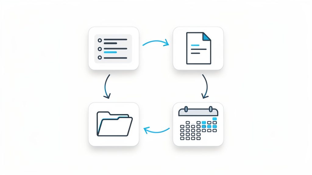
    The most effective way to use free productivity tools is to see them as part of a workflow. A lead comes in, gets added to your notes or CRM. A task is created. A meeting is scheduled. Documents are stored in one place. Follow-up happens on a defined date. Each tool supports one stage of movement.

    This mindset is especially valuable for small businesses and freelancers. When your process is clear, tools become interchangeable parts rather than sources of dependency. You can test a free tool confidently because you understand what job it is supposed to perform. That makes upgrades, replacements, and simplification much easier over time.

    A clear workflow diagram showing four connected boxes/icons: Tasks → Notes → Calendar → File Storage, with arrows indicating flow between them and small labels like 'create', 'schedule', 'store', 'reference' to show how the tools interact in a simple loop.

    Conclusion

    Free productivity tools are not just budget-friendly alternatives. When chosen carefully, they are powerful systems for reducing friction, improving visibility, and helping work move forward with less effort. The key is not using the most tools. It is using the right ones, in a way that supports your real workflow.

    Start with one bottleneck, choose one or two tools that solve it well, and build simple habits around them. Once your system feels trustworthy, expand only where needed. That approach keeps your stack lean, your processes clear, and your productivity grounded in results rather than software experimentation.

  • Productivity Tools List: Build a Focused, Minimal Stack

    Productivity Tools List: Build a Focused, Minimal Stack

    The modern workday is rarely short on effort. It is short on clarity. Tasks arrive from chat, email, tickets, meetings, documents, and personal notes, then compete for attention until even simple work starts to feel fragmented. That is why a well-structured productivity tools list matters. It is not just a catalog of apps. It is a practical system for reducing friction, preserving focus, and making execution more predictable.

    For developers and efficiency-minded professionals, the challenge is usually not access to software. It is tool sprawl. A new note app solves one problem, a new project board solves another, and a calendar extension promises to optimize time, yet the overall workflow becomes harder to manage. The right approach is to understand what each category of productivity software is designed to do, how the tools interact, and where overlap creates complexity instead of value.

    This guide breaks down a practical productivity tools list, explains the key categories, and shows how to build a setup that supports deep work rather than constant switching. The goal is not to use more tools. The goal is to use fewer tools, more intentionally.

    What is Productivity tools list?

    A productivity tools list is a structured collection of software, platforms, and utilities that help individuals or teams plan, execute, track, automate, and complete work more efficiently. In plain terms, it is a reference model for the tools that support output. That can include task managers, note-taking apps, calendars, communication platforms, automation services, file organization systems, and focus aids.

    The phrase often gets treated like a generic roundup, but in practice it should be more precise than that. A useful productivity tools list does not simply name popular applications. It groups them by operational function. That distinction matters because choosing a tool should begin with the job it performs in the workflow, not with brand familiarity.

    For example, a developer may need one tool for issue tracking, another for documentation, and another for blocking distractions during coding sessions. A founder or operations lead may need a knowledge base, a recurring task manager, and a lightweight collaboration layer. The tools differ, but the principle remains the same. Each tool should have a clearly defined role in the system.

    A strong list also accounts for environment. Solo users tend to prioritize speed, low setup overhead, and flexible capture. Teams tend to prioritize visibility, permissions, integration, and auditability. That is why the best productivity stack is rarely universal. It is contextual, shaped by role, team size, project complexity, and tolerance for maintenance.

    Why the concept matters more than the app names

    The market is saturated with software that claims to improve efficiency. Some tools are genuinely excellent. Others are polished distractions. What separates effective systems from expensive clutter is role definition. If a calendar app is also being used as a task manager, reminder system, planning board, and knowledge archive, the workflow eventually degrades.

    A better method is to view a productivity tools list as an architecture. Each category handles a specific operational domain. Tasks manage commitments. Notes store information. Calendars manage time allocation. Communication tools move decisions. Automation tools remove repetition. File systems preserve access and version clarity.

    A layered architecture diagram showing core productivity categories as interconnected modules (Task & Project Management, Notes & Knowledge, Calendar & Scheduling, Communication, Automation, Focus Tools, File Storage). Arrows indicate interactions/integrations between modules and a central 'workspace' hub that reduces fragmentation.

    That architectural view is especially important for technical professionals. Developers often work across local environments, repositories, documentation, issue trackers, CI pipelines, and team chat. Without a clear system, context switching becomes the hidden tax on output. The tools are not the work, but they strongly influence how much uninterrupted work becomes possible.

    Key Aspects of Productivity tools list

    The most useful way to evaluate a productivity tools list is by category. That approach makes comparison clearer and reduces the tendency to select tools based on trend rather than necessity.

    Task and project management tools

    Task management tools sit at the center of most productivity systems because they answer a basic operational question: what needs to happen next? The simplest versions are personal to-do managers. More advanced platforms support dependencies, priorities, recurring tasks, team ownership, and workflow states.

    For solo work, the best task tools tend to be fast, low-friction, and easy to trust. If adding a task feels like opening a control panel, the system will be abandoned. For team work, visibility becomes more important. The platform should make status, blockers, due dates, and responsibility obvious without requiring constant meetings.

    Tools in this category often include personal managers such as Todoist or Microsoft To Do, and more structured platforms such as Trello, Asana, ClickUp, Jira, and Linear. The differences are less about quality than operational design. Jira is built for structured engineering workflows. Trello emphasizes visual simplicity. Linear focuses on speed and product development efficiency.

    Note-taking and knowledge management tools

    Ideas that are not captured are usually lost. Information that is captured poorly is almost as bad. That is why note-taking and knowledge management tools deserve a distinct place in any serious productivity tools list.

    A quick-capture note app helps preserve thoughts, snippets, links, and decisions in real time. A knowledge system goes further. It organizes long-term reference material, meeting notes, internal documentation, research, and process definitions so they remain usable over time. For developers, this may include architecture notes, API references, debugging patterns, or onboarding documents.

    Notion, Obsidian, Evernote, OneNote, and Confluence each approach this domain differently. Notion is highly flexible and often used as a combined wiki and workspace. Obsidian appeals to users who want local-first note graphs and markdown workflows. Confluence is common in larger teams that need structured documentation and enterprise permissions.

    The core criterion is not feature count. It is retrieval speed. If useful information cannot be found when needed, the repository becomes a graveyard rather than a productivity asset.

    Calendar and scheduling tools

    Time is different from tasks. A task list shows obligation. A calendar shows capacity. Confusing the two creates predictable failure. That is why a good productivity tools list separates scheduling tools from general task systems.

    Google Calendar, Outlook Calendar, Calendly, Motion, and Sunsama represent different scheduling philosophies. Some tools manage meetings. Others support time blocking, planning, or dynamic prioritization. A strong calendar setup allows users to see where focused work can actually occur, instead of assuming open time exists somewhere later.

    For developers, this distinction can be critical. A day can appear light in terms of meetings but still be fragmented beyond usefulness. Calendar tooling helps identify contiguous blocks for coding, reviewing, writing, or planning. It makes work visible in time, not just in abstract quantity.

    Communication and collaboration tools

    Many productivity problems are communication problems wearing a different label. Delays happen because ownership is vague. Work gets duplicated because decisions are buried in chat. Tasks drift because there is no durable link between discussion and execution.

    Communication tools such as Slack, Microsoft Teams, and email clients remain essential, but they become productive only when paired with clear usage boundaries. Chat should support rapid coordination, not serve as the permanent home for key decisions. Important outcomes should move into tasks, docs, or project records.

    Collaboration tools also include shared whiteboards, document editors, and meeting systems. Google Workspace, Microsoft 365, Zoom, and Miro often sit in this layer. Their value lies in reducing coordination overhead, particularly in distributed teams where information otherwise fragments across time zones and tools.

    Automation and integration tools

    If a recurring process can be defined, some portion of it can usually be automated. This is where tools like Zapier, Make, IFTTT, and native app integrations become valuable. They reduce repetitive handoffs, sync data between platforms, and eliminate manual copying that adds no real value.

    Automation is especially useful in workflows that cross tool boundaries. A form submission can create a task. A ticket update can trigger a notification. A completed action can archive a file or move a record to another system. These small automations compound. They reduce cognitive load because the user no longer has to remember every administrative follow-up.

    Developers often extend this layer with scripts, webhooks, and API-based workflows. In technical environments, the highest-value automation is usually not flashy. It is the quiet removal of routine process friction.

    Focus and time management tools

    Not all productivity software is about organizing work. Some tools exist to protect attention. That function is increasingly important because digital environments are optimized for interruption.

    Focus tools include website blockers, Pomodoro timers, ambient concentration apps, and analytics platforms that show how time is actually spent. RescueTime, Forest, Freedom, and Session are common examples. These tools are most effective when paired with a deliberate work model, such as scheduled deep work blocks or notification batching.

    For knowledge workers, attention is the scarce resource. For developers, uninterrupted attention can determine whether a hard problem gets solved in one hour or remains unresolved all day. Focus software does not create discipline on its own, but it can make distraction more expensive and concentration easier to sustain.

    File storage and document organization

    Even the best tasks and notes become less useful if the underlying documents are disorganized. Cloud storage and file management tools form the infrastructure layer of a productivity system. Google Drive, Dropbox, OneDrive, and Box are obvious examples, but the real issue is not where files live. It is whether naming conventions, folder structure, and permissions support fast retrieval.

    A mature productivity tools list includes this category because document search, version control, and access management directly affect execution speed. A misplaced contract, outdated spec, or inaccessible asset can stop progress as effectively as a missing task.

    Developers often solve part of this problem through repositories and version control, while non-code artifacts still require conventional document systems. The strongest setups treat storage as part of the productivity architecture, not as an afterthought.

    Comparison of core productivity tool categories

    Category Primary Function Best For Common Risk
    Task Management Tracking actions, owners, deadlines Personal planning, team execution Overcomplication, too many statuses
    Knowledge Management Storing notes, docs, reference material Documentation, research, internal processes Poor structure, low retrieval speed
    Calendar and Scheduling Allocating time and coordinating availability Meetings, time blocking, workload visibility Treating calendar as task dump
    Communication Real-time and asynchronous coordination Team collaboration, decision flow Decision loss inside chat threads
    Automation Reducing repetitive manual work Cross-tool workflows, recurring process steps Brittle setups, low maintenance discipline
    Focus Tools Protecting attention and measuring time use Deep work, distraction control Using tracking without behavior change
    File Storage Preserving and organizing documents Shared assets, version access, archive Naming chaos, permission confusion

    What makes a tool actually productive

    A productive tool reduces total system friction. That sounds obvious, but many tools only reduce friction locally while increasing it globally. A new app might make meeting notes easier to write while forcing the team to search one more place for information. Another might automate a niche process while adding a layer of maintenance nobody owns.

    The practical test is simple. A tool should improve at least one of these variables: speed, clarity, consistency, or focus. Ideally, it improves more than one. If it does not, then it is probably adding novelty rather than productivity.

    This is where a unified environment can help. In some setups, using a central workspace such as Home makes sense because it reduces fragmentation between information, tasks, and routine operations. The value is not in having another dashboard. The value is in lowering the cost of context switching and making the workflow easier to navigate day after day.

    How to Get Started with Productivity tools list

    Building a useful productivity setup starts with diagnosis, not downloads. Most people know they are inefficient in a general sense, but they have not mapped where the inefficiency actually occurs. Before selecting any software, it helps to identify the points where work slows down, disappears, or becomes unnecessarily repetitive.

    In practice, these bottlenecks usually appear in four places. Capture fails, so ideas and tasks are forgotten. Prioritization fails, so everything looks urgent. Retrieval fails, so notes and documents cannot be found. Execution fails, so attention keeps breaking before meaningful progress happens. A solid productivity tools list should address each of these failure modes directly.

    Start with workflow mapping

    The first step is to define the lifecycle of work. For an individual, that may look like capture, plan, schedule, execute, review. For a team, it may include intake, assignment, collaboration, handoff, delivery, and retrospective. Once the lifecycle is visible, tool categories become easier to assign.

    A simple horizontal workflow map showing the lifecycle of work: Capture → Plan → Schedule → Execute → Review. Include branches for team workflows (Intake → Assignment → Collaboration → Handoff → Delivery → Retrospective) and icons for common failure points (capture fails, prioritization fails, retrieval fails, execution fails).

    This is the stage where many people discover they do not need ten tools. They need one task manager, one knowledge base, one calendar, and a small set of integrations. The goal is to cover the workflow with the fewest moving parts possible.

    A useful constraint is to avoid duplicate purpose. If two apps manage tasks, one should be removed. If notes live in three places, consolidation should become a priority. Every redundant tool adds search cost and decision fatigue.

    Choose tools by role, not popularity

    Popular software is not always the best software for a given workflow. A tool should be selected based on operational fit. That means considering interface speed, integration quality, mobile access, offline support, collaboration features, and maintenance burden.

    A developer may prefer markdown-based notes and issue-centric project tracking. A manager may prefer structured dashboards and calendar-heavy planning. A freelancer may benefit most from simple task capture and invoicing automation. There is no single correct stack, but there is a correct method for choosing one.

    The following baseline stack works for many users as a starting model:

    1. Task manager for commitments and follow-up.
    2. Notes or wiki tool for knowledge capture and reference.
    3. Calendar for time blocking and scheduling.
    4. Communication platform for coordination.
    5. Automation layer for repetitive workflows.

    That is enough to build a highly functional system. More tools should be added only when a clear gap exists.

    Build conventions before scale

    Tools fail less often because of missing features than because of missing rules. Even the best software becomes chaotic without conventions. Tasks need naming logic. Notes need structure. Files need a standard format. Shared work needs ownership definitions.

    For teams, this is non-negotiable. A project board without clear status definitions quickly turns into visual noise. A wiki without page standards becomes difficult to search and harder to trust. A chat tool without channel discipline creates endless re-asking of the same questions.

    For individual users, conventions matter just as much. A simple rule such as “all actionable items go into one task system” can remove a surprising amount of mental overhead. So can a consistent note template for meetings, research, or debugging sessions.

    Integrate carefully, then review behavior

    Once the core tools are chosen, integrations can improve flow dramatically. Calendar events can link to project records. Task completions can trigger updates. Notes can connect to action items. The point is not to automate everything. It is to reduce repeated mechanical effort.

    After setup, the system should be reviewed after one or two weeks. This is where behavior becomes visible. Are tasks being captured consistently? Are notes searchable? Is the calendar reflecting real work time? Are distractions still breaking focus? If the answer is no, the issue may be the workflow, the conventions, or the tool itself.

    This review cycle is what turns a productivity tools list into a functional operating system. Without review, most setups decay into partial adoption and silent inconsistency.

    A sample decision framework

    Need Recommended Tool Type Selection Criterion
    Too many loose tasks Task manager Fast input, recurring tasks, reminders
    Scattered knowledge Notes or wiki platform Search quality, structure flexibility, linking
    No time for deep work Calendar and focus tools Time blocking, notification control
    Repeated manual steps Automation platform Reliable integrations, low maintenance
    Team confusion on ownership Project management tool Assignees, status visibility, reporting

    Common mistakes to avoid

    The most common mistake is overbuilding too early. People often design complex systems for an ideal future version of themselves rather than for their current behavior. The result is abandonment. A lightweight system used consistently is far more effective than an elaborate setup used intermittently.

    Another mistake is measuring productivity by app count. More software does not imply more control. In many cases, the opposite is true. Every new tool creates another interface to learn, another source of notifications, and another place where information can drift.

    A third mistake is ignoring maintenance. Productivity systems require periodic cleanup. Completed projects should be archived. Old notes should be organized or deleted. Automations should be checked. Permissions should be reviewed. Without maintenance, even a strong system becomes noisy over time.

    Conclusion

    A useful productivity tools list is not a random collection of trending apps. It is a deliberate framework for managing tasks, knowledge, time, communication, automation, focus, and files with minimal friction. The strongest setups are simple, role-based, and built around actual workflow constraints rather than software enthusiasm.

    The next step is practical. Audit the tools already in use, identify overlap, and define one clear purpose for each remaining category. Then standardize the way those tools are used. If a central workspace such as Home can reduce switching and unify routine work, it is worth evaluating as part of that simplification effort. Productivity improves when the system becomes easier to trust, easier to navigate, and easier to maintain.

  • Productivity Tools for Work: Build a Focused Stack

    Productivity Tools for Work: Build a Focused Stack

    Work rarely becomes difficult because people lack effort. It becomes difficult because attention is fragmented, priorities are unclear, and every task arrives with its own app, alert, and deadline. That is why productivity tools for work matter. They do not create discipline by themselves, but they can reduce friction, compress decision-making, and make focused execution far more realistic.

    A knowledge worker at a desk overwhelmed by many floating app windows and icons

    For developers and knowledge workers, the problem is even sharper. A normal day can involve code editors, issue trackers, documentation systems, chat platforms, cloud consoles, meetings, and personal notes, all competing for context. The right productivity stack does not simply help a person “do more.” It helps them do the right work with less cognitive waste.

    What are productivity tools for work?

    Productivity tools for work are software applications, platforms, and systems designed to improve how tasks are planned, executed, communicated, tracked, and completed. In practical terms, these tools reduce operational overhead. They help people organize work, automate repetitive steps, centralize information, and preserve context across teams and projects.

    This category is broader than many people assume. It includes task managers, calendars, note-taking software, time trackers, project management platforms, collaboration suites, documentation systems, automation tools, password managers, and focus applications. A text editor with strong plugins can be a productivity tool. So can a shared knowledge base or a meeting transcription app. The defining factor is not the label, but the outcome: less time lost to coordination, searching, switching, and repetition.

    For developers, productivity tools often operate at multiple layers. One layer is personal execution, such as task capture, time blocking, and note organization. Another layer is team coordination, including sprint planning, issue assignment, and asynchronous updates. A third layer is workflow automation, where integrations connect systems so that status changes, notifications, builds, and approvals happen with minimal manual intervention.

    A three-layered stack diagram for developers: personal execution, team coordination, workflow automation

    The most effective tools do not just store information. They shape behavior. A well-designed task system encourages prioritization. A shared documentation platform improves reuse and onboarding. A calendar tool with strong scheduling logic protects deep work. In this sense, productivity software is partly technical infrastructure and partly operational design.

    Key aspects of productivity tools for work

    Task management and prioritization

    A large percentage of workplace inefficiency comes from ambiguity. People often know they are busy, but cannot clearly identify what matters now, what can wait, and what is blocked. Task management tools address this by giving work a visible structure. They convert mental clutter into explicit objects: tasks, owners, due dates, dependencies, and status fields.

    The real value is not the checklist itself. It is the ability to define a system of execution. For example, a developer handling multiple tickets can use a task manager to separate urgent production issues from strategic architecture work. Without that separation, the day becomes reactive. With it, work can be sequenced according to impact, urgency, and available focus time.

    Strong prioritization tools also create historical visibility. Teams can inspect where time is actually being spent, identify bottlenecks, and detect recurring work that should be automated. This is where many organizations move from being merely busy to being operationally mature.

    Communication and collaboration

    Communication tools are often treated as simple messaging channels, but they are among the most influential productivity tools for work because they determine how interruptions propagate. A poorly configured chat platform can destroy concentration. A well-managed collaboration environment can accelerate decisions while preserving focus.

    The distinction lies in communication design. Synchronous channels are useful for urgent issues, live debugging, and fast alignment. Asynchronous channels are better for status updates, documentation links, and decision records. Teams that understand this difference usually work more efficiently because they stop forcing every interaction into real-time conversation.

    For distributed teams, collaboration tools also function as memory systems. Message threads, shared documents, comments, and linked tasks preserve context. That context reduces duplicate questions and makes onboarding easier. Instead of repeatedly asking why a decision was made, a team member can inspect the documented trail and proceed with confidence.

    Knowledge management and documentation

    A team without documentation pays a tax on every repeated task. That tax appears in onboarding delays, duplicated troubleshooting, inconsistent processes, and reliance on a few individuals who become informal knowledge bottlenecks. Documentation platforms, internal wikis, and structured note systems are therefore central productivity assets, not administrative extras.

    The best knowledge tools support fast capture and reliable retrieval. Capturing ideas is easy. Finding them three weeks later is the real test. Search quality, tagging, linking, version history, and collaborative editing all matter because workplace productivity depends on accessible knowledge, not merely stored knowledge.

    This is one area where a platform like Home can be useful when teams need a cleaner operational center. If work, notes, and routines are scattered across too many disconnected applications, a more unified environment can reduce switching costs and make core information easier to maintain and act on.

    Time management and focus protection

    Time management software is often misunderstood as surveillance or rigid scheduling. At its best, it is neither. It is a way to align time usage with work type. Deep engineering work requires uninterrupted blocks. Administrative work can often be grouped. Meetings can be constrained. Personal focus patterns can be observed and used intentionally.

    Calendars, time-blocking systems, Pomodoro timers, and time analysis tools all support this process. Their purpose is not to fill every hour. Their purpose is to make invisible patterns visible. If a person discovers that most coding work is being interrupted every 12 minutes, the solution is not motivation. The solution is structural change.

    Focus tools become especially valuable in environments saturated with notifications. A worker who disables non-essential alerts, batches communication windows, and reserves protected work sessions can often outperform someone working longer hours with constant interruptions. Productivity is tightly coupled with attention quality, not just duration.

    Automation and integration

    Repetitive work is one of the clearest signals that a workflow can be improved. Copying data between systems, sending routine reminders, updating statuses manually, or recreating the same report each week are all candidates for automation. This is where productivity tools move from passive support to active operational leverage.

    Automation platforms connect applications through triggers, conditions, and actions. A support ticket can create a task automatically. A merged pull request can update project status. A form submission can populate a database and notify the correct team. Each individual automation may save only a few minutes, but across a team, the cumulative gain is substantial.

    Integrations also reduce context switching. Instead of visiting five tools to understand one project state, workers can centralize critical signals. This lowers mental overhead and decreases the chance of missing updates. For technical teams, integration quality is often more important than the feature list of any single product.

    Security, reliability, and scalability

    A productivity stack that saves time but creates security risk is not a real improvement. Developers and teams should evaluate tools not only for usability, but also for access controls, auditability, backup practices, and compliance alignment. Sensitive information flows through productivity systems constantly, including credentials, roadmaps, client data, and internal discussions.

    Reliability matters just as much. If a task platform is slow, a documentation tool loses edits, or a sync process fails unpredictably, users stop trusting the system. Once trust erodes, people build shadow workflows in spreadsheets, local notes, or personal chat messages, and the organization loses consistency.

    Scalability is the longer-term consideration. A tool that works for a solo freelancer may fail for a 50-person engineering team. Permission models, template systems, reporting features, and integration support become more important as work grows in complexity. Choosing tools with a view toward future workflows prevents painful migrations later.

    Choosing tool categories and team balance

    Categories that matter most in day-to-day operations

    When people search for the best productivity tools for work, they often compare products before they define requirements. That reverses the correct sequence. The better approach is to identify workflow categories first, then evaluate products inside each category. Most work environments rely on some combination of task management, communication, documentation, scheduling, file storage, and automation.

    A developer, for instance, may need an issue tracker for engineering tasks, a personal note system for design ideas, a team documentation platform for architecture records, and a calendar system that can protect coding blocks from meeting sprawl. If all four categories are covered well, productivity improves substantially even without a large software budget.

    The table below shows how common tool categories map to workplace outcomes.

    Tool Category Primary Function Typical Benefit Common Risk
    Task Management Track work items and priorities Better execution clarity Over-engineering workflows
    Team Chat Fast communication and coordination Faster response times Constant interruption
    Documentation Store and retrieve shared knowledge Reduced duplication Stale or unmaintained content
    Calendar and Scheduling Allocate time and meetings Better focus planning Overscheduled days
    Automation Platforms Remove manual repetitive work Higher operational efficiency Fragile or opaque automations
    Time Tracking Measure effort and patterns Better planning accuracy Micromanagement if misused

    The pattern is consistent. Every category has upside and trade-offs. A tool becomes productive only when its implementation aligns with actual work behavior. Adding software without process discipline often increases complexity instead of reducing it.

    Personal productivity versus team productivity

    A common mistake is optimizing only for the individual. A person may have a beautifully organized personal system while the team around them operates in fragmented ways. In that case, the personal gain remains limited because collaboration still creates delays, duplicate effort, and confusion.

    Personal productivity tools help with capture, planning, focus, and recall. Team productivity tools help with visibility, alignment, handoffs, and accountability. Both are necessary. A developer can maintain excellent private notes, but if architectural decisions live only there, the team gains little value. Conversely, a team can have a robust project board, but if individuals lack a method for handling daily priorities, execution still degrades.

    The strongest setups connect the two levels cleanly. Personal tasks should map to team goals. Team documentation should support individual execution. Meeting decisions should create trackable actions. This is the difference between a collection of apps and a real productivity system.

    The hidden cost of tool sprawl

    Many organizations do not suffer from too few tools. They suffer from too many. Tool sprawl occurs when each new problem is addressed with another platform, often without integration, governance, or retirement of the old system. Over time, the stack becomes noisy and expensive, and people stop knowing where truth lives.

    This issue is especially common in technical environments because teams adopt specialized software rapidly. One tool handles project planning, another handles docs, another stores snippets, another captures retrospectives, and another sends alerts. Each may be good individually, but together they can create a high-friction environment.

    Reducing tool sprawl does not mean collapsing everything into one product at any cost. It means being deliberate. Teams should identify core systems of record, define where certain information belongs, and retire redundant workflows. In many cases, a platform like Home is most valuable not because it adds another feature, but because it consolidates routine work patterns into a more coherent operating space.

    How to get started with productivity tools for work

    Choosing productivity tools should begin with observation, not shopping. Before selecting software, it is necessary to understand where work is actually slowing down. That may be task overload, constant interruptions, poor handoffs, missing documentation, or too much manual updating between systems. Tools are effective only when they are matched to a real constraint.

    A simple starting framework is to audit one normal workweek. Track where delays occur, where information gets lost, and which repeated actions feel unnecessary. If meetings generate unclear follow-up, a task and note system may be the priority. If project knowledge is trapped in chat, documentation should come first. If status reporting consumes too much time, automation may produce the fastest return.

    A practical setup sequence

    For most individuals and teams, implementation is easier when done in a stable order. The sequence below reduces confusion and prevents premature complexity.

    1. Define the workflow problem, identify whether the main issue is planning, communication, documentation, focus, or repetitive admin work.
    2. Select one primary tool per category, and avoid testing multiple overlapping platforms at the same time.
    3. Create minimal structure, using a small number of projects, tags, statuses, or folders rather than an elaborate taxonomy.
    4. Establish team rules that decide where tasks live, where decisions are documented, and what belongs in chat versus project systems.
    5. Review after two weeks, remove friction, simplify fields, and automate only the steps that repeat consistently.

    This order matters because most tool rollouts fail from overconfiguration. People build complex boards, labels, templates, and automations before they have validated basic usage. A lightweight system that people actually use is more productive than a sophisticated one nobody trusts.

    Start small, then standardize

    The first version of a productivity system should be intentionally modest. For a solo professional, that may mean one task manager, one note system, and a disciplined calendar. For a team, it may mean one project board, one documentation repository, and one communication standard for decisions and updates.

    Once basic adoption is stable, the next step is standardization. Naming conventions, task templates, document formats, and recurring meeting notes all reduce variability. This may sound bureaucratic, but in practice it removes decision fatigue. When every sprint ticket follows a known format and every project page contains the same key sections, people spend less time interpreting structure and more time doing work.

    Standardization is particularly valuable for developers, who often move between implementation and coordination. Structured workflows reduce the amount of mental decompression required when switching contexts.

    Evaluate tools by workflow fit, not hype

    Software selection is often distorted by popularity. A tool may be widely recommended and still be wrong for a given team. The better evaluation method is to test workflow fit. Does the software support how work actually moves? Does it integrate with existing systems? Can it scale without becoming administratively heavy? Is the interface fast enough for daily use?

    This is also where teams should assess hidden costs. A feature-rich platform can require significant maintenance. A simpler product may produce better results if it lowers setup time and training overhead. Productivity is not gained from having more toggles. It is gained from reducing friction at decision points.

    A useful comparison lens is shown below.

    Evaluation Factor What to Ask Why It Matters
    Ease of Adoption Can a new user become productive quickly? Lowers rollout friction
    Integration Support Does it connect to core tools already in use? Reduces manual transfer work
    Flexibility Can it support current and future workflows? Prevents early replacement
    Search and Retrieval Can information be found fast? Preserves context and knowledge
    Governance Are permissions and visibility controllable? Supports security and scale
    Maintenance Load How much admin work does the tool create? Prevents system fatigue

    If a team is already overwhelmed, low-maintenance tools usually outperform highly customizable ones. Precision matters, but so does operational simplicity.

    Build habits around the tools

    Even excellent productivity tools fail when they are treated as passive containers. They need rituals. A task system needs a daily review. A documentation tool needs ownership and update rules. A calendar needs explicit focus blocks. Automation needs monitoring so failures are visible and fixable.

    Habits are what transform software into process. A weekly review, for example, can surface stale tasks, blocked dependencies, and mismatched priorities. A post-project documentation pass can preserve lessons before context fades. A shared protocol for meeting outcomes can ensure that discussion becomes action rather than disappearing into chat history.

    This is why adoption strategy is as important as selection strategy. The tool itself rarely solves the problem alone. The combination of tool, workflow, and habit is what drives measurable gains.

    Conclusion

    The best productivity tools for work do not simply help people move faster. They help them work with greater clarity, lower friction, and stronger alignment. Task systems improve prioritization. Documentation tools preserve knowledge. Communication platforms shape collaboration. Automation removes repetitive effort. When these elements are chosen deliberately and used consistently, productivity becomes a property of the system, not just an individual struggle.

    The next step is practical. Identify the single biggest source of friction in your current workflow, then choose one tool category that directly addresses it. Implement a minimal version, use it for two weeks, and refine based on real behavior. If the goal is a cleaner, more centralized working environment, a solution like Home may be worth considering as part of that simplification. The objective is not more software. It is better work, with less waste.

  • Productivity Tool Setup Guide — Reduce Tool Friction

    Productivity Tool Setup Guide — Reduce Tool Friction

    Most people do not have a time problem, they have a tool friction problem. Work gets slower not because tasks are unusually difficult, but because notes live in one app, tasks in another, files in a third, and alerts arrive from everywhere at once. A productivity stack that is installed but not configured properly quickly turns into another source of noise.

    A visual of 'tool friction': multiple app windows/icons (notes app, task manager, calendar, chat, file storage) scattered around a person at a desk. Arrows between apps cross and tangle, and small visual 'noise' symbols (bells, red dots) indicate notifications. Emphasize friction and fragmentation rather than complexity.

    A solid productivity tool setup guide fixes that at the system level. Instead of chasing isolated tips, it defines how tools should capture inputs, organize work, surface priorities, and reduce context switching. For developers and efficiency-minded professionals, that matters more than any single app recommendation. The best setup is not the one with the most features. It is the one that disappears into the background and reliably supports execution.

    What is a productivity tool setup guide?

    A productivity tool setup guide is a structured method for selecting, configuring, and connecting the tools used to manage work. It covers the practical design of a personal or team workflow, including task management, note capture, calendar control, communication boundaries, automation, and file organization. The purpose is not simply to install software, the purpose is to create a repeatable operating environment.

    In technical terms, a good setup guide functions like system architecture for attention. Inputs are routed into known channels. Processing rules determine what becomes a task, what becomes a note, and what gets ignored. Outputs, such as scheduled work, documented decisions, and completed deliverables, become easier to track because the system has consistent states and fewer exceptions.

    A system-architecture diagram for attention: inputs (email, chat, meeting notes, PRs) flow into three labeled funnels/channels (Capture, Process/Organize, Execute) with processing rules boxes that route items into Task System, Knowledge Base, or Archive. Outputs (scheduled work, documented decisions, completed deliverables) come out the other side. Use clear labels for channels and routing decisions.

    For developers, this matters in a very specific way. Engineering work often combines deep focus, asynchronous communication, ticket-driven execution, documentation, and ad hoc troubleshooting. If the setup does not distinguish between high-focus work and low-value interruptions, the day gets fragmented. A proper configuration reduces the number of decisions required just to begin working.

    The guide also serves another purpose, which is long-term maintainability. Many people build a workflow accidentally, one app at a time. Over months, the stack becomes bloated. Notifications multiply. Duplicate systems emerge. A setup guide imposes constraints. It clarifies what each tool is for, what it is not for, and how information should move across the stack.

    Key aspects of a productivity tool setup guide

    Define the role of each tool

    The first rule in any effective productivity system is simple, one clear role per tool. Confusion starts when the same type of information is stored in multiple places. Tasks in chat, ideas in email drafts, project notes in local text files, and deadlines in memory create an unreliable operating model.

    A better approach is to assign strict functional boundaries. One tool should serve as the task system of record. Another should serve as the knowledge base. A calendar should represent hard commitments, not wishful intentions. Communication tools should be used for discussion, not long-term storage. When each system has a defined role, retrieval becomes predictable and trust increases.

    This separation is especially important for developers who already work across issue trackers, code repositories, terminal environments, and team chat. Without boundaries, the same bug might appear in GitHub Issues, Slack, a notebook, and a calendar reminder. The duplication feels safe at first, but it creates synchronization overhead. A good setup removes that redundancy.

    Build around capture, organization, and review

    Every strong setup handles three phases well, capture, organization, and review. Capture refers to the ability to record incoming ideas, requests, and obligations quickly. If capture is slow, people defer it. Deferred capture becomes forgotten work.

    Organization is the process of converting raw input into structured information. That means deciding whether an item is actionable, reference material, waiting on someone else, or irrelevant. The key is to avoid over-organizing. Too many folders, tags, and statuses create more maintenance work than value.

    Weekly review is the part most users skip, and it is the reason many systems fail after a few weeks. A setup only stays useful if it is checked regularly. Daily review keeps priorities current. Weekly review resets project status, removes stale items, and catches drift before it becomes disorder. In practice, review is what converts a collection of apps into an actual system.

    Minimize context switching

    A major objective of any productivity tool setup guide is reducing attention fragmentation. Context switching is expensive. It introduces latency, increases mental reload time, and lowers the quality of deep work. This is not just a preference issue, it is a throughput issue.

    The setup should therefore reduce unnecessary app hopping. Notifications must be tuned aggressively. Integrations should support flow, not add noise. If a tool can centralize alerts, summaries, or task updates without becoming another inbox, it usually improves focus. This is one reason unified environments can work well when configured carefully. A platform like Home, for example, can be useful when the goal is to reduce scattered touchpoints and create a cleaner work surface rather than adding yet another destination.

    The practical test is simple. At any point in the workday, it should be obvious where new inputs arrive, where current priorities live, and where supporting information is stored. If that answer changes depending on the day, the setup needs simplification.

    Design for retrieval, not just storage

    Many people optimize for collecting information. Fewer optimize for finding it later. That is a critical mistake. A productivity system is only as effective as its retrieval path. Notes that cannot be found, tasks buried under vague labels, and files named inconsistently all increase friction at the point of execution.

    A better design uses a small number of categories, predictable naming, and lightweight metadata. Projects should have stable names. Meeting notes should follow the same title pattern. Files should be stored according to how they are retrieved in practice, not according to an ideal taxonomy no one remembers.

    This principle applies strongly to technical workers. Documentation is useful only if it is discoverable during implementation, debugging, onboarding, or handoff. A clean setup treats future retrieval as a primary requirement, not an afterthought.

    Match the stack to work type

    Not every workflow needs the same tools. A solo developer, a startup operator, and an enterprise engineering manager all have different needs. The right setup depends on the volume of communication, complexity of projects, collaboration model, and reporting requirements.

    A lightweight stack may be enough for an individual contributor. That often means one task manager, one notes repository, a calendar, and basic automation. A more complex environment may need issue tracking, team documentation, scheduled reporting, collaboration spaces, and dashboarding. The mistake is assuming that more complexity equals more control. In many cases, extra layers only make the system harder to maintain.

    The most reliable setups are usually conservative. They cover the critical functions well and avoid optional complexity until there is a real operational need.

    Core tool categories and their purpose

    Tool Category Primary Function Configuration Priority Common Failure Mode
    Task Manager Track actionable work and next steps High Treated as a wishlist instead of a current execution system
    Notes/Knowledge Base Store reference material, decisions, and ideas High Over-tagging and poor retrieval structure
    Calendar Manage time-bound commitments High Used for vague intentions rather than real constraints
    Communication Tool Support discussion and coordination Medium Becomes a task manager and archive at the same time
    File Storage Preserve assets and documents Medium Inconsistent naming and duplicated versions
    Automation Layer Move information between systems Medium Automates broken processes instead of fixing them
    Dashboard/Home Workspace Centralize visibility and reduce switching Medium to High Added as another destination without clear workflow value

    How to get started with a productivity tool setup guide

    Start with workflow mapping, not app shopping

    The best way to begin is to map the work before choosing or reconfiguring tools. Many people start with feature lists and pricing pages. That usually leads to a stack that looks impressive but does not fit actual behavior. Workflow mapping reveals the real requirements.

    Track where work enters the system, how it gets clarified, where it is executed, and how it is reviewed. For a developer, this often includes issue trackers, pull request reviews, standups, chat messages, meeting notes, and personal tasks. Once those flows are visible, tool choices become more obvious. The setup should reflect actual demand patterns, not aspirational productivity habits.

    This stage also reveals duplication. If the same item is captured in three places, one of those locations should be eliminated. If approvals are hidden in chat but project status lives elsewhere, the handoff point needs to be made explicit. Good setup is often subtraction before addition.

    Establish a minimum viable stack

    A practical productivity system usually begins with a short list of components: a task manager, a notes or documentation tool, a calendar, a primary communication channel, and an optional dashboard or workspace hub. That minimal stack is enough for most individuals and many small teams. The important part is not the quantity of tools but the contract between them. The task manager owns action items. The notes tool owns reference material. The calendar owns fixed time commitments. Communication tools handle conversation and escalation, not long-term planning.

    If a central workspace is added, it should reduce search time and provide visibility across priorities. That is where a solution like Home can add value, especially for users who want a simpler control layer over fragmented apps and recurring work surfaces.

    Configure capture paths first

    Before customizing tags, themes, templates, or advanced views, configure capture. This is the highest-leverage step. If incoming information does not enter the system quickly, nothing else matters.

    Create one default path for tasks and one for notes. The task path should be fast enough to use during meetings, coding sessions, and interruptions. The note path should support quick idea capture without forcing premature categorization. Email forwarding, mobile widgets, browser shortcuts, and keyboard quick-add features are often more valuable than advanced organization settings.

    The reason is behavioral. People consistently use systems that have low entry friction. They abandon systems that require too many decisions at the moment of capture. Good setup respects that constraint.

    Keep organization deliberately simple

    A common failure pattern is building a beautifully structured system that is too complex to sustain. Excessive tags, nested folders, multi-stage statuses, and custom taxonomies may look efficient, but they usually increase maintenance cost. A productivity system should support work, not become work.

    Use a limited number of project areas and statuses. Choose naming conventions that are obvious on first glance. Prefer broad categories over fine-grained classification unless reporting requirements justify the detail. If a label is rarely used for retrieval, it probably does not need to exist.

    This principle is even more important when the system is shared with others. Complexity compounds under collaboration. What feels precise to one user often feels ambiguous to the rest of the team.

    Set review intervals and protection rules

    A setup becomes reliable when it has operational cadence. That means the system is not only configured once but maintained through routine review. Daily review keeps the current task list aligned with reality. Weekly review checks open loops, stale projects, deferred items, and upcoming deadlines.

    Protection rules are equally important. These are the boundaries that prevent degradation. For example, tasks should not live permanently in chat. Calendar blocks should correspond to genuine commitments. Notes should be linked to projects when relevant. Notifications should be opt-in for low-priority channels and explicit for urgent ones.

    A system without review becomes a graveyard. A system without rules becomes inconsistent. A durable setup requires both.

    Implement in a controlled sequence

    The rollout should be sequential, not simultaneous. Rebuilding everything at once creates unnecessary resistance and makes it difficult to diagnose what is working.

    1. Audit current tools and remove obvious duplicates.
    2. Choose the system of record for tasks and notes.
    3. Configure capture methods and notification rules.
    4. Define naming conventions, project structure, and review cadence.
    5. Add integrations or a central workspace only after the core flow is stable.

    This sequence works because it preserves functional clarity. Capture and execution come first. Optimization comes later. Once the core system is stable, dashboards, automations, and unified workspaces can be layered in with less risk.

    Example of a practical developer setup

    A developer-focused configuration often works best when it mirrors the rhythm of technical work. Tickets and deliverables should live in the primary task system or issue tracker. Meeting outcomes and architecture notes should live in the documentation layer. The calendar should contain actual time-bound events, along with selective focus blocks for deep work. Chat should remain for coordination, not long-term task storage.

    In this configuration, the daily operating loop becomes straightforward. New requests are captured quickly. Work is clarified into next actions. Supporting context is stored in notes or project documentation. Scheduled obligations are visible on the calendar. Review closes the loop. If a workspace such as Home is used on top of that stack, its role should be visibility and simplification, giving the user one dependable place to see priorities, context, and current commitments.

    The result is not a perfect system. No real productivity setup is perfect. The result is a lower-friction environment that supports consistent execution.

    Conclusion

    A strong productivity tool setup guide is less about software selection and more about system design. It defines the role of each tool, reduces duplication, improves capture, simplifies organization, and creates a review rhythm that keeps the whole structure usable over time. For developers and efficiency-focused professionals, that translates directly into better focus, cleaner handoffs, and less operational drag.

    The next step is to audit the current stack with a strict lens. Identify where tasks actually live, where context gets lost, and where switching costs are highest. Then simplify. Configure one reliable capture path, one trusted task system, one clear notes repository, and a review cadence you can sustain. Once that foundation is stable, tools like Home can help unify visibility and make the setup even more efficient without adding unnecessary complexity.

  • Time Management Tools: Protect Focus and Boost Output

    Time Management Tools: Protect Focus and Boost Output

    Time disappears fastest when work is fragmented. A few messages, a calendar alert, an unfinished task, a context switch, and suddenly a full afternoon has been consumed without meaningful progress. That is exactly why time management tools matter. They do not create more hours, but they make hours more visible, structured, and defensible.

    A visual of a single afternoon being eaten by many small interruptions: floating icons for chat messages, email alerts, a calendar notification, a half-finished task sticky note, and a developer looking distracted while the clock hands spin quickly. The composition should convey that fragmented, small events aggregate into a large loss of focused time.

    For developers and efficiency-focused professionals, the problem is rarely a lack of ambition. It is usually a systems problem. Work arrives from multiple channels, priorities shift in real time, and deep focus competes with meetings, support requests, and administrative overhead. The right toolset turns this chaos into an operable workflow, creating a layer between intention and distraction.

    This article examines what time management tools are, how they function in practice, which categories matter most, and how to adopt them without building a complicated productivity stack that becomes another source of friction. The objective is not to recommend more software for its own sake. It is to show how to use tools to protect attention, reduce task drift, and improve output quality over time.

    What is Time management tools?

    Time management tools are systems, applications, and interfaces designed to help individuals plan, allocate, track, and optimize how time is used. At a basic level, they help answer four operational questions: what needs to be done, when it should be done, how long it should take, and whether time was actually spent as intended.

    In practical terms, the category includes task managers, digital calendars, project planning platforms, focus timers, habit trackers, time trackers, scheduling assistants, and automation tools. Some tools are lightweight, built for personal use and rapid capture. Others are designed for teams, where time management intersects with resource planning, sprint velocity, delivery forecasting, and workload balancing.

    The phrase itself can sound broad because it is broad. A calendar is a time management tool. So is a Kanban board. So is a Pomodoro timer. So is software that logs application usage and reveals that “quick checks” of email consumed ninety minutes. What unifies them is not form factor, but function. Each tool attempts to bring structure, visibility, and control to time use.

    For technical professionals, the category has an additional layer. Time management is not only about scheduling. It is also about cognitive load management. A developer may need long uninterrupted blocks for architecture work, shorter windows for code review, and explicit boundaries around communication channels. In that context, time management tools become less about rigid planning and more about protecting the conditions required for high-quality work.

    Why the concept matters now

    Modern work environments reward responsiveness, but meaningful progress often depends on the opposite. Deep work requires latency. Good problem solving needs uninterrupted sequences of thought. Without deliberate tooling, the default environment pushes toward reactive behavior, where urgency displaces importance.

    That is why many people adopt time management tools after a failure point. Deadlines slip. Task lists become unreliable. Meetings consume planned execution time. Or personal energy becomes inconsistent because every day feels improvised. The tool is then not a luxury, but a control mechanism.

    Used well, these tools create a feedback loop. Planning improves execution. Execution produces tracking data. Tracking data reveals misestimation, bottlenecks, and distraction patterns. That information then improves future planning. Over time, the user shifts from guessing to managing.

    Key Aspects of Time management tools

    Visibility into commitments

    The first major function of a time management tool is visibility. Many productivity problems are not caused by laziness or poor discipline. They are caused by hidden commitments. Work exists in inboxes, chat threads, issue trackers, personal notes, and memory. If obligations are distributed across too many places, prioritization becomes unreliable.

    A funnel or hub-and-spoke diagram showing multiple sources (email, chat, issue tracker, personal notes, meetings) feeding into a single central dashboard that displays a combined view of tasks, deadlines, and calendar blocks. Emphasize that the central view enables prioritization and reduces hidden commitments.

    A strong tool centralizes what matters. It does not need to hold every artifact, but it should serve as the authoritative layer where tasks, deadlines, and time blocks can be reviewed together. This is where digital calendars and task managers become foundational. One shows when time is already allocated. The other shows what still competes for that time.

    When visibility improves, decision quality improves. It becomes easier to identify overload early, defer low-value work, and avoid the common mistake of assuming open calendar space means available cognitive capacity. Those are not the same thing.

    Prioritization and sequencing

    Not all time management tools are equal in how they handle priority. Some are excellent for capture but weak in sequencing. Others support dependencies, due dates, tags, effort estimates, and status transitions. The right choice depends on whether the user needs simple personal organization or structured workflow control.

    For developers, prioritization often has hidden complexity. A task may look small but require setup time, environment context, or coordination with another team. Good tools support more than deadlines. They help separate urgent, important, blocked, and optional work. They also make sequencing easier by showing what should happen next, not just what exists in the backlog.

    This distinction matters. A long unsorted task list creates anxiety, not execution. Effective time management tools reduce ambiguity by narrowing focus. Instead of presenting fifty open items, they help surface the two or three that deserve the next available block of concentration.

    Time blocking and calendar integration

    One of the most effective applications of time management tools is time blocking, the practice of assigning work to actual periods on the calendar rather than leaving it as abstract intention. This is often where productivity systems become real. A task on a list is a possibility. A task assigned to 10:00 to 11:30 is a commitment.

    Calendar-based planning forces realism. It exposes whether workload actually fits inside available time. It also creates friction against overcommitting. Many professionals discover that their problem is not underperformance, but systematic overplanning. They schedule eight hours of focused work into a day that contains three meetings, multiple interruptions, and unavoidable operational tasks.

    Tools that synchronize tasks and calendar events are particularly useful because they bridge planning and execution. This is also an area where an integrated workspace like Home can be valuable, especially for users who want planning, scheduling, and personal workflow structure in one environment instead of spread across disconnected apps.

    Tracking actual time versus estimated time

    Planning alone is incomplete without measurement. That is why time tracking is one of the most important, and often most misunderstood, categories of time management tools. Tracking is not only for freelancers billing clients or managers monitoring utilization. It is also a diagnostic tool for personal accuracy.

    Many people consistently underestimate how long tasks take. Others fail to account for startup costs, interruptions, and recovery time after context switching. Time tracking reveals these patterns. It helps answer whether recurring work is truly routine, whether meetings generate hidden follow-up overhead, and whether certain parts of the day produce better output than others.

    For technical work, this can be especially useful. Debugging, refactoring, investigation, and performance optimization rarely fit neat estimates. Tracking actual time spent can improve sprint planning, reduce unrealistic commitments, and create more credible future forecasts.

    Focus support and distraction control

    A large segment of time management tools is built around a simple truth, unmanaged attention makes planning irrelevant. A perfect calendar does not help if the planned hour is lost to notifications, tab switching, or passive communication loops.

    Focus tools address this by creating boundaries. Some use timers, such as Pomodoro-based applications. Others block distracting websites, mute notifications, or provide session analytics. The goal is not to gamify concentration, but to reduce the number of times the brain is asked to re-enter a task after interruption.

    This matters because context switching carries a real cost. For developers, that cost can be severe. Rebuilding working memory after interruption takes time and degrades quality. A time management tool that protects uninterrupted sessions may therefore be more valuable than one with a long feature list but no practical support for focus.

    Automation and recurring workflows

    Advanced time management becomes more efficient when routine actions are automated. Repeating reminders, recurring task templates, scheduled reviews, and meeting buffers all reduce the need for manual maintenance. Good tools do not just store plans, they help operationalize them.

    Automation is especially effective for recurring responsibilities that tend to be forgotten because they are small, not because they are unimportant. Weekly planning, code review follow-ups, invoice deadlines, learning sessions, or maintenance tasks benefit from systems that regenerate them automatically. This lowers cognitive overhead and increases consistency.

    The best setups often feel almost invisible. They surface work at the right time, preserve default structures, and reduce decision fatigue. That is a stronger outcome than a feature-rich tool that requires constant upkeep.

    Team coordination versus personal execution

    A common mistake is using one tool to solve two very different problems. Team project platforms optimize for shared visibility, dependencies, assignments, and status reporting. Personal time management tools optimize for focus, scheduling, and day-level execution. Sometimes one product handles both reasonably well. Often, it does not.

    This is why professionals frequently maintain a layered system. Team obligations live in a project management platform. Personal execution happens in a task manager or calendar environment that translates shared commitments into individual time blocks. The separation is useful because project status is not the same as daily actionability.

    A developer may be assigned five tickets in a sprint board, but still need a personal system to decide which one enters the next focus block, how much time to reserve, and when administrative work should happen around it. Time management tools are most effective when that distinction is explicit.

    Comparing common categories of time management tools

    The market is crowded, but most products fall into a small number of operational categories. The comparison below clarifies what each category does best.

    Tool Category Primary Function Best For Limitation
    Task Managers Capture, organize, and prioritize tasks Personal workflows, daily planning, follow-ups Weak if not linked to calendar reality
    Calendars Schedule time-bound events and work blocks Time blocking, meetings, deadline visibility Does not manage backlog complexity well
    Project Management Platforms Coordinate tasks across teams Shared projects, dependencies, progress tracking Can become too heavy for personal execution
    Time Trackers Measure actual time spent Estimation accuracy, billing, productivity analysis Tracking without review creates noise
    Focus Tools Protect attention during work sessions Deep work, distraction control, session discipline Limited value without clear priorities
    Automation Tools Reduce repetitive planning/admin work Recurring tasks, reminders, workflow consistency Poor setup can create silent failure points

    The important point is not to adopt one of everything. It is to identify which operational gaps actually exist. If the problem is forgotten tasks, a timer will not solve it. If the problem is distraction, a better backlog view may not help enough. Tool choice should follow failure mode.

    How to Get Started with Time management tools

    Start with the bottleneck, not the feature list

    Most failed productivity systems begin with enthusiasm and collapse under complexity. The user installs multiple apps, creates tags and categories, imports goals, watches tutorials, and then abandons the setup within two weeks because maintenance becomes a second job.

    A better starting point is to define the bottleneck. Is work being forgotten? Is too much work being accepted? Are priorities unclear? Is focus constantly interrupted? Is task duration consistently underestimated? A good implementation begins with one concrete problem and one corresponding tool capability.

    If someone misses deadlines because tasks are scattered across email and chat, the first need is a trusted capture and task management layer. If someone knows what to do but never finds uninterrupted time, the first need is calendar blocking plus distraction control. This diagnostic approach prevents overbuilding.

    Build a minimal stack

    A minimal stack is usually enough for most professionals. In many cases, a strong combination is one task manager, one calendar, and one method for focused execution. Additional layers should only be added when they solve a known problem.

    A practical starter stack often includes the following elements:

    1. Task Manager for capturing and prioritizing work.
    2. Calendar for assigning time blocks and reviewing commitments.
    3. Focus Method such as timed sessions or notification control.
    4. Optional Tracker for measuring actual time if estimates are unreliable.

    This setup is intentionally restrained. The objective is to create a working system that survives real life, not an idealized dashboard that looks impressive and fails under pressure.

    Define a workflow before customizing

    Tools perform best when attached to a clear workflow. Without one, even excellent software becomes a storage container for good intentions. A simple workflow might look like this: capture all incoming tasks in one place, review and prioritize them daily, assign top tasks to calendar blocks, execute during focus sessions, and review actual progress at the end of the day.

    That sequence matters because it turns productivity from aspiration into process. The software supports the process, but does not replace it. This is where many users go wrong. They expect the application to create discipline automatically. In reality, the tool amplifies whatever workflow already exists, whether disciplined or chaotic.

    For users who want a more unified environment, Home can help reduce fragmentation by bringing daily planning and execution into a single operational space. That matters because fewer system boundaries usually mean less friction and better follow-through.

    Use estimates carefully

    Time estimates are useful, but only when treated as operational signals rather than promises. A developer may estimate a feature task at ninety minutes, then discover that environment setup, dependency issues, and edge case testing expand it to three hours. This does not mean estimation is pointless. It means estimates should be revisited using real tracking data.

    A practical approach is to estimate in broad ranges first. Short, medium, and deep-work tasks are often easier to classify than assigning exact minutes. Once patterns emerge, estimates become more accurate. This helps with both personal planning and team communication.

    The goal is not perfect precision. It is reduced surprise. Better estimates lead to better calendars, fewer missed commitments, and more realistic daily plans.

    Create review loops

    A time management tool becomes valuable only when it is reviewed consistently. Without review, task lists decay, calendars fill reactively, and tracking data remains unused. Review is the maintenance layer that keeps the system credible.

    Daily review should be brief. It checks today’s commitments, identifies the top priorities, and ensures the calendar reflects actual intention. Weekly review is more strategic. It examines overdue work, recurring bottlenecks, unfinished priorities, and upcoming constraints. This is also where the user can decide whether the tool setup still matches current workload.

    These reviews are not administrative overhead in the negative sense. They are control points. They prevent drift. They also convert the tool from passive repository into active management system.

    Avoid common implementation errors

    Several patterns repeatedly undermine adoption. One is using too many tools at once. Another is storing tasks in multiple places without a clear system of record. A third is creating highly detailed plans that collapse the first time the day changes. Overengineering is often just procrastination wearing a technical disguise.

    Another common error is measuring too much without acting on the data. Tracking every minute can feel productive, but if the information is never reviewed, it becomes surveillance rather than insight. The same applies to tags, labels, and project structures that are too granular to sustain.

    The most durable systems are slightly boring. They are predictable, easy to maintain, and clear under stress. That is a feature, not a flaw.

    A practical selection framework

    When evaluating time management tools, it helps to compare them against real operational criteria rather than marketing language.

    Evaluation Factor What to Look For Why It Matters
    Capture Speed Fast task entry on desktop and mobile Friction causes tasks to stay in memory or get lost
    Calendar Integration Two-way sync or easy time blocking Planning improves when tasks meet real time constraints
    Review Usability Clear dashboard, filters, or today view A system that is hard to review will not be maintained
    Focus Support Timers, notification controls, session modes Good planning fails without protected execution time
    Automation Recurring tasks, reminders, templates Reduces repetitive setup and improves consistency
    Scalability Works for both light and busy weeks A tool should not break when workload changes

    This framework is intentionally functional. The right choice is the one that supports execution with the least friction, not the one with the largest feature inventory.

    Conclusion

    Time management tools are most effective when they solve a specific coordination problem between intention, attention, and execution. They help make work visible, translate priorities into time, reveal where hours actually go, and create boundaries around focus. For developers and efficiency-minded professionals, that means fewer lost tasks, better estimates, and more reliable progress on demanding work.

    The next step is simple. Identify the single point where time currently leaks the most, then choose one tool or one integrated environment to address it. Build a small system, review it regularly, and let data refine the process. Better time management is rarely the result of trying harder. More often, it is the result of using the right structure consistently.

  • WebP’ten PNG’ye: Ne Zaman Dönüştürülmelidir, Araçlar ve Komutlar

    WebP’ten PNG’ye: Ne Zaman Dönüştürülmelidir, Araçlar ve Komutlar

    Converting WebP to PNG sounds simple until you actually need the result to work everywhere. Maybe a design team needs a transparent image in a legacy workflow. Maybe a CMS refuses WebP uploads. Maybe you just want a raster file you can edit without surprises.

    The good news is there are fast online tools, reliable desktop apps, and developer-friendly commands that make WebP to PNG conversion easy. The better news is that you do not always need to convert at all. In many cases, keeping WebP is the smarter choice.

    1. What is WebP and why convert it to PNG?

    WebP is a modern image format created by Google to reduce file size while keeping good visual quality. It supports both lossy compression, which discards some data to shrink files, and lossless compression, which preserves pixel data more faithfully. It also supports transparency, which makes it useful for logos, UI assets, and images with cutouts.

    PNG is older, but still incredibly important. It is a lossless format, so it preserves image data without the quality loss associated with recompression. PNG is widely supported across browsers, operating systems, editing apps, and print-oriented workflows, which is why it remains a default choice for screenshots, graphics, and files that need consistent handling.

    Side-by-side visual comparison showing a WebP file and a PNG file: icons or thumbnails with callouts for key attributes (lossy/lossless support, typical file size, transparency support, common use cases like web delivery vs editing/printing). Include a small bar or numeric indicator showing typical file-size difference.

    Overview of WebP: origins, features, and typical use cases

    WebP was designed for the web, especially where bandwidth matters. It usually delivers smaller files than PNG and often smaller than JPEG too, depending on the content. That makes it ideal for websites, responsive image delivery, e-commerce listings, and content-heavy pages where performance matters. If the image is going to be displayed in a browser and you control the environment, WebP is often the more efficient format.

    Overview of PNG: features, strengths, and when it’s preferred

    PNG shines when you need exact visual fidelity. It is especially good for screenshots, icons, diagrams, UI assets, and images that need transparent backgrounds. It is also favored when software compatibility matters. Many older applications, print tools, DAM systems, and content workflows still handle PNG more reliably than WebP.

    Why conversion is needed: compatibility, editing, transparency, and printing

    The most common reason to convert WebP to PNG is compatibility. Some apps, platforms, and legacy systems still do not accept WebP. Others accept it poorly, especially in editing pipelines or batch import workflows. PNG is often a better fit for image editing in many cases because it behaves predictably in tools like Photoshop alternatives, desktop viewers, and asset managers. If you work with printing, archived assets, or screenshots that must stay visually consistent, PNG is often the safer format.

    2. When you should and shouldn’t convert WebP to PNG

    This is the decision most people skip, but it matters. Conversion is useful when PNG solves a real problem. If the only reason is habit, keeping WebP may be better.

    When to convert: compatibility, editing, archiving, design work, screenshots and raster manipulation

    Convert to PNG when the file must work in a legacy app, be edited in a tool that does not handle WebP well, or be used in a workflow that expects PNG. It is also a good choice for screenshots, UI mockups, technical diagrams, and raster assets that may be annotated, retouched, or archived for long-term access. In these cases, PNG’s predictability is a practical advantage.

    When to keep WebP: web performance, storage, responsive images

    Keep WebP when the image is primarily for web delivery and you care about speed, storage efficiency, and lower bandwidth usage. For modern websites, WebP often offers a better trade-off, and serving WebP through responsive images can dramatically reduce payload size, especially for photo-heavy pages.

    Trade-offs: file size, quality, metadata, alpha/transparency fidelity

    The biggest trade-off is file size. PNG is typically larger than WebP, sometimes much larger. That matters for storage, backups, uploads, and page weight. Quality is more nuanced. If the source WebP is lossy, converting it to PNG does not restore lost detail. It only preserves the current decoded pixels. Transparency usually survives well, but color profiles and metadata may not always transfer cleanly depending on the tool. A simple rule helps here: convert when compatibility matters more than file size, and keep WebP when performance matters more than universal editing support.

    Quick decision checklist

    • Will this image be edited, printed, or archived? PNG is often better.
    • Will it be served on a modern website only? WebP is often better.
    • Does the target app reject WebP? Convert it.
    • Is file size critical? Keep WebP if possible.

    A simple decision flowchart for the "Quick decision checklist": start node asks questions (Will this be edited/printed/archived? Is it for a modern website only? Does target app reject WebP? Is file size critical?) with arrows to outcomes: "Convert to PNG", "Keep WebP", or "Generate both (derive PNG for legacy)".

    3. Quick online tools to convert WebP to PNG

    If you need the fastest path, online converters are hard to beat for one-off conversions, quick proofs, and non-sensitive assets. Popular services include CloudConvert, Convertio, Ezgif, FreeConvert, and Online-Convert. They vary by batch support, metadata handling, file-size limits, and privacy posture. CloudConvert is flexible and supports batch jobs and an API. Convertio is fast and easy. Ezgif is lightweight and approachable for simple image tasks. FreeConvert and Online-Convert offer broad format support and more tuning options on paid tiers. For privacy-sensitive images, avoid third-party uploads and use an offline method instead.

    CloudConvert: https://cloudconvert.com, Convertio: https://convertio.co, Ezgif: https://ezgif.com, FreeConvert: https://www.freeconvert.com, Online-Convert: https://www.online-convert.com

    Security and privacy considerations for uploading images

    Online tools are convenient, but they create risk. If the image contains client work, private product shots, sensitive documents, internal screenshots, or personally identifiable information, uploading it to a third-party service may be inappropriate. Metadata is another concern. EXIF data can include camera info, location, timestamps, and software details. Some converters strip metadata automatically, while others may preserve parts of it. If privacy matters, assume nothing and verify the tool’s behavior. If the file is confidential, use an offline desktop method instead.

    4. Converting WebP to PNG on desktop

    Desktop conversion gives you more control, better privacy, and stronger batch workflow support. It is the right choice when you work with many files or care about repeatability.

    Windows: built-in and third-party options

    Windows users sometimes try Photos or Paint first. The trouble is that built-in tools can be inconsistent depending on version and installed codecs. A more dependable option is IrfanView, which is fast for image conversion and batch processing when the proper plugins are installed. The common workflow is to open the WebP file, choose save or export, and select PNG.

    Websites: https://www.microsoft.com/windows, https://www.irfanview.com

    macOS: Preview, ImageMagick, GraphicConverter

    On macOS, Preview is often enough for individual files: open the WebP, then export as PNG. For more control, ImageMagick is excellent for batch jobs, repeatable conversions, and automation. GraphicConverter provides a polished GUI with deep format support for users who want extensive options.

    Websites: https://www.apple.com, https://imagemagick.org, https://www.lemkesoft.de

    Linux: ImageMagick, GIMP, command-line examples

    Linux users typically rely on command-line tools. ImageMagick is the workhorse, and GIMP is a reliable GUI fallback. For a single file:

    magick input.webp output.png
    

    If your system uses the older command syntax:

    convert input.webp output.png
    

    For batch conversion in a directory:

    mkdir -p png_OUT
    for f in *.webp; do magick "$f" "${f%.webp}.png"; done
    

    ImageMagick usually preserves transparency automatically when the source supports alpha.

    Website: https://www.gimp.org

    Batch conversion with desktop apps

    Batch conversion is where desktop tools become much more efficient than online converters. IrfanView, GraphicConverter, and ImageMagick all support batch workflows. Processing dozens or thousands of files with consistent naming and predictable output makes desktop tools the smarter long-term option.

    5. Command-line and developer-friendly methods

    For developers, the command line is often the cleanest path because it is scriptable, auditable, and easy to integrate into build systems.

    ImageMagick: commands and flags

    ImageMagick can convert WebP to PNG, preserve alpha, and be integrated into shell scripts or CI jobs:

    magick input.webp output.png
    

    To keep metadata when possible:

    magick input.webp -define png:preserve-iCCP=true output.png
    

    Avoid -strip unless you want metadata removed. For batch conversion:

    for f in *.webp; do magick "$f" "${f%.webp}.png"; done
    

    ffmpeg: when to use it and example commands

    ffmpeg is useful in media pipelines, especially when WebP is part of a broader video or animation workflow. For a single WebP frame:

    ffmpeg -i input.webp output.png
    

    For animated WebP, ffmpeg can extract frames or inspect timing, though specialized WebP tools may be simpler for some tasks.

    Website: https://ffmpeg.org

    libwebp tools: dwebp usage and options

    The libwebp toolkit offers dwebp, a precise decoder for WebP files. For a dedicated WebP-to-PNG path:

    dwebp input.webp -o output.png
    

    libwebp tools can be easier to reason about than a general-purpose image suite when you need specific decoding behavior.

    Website: https://developers.google.com/speed/webp

    Node.js and Python libraries with sample code

    For application code, use libraries that already understand both formats.

    Node.js with sharp:

    import sharp from "sharp";
    
    await sharp("input.webp")
    ## .png()
      .toFile("output.png");
    

    sharp is fast and widely used in production.

    Python with Pillow:

    from PIL import Image
    
    img = Image.open("input.webp")
    img.save("output.png", "PNG")
    

    Pillow is ideal for scripts, automation, and lightweight batch jobs.

    Websites: https://sharp.pixelplumbing.com, https://python-pillow.org

    6. Automating conversion in workflows and CMS

    Manual conversion does not scale. If your team handles images regularly, automation will save time and reduce mistakes.

    Automated server-side conversion

    A common pattern is convert-on-upload. Store the original WebP, then create a PNG derivative for compatibility or downstream systems. This lets modern browsers receive WebP while legacy systems, admin tools, or print workflows get PNG. Another pattern is on-demand conversion, useful when PNG output is rare and you do not want to store multiple variants. The trade-off is extra compute at request time.

    Plugins and integrations for WordPress, Shopify, and headless CMSs

    Many CMS platforms have plugins or media pipelines that can serve format-specific variants. WordPress users often rely on image optimization plugins that generate or serve WebP while allowing fallback formats. For Shopify and headless CMS setups, the image pipeline around the platform is usually where conversion logic belongs, for example a middleware function that converts WebP to PNG only for systems that require it.

    Build-time conversion in static site generators

    Static site generators such as Gatsby, Hugo, and Eleventy are a strong fit for build-time image processing. If the site is rebuilt during deployment, you can generate PNG derivatives once and cache them as part of the output. This is useful when one source image must produce both a WebP asset for the site and a PNG asset for tooling that still expects PNG.

    7. Quality, color, and transparency pitfalls, and how to avoid them

    Conversion is usually safe, but subtle issues can surprise you.

    Common issues: color shifts, banding, alpha channel problems

    Color shifts often happen when color profiles are ignored or reinterpreted by different tools. Banding can appear if gradients are limited or if a lossy WebP is decoded and then viewed in contexts that expose quantization artifacts. Alpha channel issues are less common, but they matter. If transparency is present, make sure the tool preserves it and the target app understands the PNG alpha channel correctly.

    How to preserve transparency and color profiles

    Prefer tools known to preserve alpha reliably, such as ImageMagick, libwebp’s dwebp, Pillow, or sharp. For color accuracy, use tools that keep embedded profiles when possible. Avoid unnecessary metadata stripping unless intentional. When moving assets between design software and web workflows, verify the image in the target environment as part of QA.

    Testing and validation

    Open the converted PNG in at least two different viewers and compare it against the original. For teams, automate basic checks for dimensions, transparency presence, file size thresholds, and checksum tracking so problems show up before assets ship.

    8. Performance, storage, and best practices

    PNG is dependable, but it can be expensive in storage terms, so be selective.

    File size comparisons: WebP vs PNG

    As a rough rule, WebP often beats PNG on file size by a wide margin for photographic content and many mixed images. PNG can be acceptable for simple graphics, but it grows quickly with color complexity. For example, a 1 MB WebP might become a 3 MB or 5 MB PNG, depending on the image.

    When to use PNG-8 vs PNG-24 vs indexed palettes

    If the image has a limited color set, PNG-8 or indexed palettes can dramatically reduce size, which helps icons, simple logos, and flat graphics. Use PNG-24 for full color and smooth gradients. Test indexed palettes visually before adopting aggressive color reduction.

    Optimizing PNGs after conversion

    After converting, further shrink the result with PNG optimizers such as pngcrush, optipng, or zopflipng. A typical workflow is convert first, then optimize the PNG. That keeps quality decisions separate from compression tuning.

    Websites: http://optipng.sourceforge.net, https://pmt.sourceforge.io/pngcrush/, https://github.com/google/zopfli

    9. Privacy, security, and legal considerations

    Image conversion sounds harmless, but in business settings it can carry real risk.

    Risks of uploading images to third-party converters

    Third-party converters may store files temporarily, log metadata, or process uploads on infrastructure outside your control. For internal prototypes that may be fine. For client materials, unreleased product images, or sensitive screenshots, use offline tools.

    EXIF, IPR, and redistribution concerns

    EXIF metadata can reveal camera details, timestamps, and sometimes location data. When converting and redistributing assets, review metadata intentionally. Also remember conversion does not change ownership or usage rights. If you do not have the right to reuse an image, converting it does not make it safer to publish.

    Recommended safeguards and policies for teams

    Define when online conversion is allowed and when offline tools are mandatory. Use offline tools for anything confidential, strip metadata when appropriate, and document which conversion pipeline is used for public assets. That keeps compliance and process hygiene under control.

    10. Troubleshooting and FAQs

    Why does my converted PNG look different?

    Common causes include color profile differences, lossy source compression, or viewer discrepancies. If the source WebP was lossy, some detail loss is permanent. Try a different conversion tool, check whether metadata and profiles were preserved, and compare the image in a second viewer.

    How do I convert animated WebP to PNG?

    A single PNG cannot preserve animation. Animated WebP must be handled as frames. If you need still images, extract each frame. If you need animation preserved, consider GIF or MP4. ffmpeg or specialized WebP tools can help with frame extraction.

    I get errors with ImageMagick, what should I check?

    Confirm your ImageMagick build includes WebP support, check file permissions and path names, and use the correct command syntax for your version. On newer systems, use magick instead of the older convert command.

    How do I batch-convert thousands of images efficiently?

    Use a script and process files in chunks. ImageMagick or sharp are common choices. Add logging, retry handling, and post-conversion optimization so the workflow remains stable at scale.

    11. Cheat-sheet: commands and tools at a glance

    Task Tool Command
    Convert one WebP to PNG ImageMagick magick input.webp output.png
    Batch convert a folder ImageMagick for f in *.webp; do magick "$f" "${f%.webp}.png"; done
    Decode with libwebp dwebp dwebp input.webp -o output.png
    Convert in Node.js sharp sharp("input.webp").png().toFile("output.png")
    Convert in Python Pillow img.save("output.png", "PNG")
    Extract from animation workflow ffmpeg ffmpeg -i input.webp output.png

    For one-offs, use a trustworthy online converter for non-sensitive images. For offline desktop work, Preview, Paint, IrfanView, or GraphicConverter are convenient. For bulk server-side conversion, ImageMagick and sharp are strong general-purpose choices. For precision WebP decoding, use dwebp.

    Checklist before converting: confirm whether you really need PNG, whether the file contains transparency, and whether metadata matters. After converting, verify dimensions, transparency, color, and file size.

    12. Conclusion and recommended workflow

    The best WebP to PNG workflow depends on the job. If you need speed and the file is harmless, an online converter is fine. If you need control, privacy, or batch processing, use ImageMagick, dwebp, sharp, or Pillow. If you are building a modern web stack, consider keeping WebP for delivery and generating PNG only where compatibility demands it.

    A practical default is simple, keep WebP for performance, convert to PNG only when compatibility, editing, or workflow constraints require it. That approach saves storage, avoids unnecessary recompression, and keeps your image pipeline cleaner.

    Next step: choose one offline method, test it on a sample image with transparency and metadata, and standardize that conversion path for your team.

  • WebP to PNG: When to Convert, Tools & Commands

    WebP to PNG: When to Convert, Tools & Commands

    Converting WebP to PNG sounds simple until you actually need the result to work everywhere. Maybe a design team needs a transparent image in a legacy workflow. Maybe a CMS refuses WebP uploads. Maybe you just want a raster file you can edit without surprises.

    The good news is there are fast online tools, reliable desktop apps, and developer-friendly commands that make WebP to PNG conversion easy. The better news is that you do not always need to convert at all. In many cases, keeping WebP is the smarter choice.

    1. What is WebP and why convert it to PNG?

    WebP is a modern image format created by Google to reduce file size while keeping good visual quality. It supports both lossy compression, which discards some data to shrink files, and lossless compression, which preserves pixel data more faithfully. It also supports transparency, which makes it useful for logos, UI assets, and images with cutouts.

    PNG is older, but still incredibly important. It is a lossless format, so it preserves image data without the quality loss associated with recompression. PNG is widely supported across browsers, operating systems, editing apps, and print-oriented workflows, which is why it remains a default choice for screenshots, graphics, and files that need consistent handling.

    Side-by-side visual comparison showing a WebP file and a PNG file: icons or thumbnails with callouts for key attributes (lossy/lossless support, typical file size, transparency support, common use cases like web delivery vs editing/printing). Include a small bar or numeric indicator showing typical file-size difference.

    Overview of WebP: origins, features, and typical use cases

    WebP was designed for the web, especially where bandwidth matters. It usually delivers smaller files than PNG and often smaller than JPEG too, depending on the content. That makes it ideal for websites, responsive image delivery, e-commerce listings, and content-heavy pages where performance matters. If the image is going to be displayed in a browser and you control the environment, WebP is often the more efficient format.

    Overview of PNG: features, strengths, and when it’s preferred

    PNG shines when you need exact visual fidelity. It is especially good for screenshots, icons, diagrams, UI assets, and images that need transparent backgrounds. It is also favored when software compatibility matters. Many older applications, print tools, DAM systems, and content workflows still handle PNG more reliably than WebP.

    Why conversion is needed: compatibility, editing, transparency, and printing

    The most common reason to convert WebP to PNG is compatibility. Some apps, platforms, and legacy systems still do not accept WebP. Others accept it poorly, especially in editing pipelines or batch import workflows. PNG is often a better fit for image editing in many cases because it behaves predictably in tools like Photoshop alternatives, desktop viewers, and asset managers. If you work with printing, archived assets, or screenshots that must stay visually consistent, PNG is often the safer format.

    2. When you should and shouldn’t convert WebP to PNG

    This is the decision most people skip, but it matters. Conversion is useful when PNG solves a real problem. If the only reason is habit, keeping WebP may be better.

    When to convert: compatibility, editing, archiving, design work, screenshots and raster manipulation

    Convert to PNG when the file must work in a legacy app, be edited in a tool that does not handle WebP well, or be used in a workflow that expects PNG. It is also a good choice for screenshots, UI mockups, technical diagrams, and raster assets that may be annotated, retouched, or archived for long-term access. In these cases, PNG’s predictability is a practical advantage.

    When to keep WebP: web performance, storage, responsive images

    Keep WebP when the image is primarily for web delivery and you care about speed, storage efficiency, and lower bandwidth usage. For modern websites, WebP often offers a better trade-off, and serving WebP through responsive images can dramatically reduce payload size, especially for photo-heavy pages.

    Trade-offs: file size, quality, metadata, alpha/transparency fidelity

    The biggest trade-off is file size. PNG is typically larger than WebP, sometimes much larger. That matters for storage, backups, uploads, and page weight. Quality is more nuanced. If the source WebP is lossy, converting it to PNG does not restore lost detail. It only preserves the current decoded pixels. Transparency usually survives well, but color profiles and metadata may not always transfer cleanly depending on the tool. A simple rule helps here: convert when compatibility matters more than file size, and keep WebP when performance matters more than universal editing support.

    Quick decision checklist

    • Will this image be edited, printed, or archived? PNG is often better.
    • Will it be served on a modern website only? WebP is often better.
    • Does the target app reject WebP? Convert it.
    • Is file size critical? Keep WebP if possible.

    A simple decision flowchart for the "Quick decision checklist": start node asks questions (Will this be edited/printed/archived? Is it for a modern website only? Does target app reject WebP? Is file size critical?) with arrows to outcomes: "Convert to PNG", "Keep WebP", or "Generate both (derive PNG for legacy)".

    3. Quick online tools to convert WebP to PNG

    If you need the fastest path, online converters are hard to beat for one-off conversions, quick proofs, and non-sensitive assets. Popular services include CloudConvert, Convertio, Ezgif, FreeConvert, and Online-Convert. They vary by batch support, metadata handling, file-size limits, and privacy posture. CloudConvert is flexible and supports batch jobs and an API. Convertio is fast and easy. Ezgif is lightweight and approachable for simple image tasks. FreeConvert and Online-Convert offer broad format support and more tuning options on paid tiers. For privacy-sensitive images, avoid third-party uploads and use an offline method instead.

    CloudConvert: https://cloudconvert.com, Convertio: https://convertio.co, Ezgif: https://ezgif.com, FreeConvert: https://www.freeconvert.com, Online-Convert: https://www.online-convert.com

    Security and privacy considerations for uploading images

    Online tools are convenient, but they create risk. If the image contains client work, private product shots, sensitive documents, internal screenshots, or personally identifiable information, uploading it to a third-party service may be inappropriate. Metadata is another concern. EXIF data can include camera info, location, timestamps, and software details. Some converters strip metadata automatically, while others may preserve parts of it. If privacy matters, assume nothing and verify the tool’s behavior. If the file is confidential, use an offline desktop method instead.

    4. Converting WebP to PNG on desktop

    Desktop conversion gives you more control, better privacy, and stronger batch workflow support. It is the right choice when you work with many files or care about repeatability.

    Windows: built-in and third-party options

    Windows users sometimes try Photos or Paint first. The trouble is that built-in tools can be inconsistent depending on version and installed codecs. A more dependable option is IrfanView, which is fast for image conversion and batch processing when the proper plugins are installed. The common workflow is to open the WebP file, choose save or export, and select PNG.

    Websites: https://www.microsoft.com/windows, https://www.irfanview.com

    macOS: Preview, ImageMagick, GraphicConverter

    On macOS, Preview is often enough for individual files: open the WebP, then export as PNG. For more control, ImageMagick is excellent for batch jobs, repeatable conversions, and automation. GraphicConverter provides a polished GUI with deep format support for users who want extensive options.

    Websites: https://www.apple.com, https://imagemagick.org, https://www.lemkesoft.de

    Linux: ImageMagick, GIMP, command-line examples

    Linux users typically rely on command-line tools. ImageMagick is the workhorse, and GIMP is a reliable GUI fallback. For a single file:

    magick input.webp output.png
    

    If your system uses the older command syntax:

    convert input.webp output.png
    

    For batch conversion in a directory:

    mkdir -p png आउट
    for f in *.webp; do magick "$f" "png/${f%.webp}.png"; done
    

    ImageMagick usually preserves transparency automatically when the source supports alpha.

    Website: https://www.gimp.org

    Batch conversion with desktop apps

    Batch conversion is where desktop tools become much more efficient than online converters. IrfanView, GraphicConverter, and ImageMagick all support batch workflows. Processing dozens or thousands of files with consistent naming and predictable output makes desktop tools the smarter long-term option.

    5. Command-line and developer-friendly methods

    For developers, the command line is often the cleanest path because it is scriptable, auditable, and easy to integrate into build systems.

    ImageMagick: commands and flags

    ImageMagick can convert WebP to PNG, preserve alpha, and be integrated into shell scripts or CI jobs:

    magick input.webp output.png
    

    To keep metadata when possible:

    magick input.webp -define png:preserve-iCCP=true output.png
    

    Avoid -strip unless you want metadata removed. For batch conversion:

    for f in *.webp; do magick "$f" "${f%.webp}.png"; done
    

    ffmpeg: when to use it and example commands

    ffmpeg is useful in media pipelines, especially when WebP is part of a broader video or animation workflow. For a single WebP frame:

    ffmpeg -i input.webp output.png
    

    For animated WebP, ffmpeg can extract frames or inspect timing, though specialized WebP tools may be simpler for some tasks.

    Website: https://ffmpeg.org

    libwebp tools: dwebp usage and options

    The libwebp toolkit offers dwebp, a precise decoder for WebP files. For a dedicated WebP-to-PNG path:

    dwebp input.webp -o output.png
    

    libwebp tools can be easier to reason about than a general-purpose image suite when you need specific decoding behavior.

    Website: https://developers.google.com/speed/webp

    Node.js and Python libraries with sample code

    For application code, use libraries that already understand both formats.

    Node.js with sharp:

    import sharp from "sharp";
    await sharp("input.webp")
    ## .png()
      .toFile("output.png");
    

    sharp is fast and widely used in production.

    Python with Pillow:

    from PIL import Image
    img = Image.open("input.webp")
    img.save("output.png", "PNG")
    

    Pillow is ideal for scripts, automation, and lightweight batch jobs.

    Websites: https://sharp.pixelplumbing.com, https://python-pillow.org

    6. Automating conversion in workflows and CMS

    Manual conversion does not scale. If your team handles images regularly, automation will save time and reduce mistakes.

    Automated server-side conversion

    A common pattern is convert-on-upload. Store the original WebP, then create a PNG derivative for compatibility or downstream systems. This lets modern browsers receive WebP while legacy systems, admin tools, or print workflows get PNG. Another pattern is on-demand conversion, useful when PNG output is rare and you do not want to store multiple variants. The trade-off is extra compute at request time.

    Plugins and integrations for WordPress, Shopify, and headless CMSs

    Many CMS platforms have plugins or media pipelines that can serve format-specific variants. WordPress users often rely on image optimization plugins that generate or serve WebP while allowing fallback formats. For Shopify and headless CMS setups, the image pipeline around the platform is usually where conversion logic belongs, for example a middleware function that converts WebP to PNG only for systems that require it.

    Build-time conversion in static site generators

    Static site generators such as Gatsby, Hugo, and Eleventy are a strong fit for build-time image processing. If the site is rebuilt during deployment, you can generate PNG derivatives once and cache them as part of the output. This is useful when one source image must produce both a WebP asset for the site and a PNG asset for tooling that still expects PNG.

    7. Quality, color, and transparency pitfalls, and how to avoid them

    Conversion is usually safe, but subtle issues can surprise you.

    Common issues: color shifts, banding, alpha channel problems

    Color shifts often happen when color profiles are ignored or reinterpreted by different tools. Banding can appear if gradients are limited or if a lossy WebP is decoded and then viewed in contexts that expose quantization artifacts. Alpha channel issues are less common, but they matter. If transparency is present, make sure the tool preserves it and the target app understands the PNG alpha channel correctly.

    How to preserve transparency and color profiles

    Prefer tools known to preserve alpha reliably, such as ImageMagick, libwebp’s dwebp, Pillow, or sharp. For color accuracy, use tools that keep embedded profiles when possible. Avoid unnecessary metadata stripping unless intentional. When moving assets between design software and web workflows, verify the image in the target environment as part of QA.

    Testing and validation

    Open the converted PNG in at least two different viewers and compare it against the original. For teams, automate basic checks for dimensions, transparency presence, file size thresholds, and checksum tracking so problems show up before assets ship.

    8. Performance, storage, and best practices

    PNG is dependable, but it can be expensive in storage terms, so be selective.

    File size comparisons: WebP vs PNG

    As a rough rule, WebP often beats PNG on file size by a wide margin for photographic content and many mixed images. PNG can be acceptable for simple graphics, but it grows quickly with color complexity. For example, a 1 MB WebP might become a 3 MB or 5 MB PNG, depending on the image.

    When to use PNG-8 vs PNG-24 vs indexed palettes

    If the image has a limited color set, PNG-8 or indexed palettes can dramatically reduce size, which helps icons, simple logos, and flat graphics. Use PNG-24 for full color and smooth gradients. Test indexed palettes visually before adopting aggressive color reduction.

    Optimizing PNGs after conversion

    After converting, further shrink the result with PNG optimizers such as pngcrush, optipng, or zopflipng. A typical workflow is convert first, then optimize the PNG. That keeps quality decisions separate from compression tuning.

    Websites: http://optipng.sourceforge.net, https://pmt.sourceforge.io/pngcrush/, https://github.com/google/zopfli

    9. Privacy, security, and legal considerations

    Image conversion sounds harmless, but in business settings it can carry real risk.

    Risks of uploading images to third-party converters

    Third-party converters may store files temporarily, log metadata, or process uploads on infrastructure outside your control. For internal prototypes that may be fine. For client materials, unreleased product images, or sensitive screenshots, use offline tools.

    EXIF, IPR, and redistribution concerns

    EXIF metadata can reveal camera details, timestamps, and sometimes location data. When converting and redistributing assets, review metadata intentionally. Also remember conversion does not change ownership or usage rights. If you do not have the right to reuse an image, converting it does not make it safer to publish.

    Recommended safeguards and policies for teams

    Define when online conversion is allowed and when offline tools are mandatory. Use offline tools for anything confidential, strip metadata when appropriate, and document which conversion pipeline is used for public assets. That keeps compliance and process hygiene under control.

    10. Troubleshooting and FAQs

    Why does my converted PNG look different?

    Common causes include color profile differences, lossy source compression, or viewer discrepancies. If the source WebP was lossy, some detail loss is permanent. Try a different conversion tool, check whether metadata and profiles were preserved, and compare the image in a second viewer.

    How do I convert animated WebP to PNG?

    A single PNG cannot preserve animation. Animated WebP must be handled as frames. If you need still images, extract each frame. If you need animation preserved, consider GIF or MP4. ffmpeg or specialized WebP tools can help with frame extraction.

    I get errors with ImageMagick, what should I check?

    Confirm your ImageMagick build includes WebP support, check file permissions and path names, and use the correct command syntax for your version. On newer systems, use magick instead of the older convert command.

    How do I batch-convert thousands of images efficiently?

    Use a script and process files in chunks. ImageMagick or sharp are common choices. Add logging, retry handling, and post-conversion optimization so the workflow remains stable at scale.

    11. Cheat-sheet: commands and tools at a glance

    TaskToolCommand
    Convert one WebP to PNGImageMagickmagick input.webp output.png
    Batch convert a folderImageMagickfor f in *.webp; do magick "$f" "${f%.webp}.png"; done
    Decode with libwebpdwebpdwebp input.webp -o output.png
    Convert in Node.jssharpsharp("input.webp").png().toFile("output.png")
    Convert in PythonPillowimg.save("output.png", "PNG")
    Extract from animation workflowffmpegffmpeg -i input.webp output.png

    For one-offs, use a trustworthy online converter for non-sensitive images. For offline desktop work, Preview, Paint, IrfanView, or GraphicConverter are convenient. For bulk server-side conversion, ImageMagick and sharp are strong general-purpose choices. For precision WebP decoding, use dwebp.

    Checklist before converting: confirm whether you really need PNG, whether the file contains transparency, and whether metadata matters. After converting, verify dimensions, transparency, color, and file size.

    12. Conclusion and recommended workflow

    The best WebP to PNG workflow depends on the job. If you need speed and the file is harmless, an online converter is fine. If you need control, privacy, or batch processing, use ImageMagick, dwebp, sharp, or Pillow. If you are building a modern web stack, consider keeping WebP for delivery and generating PNG only where compatibility demands it.

    A practical default is simple, keep WebP for performance, convert to PNG only when compatibility, editing, or workflow constraints require it. That approach saves storage, avoids unnecessary recompression, and keeps your image pipeline cleaner.

    Next step: choose one offline method, test it on a sample image with transparency and metadata, and standardize that conversion path for your team.